Seaborn分布数据可视化---箱型分布图
箱型分布图
boxplot()
sns.boxplot(

    x=None,

    y=None,

    hue=None,

    data=None,

    order=None,

    hue_order=None,

    orient=None,

    color=None,

    palette=None,

    saturation=0.75,

    width=0.8,

    dodge=True,

    fliersize=5,

    linewidth=None,

    whis=1.5,

    notch=False,

    ax=None,

    **kwargs,

)

Docstring:

Draw a box plot to show distributions with respect to categories.

A box plot (or box-and-whisker plot) shows the distribution of quantitative

data in a way that facilitates comparisons between variables or across

levels of a categorical variable. The box shows the quartiles of the

dataset while the whiskers extend to show the rest of the distribution,

except for points that are determined to be "outliers" using a method

that is a function of the inter-quartile range.

Input data can be passed in a variety of formats, including:

- Vectors of data represented as lists, numpy arrays, or pandas Series

  objects passed directly to the ``x``, ``y``, and/or ``hue`` parameters.

- A "long-form" DataFrame, in which case the ``x``, ``y``, and ``hue``

  variables will determine how the data are plotted.

- A "wide-form" DataFrame, such that each numeric column will be plotted.

- An array or list of vectors.

In most cases, it is possible to use numpy or Python objects, but pandas

objects are preferable because the associated names will be used to

annotate the axes. Additionally, you can use Categorical types for the

grouping variables to control the order of plot elements.

This function always treats one of the variables as categorical and

draws data at ordinal positions (0, 1, ... n) on the relevant axis, even

when the data has a numeric or date type.

See the :ref:`tutorial <categorical_tutorial>` for more information.

Parameters

----------

x, y, hue : names of variables in ``data`` or vector data, optional

    Inputs for plotting long-form data. See examples for interpretation.

data : DataFrame, array, or list of arrays, optional

    Dataset for plotting. If ``x`` and ``y`` are absent, this is

    interpreted as wide-form. Otherwise it is expected to be long-form.

order, hue_order : lists of strings, optional

    Order to plot the categorical levels in, otherwise the levels are

    inferred from the data objects.

orient : "v" | "h", optional

    Orientation of the plot (vertical or horizontal). This is usually

    inferred from the dtype of the input variables, but can be used to

    specify when the "categorical" variable is a numeric or when plotting

    wide-form data.

color : matplotlib color, optional

    Color for all of the elements, or seed for a gradient palette.

palette : palette name, list, or dict, optional

    Colors to use for the different levels of the ``hue`` variable. Should

    be something that can be interpreted by :func:`color_palette`, or a

    dictionary mapping hue levels to matplotlib colors.

saturation : float, optional

    Proportion of the original saturation to draw colors at. Large patches

    often look better with slightly desaturated colors, but set this to

    ``1`` if you want the plot colors to perfectly match the input color

    spec.

width : float, optional

    Width of a full element when not using hue nesting, or width of all the

    elements for one level of the major grouping variable.

dodge : bool, optional

    When hue nesting is used, whether elements should be shifted along the

    categorical axis.

fliersize : float, optional

    Size of the markers used to indicate outlier observations.

linewidth : float, optional

    Width of the gray lines that frame the plot elements.

whis : float, optional

    Proportion of the IQR past the low and high quartiles to extend the

    plot whiskers. Points outside this range will be identified as

    outliers.

notch : boolean, optional

    Whether to "notch" the box to indicate a confidence interval for the

    median. There are several other parameters that can control how the

    notches are drawn; see the ``plt.boxplot`` help for more information

    on them.

ax : matplotlib Axes, optional

    Axes object to draw the plot onto, otherwise uses the current Axes.

kwargs : key, value mappings

    Other keyword arguments are passed through to ``plt.boxplot`` at draw

    time.

Returns

-------

ax : matplotlib Axes

    Returns the Axes object with the plot drawn onto it.

See Also

--------

violinplot : A combination of boxplot and kernel density estimation.

stripplot : A scatterplot where one variable is categorical. Can be used

            in conjunction with other plots to show each observation.

swarmplot : A categorical scatterplot where the points do not overlap. Can

            be used with other plots to show each observation.
#设置风格
sns.set_style('white')
#导入数据
tip_datas = sns.load_dataset('tips', data_home='seaborn-data')
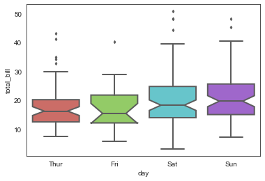
# 绘制传统的箱型图
sns.boxplot(x='day', y='total_bill', data=tip_datas,
linewidth=2, #线宽
width=0.8, #箱之间的间隔比例
fliersize=3, #异常点大小
palette='hls', #设置调色板
whis=1.5, #设置IQR
notch=True, #设置中位值凹陷
order=['Thur','Fri','Sat','Sun'], #选择类型并排序
)
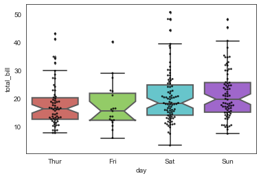
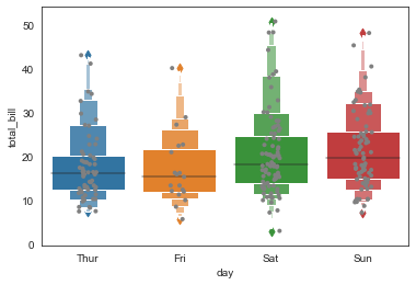
# 绘制箱型图

sns.boxplot(x='day', y='total_bill', data=tip_datas,

            linewidth=2,

            width=0.8,

            fliersize=3,

            palette='hls',

            whis=1.5,

            notch=True,

            order=['Thur','Fri','Sat','Sun'],

            )

#添加散点图

sns.swarmplot(x='day', y='total_bill', data=tip_datas, color='k', size=3, alpha=0.8)
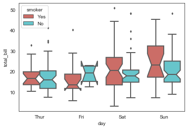
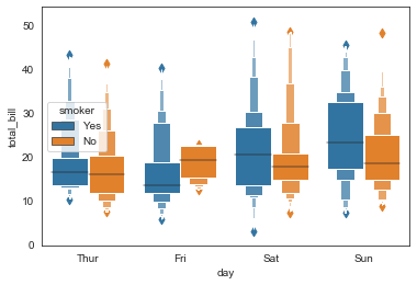
# 绘制箱型图,hue参数设置再分类

sns.boxplot(x='day', y='total_bill', data=tip_datas,

            linewidth=2,

            width=0.8,

            fliersize=3,

            palette='hls',

            whis=1.5,

            notch=True,

            order=['Thur','Fri','Sat','Sun'],

            hue='smoker',

            )
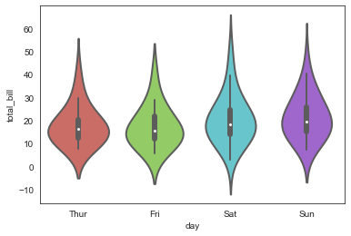
violinplot()
sns.violinplot(x='day', y='total_bill', data=tip_datas,

               linewidth=2,

               width=0.8,

               palette='hls',

               order=['Thur','Fri','Sat','Sun'],

               scale='area',                    #设置提琴宽度:area-面积相同,count-按照样本数量决定宽度,width-宽度一样

               gridsize=50,                     #设置提琴图的边线平滑度,越高越平滑

               inner='box',                     #设置内部显示类型--"box","quartile","point","stick",None

               bw=0.8                           #控制拟合程度,一般可以不设置

              )
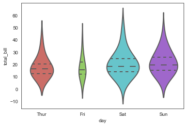
sns.violinplot(x='day', y='total_bill', data=tip_datas,

               linewidth=2,

               width=0.8,

               palette='hls',

               order=['Thur','Fri','Sat','Sun'],

               scale='width',

               gridsize=50,

               inner='quartile',                   #内部标记分位线

               bw=0.8

              )
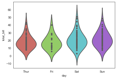
sns.violinplot(x='day', y='total_bill', data=tip_datas,

               linewidth=2,

               width=0.8,

               palette='hls',

               order=['Thur','Fri','Sat','Sun'],

               scale='width',

               gridsize=50,

               inner='point',                 #内部添加散点

               bw=0.8

              )
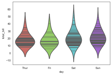
sns.violinplot(x='day', y='total_bill', data=tip_datas,

               linewidth=2,

               width=0.8,

               palette='hls',

               order=['Thur','Fri','Sat','Sun'],

               scale='width',

               gridsize=50,

               inner='stick',              #内部添加细横线

               bw=0.8

              )
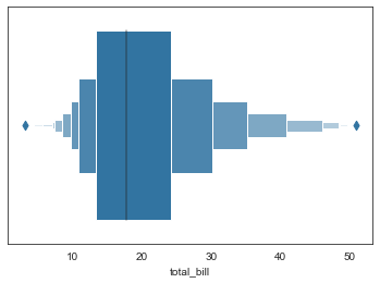
boxenplot()
sns.boxenplot(

    x=None,

    y=None,

    hue=None,

    data=None,

    order=None,

    hue_order=None,

    orient=None,

    color=None,

    palette=None,

    saturation=0.75,

    width=0.8,

    dodge=True,

    k_depth='proportion',

    linewidth=None,

    scale='exponential',

    outlier_prop=None,

    ax=None,

    **kwargs,

)

Docstring:

Draw an enhanced box plot for larger datasets.

This style of plot was originally named a "letter value" plot because it

shows a large number of quantiles that are defined as "letter values".  It

is similar to a box plot in plotting a nonparametric representation of a

distribution in which all features correspond to actual observations. By

plotting more quantiles, it provides more information about the shape of

the distribution, particularly in the tails. For a more extensive

explanation, you can read the paper that introduced the plot:

https://vita.had.co.nz/papers/letter-value-plot.html

Input data can be passed in a variety of formats, including:

- Vectors of data represented as lists, numpy arrays, or pandas Series

  objects passed directly to the ``x``, ``y``, and/or ``hue`` parameters.

- A "long-form" DataFrame, in which case the ``x``, ``y``, and ``hue``

  variables will determine how the data are plotted.

- A "wide-form" DataFrame, such that each numeric column will be plotted.

- An array or list of vectors.

In most cases, it is possible to use numpy or Python objects, but pandas

objects are preferable because the associated names will be used to

annotate the axes. Additionally, you can use Categorical types for the

grouping variables to control the order of plot elements.

This function always treats one of the variables as categorical and

draws data at ordinal positions (0, 1, ... n) on the relevant axis, even

when the data has a numeric or date type.

See the :ref:`tutorial <categorical_tutorial>` for more information.

Parameters

----------

x, y, hue : names of variables in ``data`` or vector data, optional

    Inputs for plotting long-form data. See examples for interpretation.

data : DataFrame, array, or list of arrays, optional

    Dataset for plotting. If ``x`` and ``y`` are absent, this is

    interpreted as wide-form. Otherwise it is expected to be long-form.

order, hue_order : lists of strings, optional

    Order to plot the categorical levels in, otherwise the levels are

    inferred from the data objects.

orient : "v" | "h", optional

    Orientation of the plot (vertical or horizontal). This is usually

    inferred from the dtype of the input variables, but can be used to

    specify when the "categorical" variable is a numeric or when plotting

    wide-form data.

color : matplotlib color, optional

    Color for all of the elements, or seed for a gradient palette.

palette : palette name, list, or dict, optional

    Colors to use for the different levels of the ``hue`` variable. Should

    be something that can be interpreted by :func:`color_palette`, or a

    dictionary mapping hue levels to matplotlib colors.

saturation : float, optional

    Proportion of the original saturation to draw colors at. Large patches

    often look better with slightly desaturated colors, but set this to

    ``1`` if you want the plot colors to perfectly match the input color

    spec.

width : float, optional

    Width of a full element when not using hue nesting, or width of all the

    elements for one level of the major grouping variable.

dodge : bool, optional

    When hue nesting is used, whether elements should be shifted along the

    categorical axis.

k_depth : "proportion" | "tukey" | "trustworthy", optional

    The number of boxes, and by extension number of percentiles, to draw.

    All methods are detailed in Wickham's paper. Each makes different

    assumptions about the number of outliers and leverages different

    statistical properties.

linewidth : float, optional

    Width of the gray lines that frame the plot elements.

scale : "linear" | "exponential" | "area"

    Method to use for the width of the letter value boxes. All give similar

    results visually. "linear" reduces the width by a constant linear

    factor, "exponential" uses the proportion of data not covered, "area"

    is proportional to the percentage of data covered.

outlier_prop : float, optional

    Proportion of data believed to be outliers. Used in conjunction with

    k_depth to determine the number of percentiles to draw. Defaults to

    0.007 as a proportion of outliers. Should be in range [0, 1].

ax : matplotlib Axes, optional

    Axes object to draw the plot onto, otherwise uses the current Axes.

kwargs : key, value mappings

    Other keyword arguments are passed through to ``plt.plot`` and

    ``plt.scatter`` at draw time.

Returns

-------

ax : matplotlib Axes

    Returns the Axes object with the plot drawn onto it.

See Also

--------

violinplot : A combination of boxplot and kernel density estimation.

boxplot : A traditional box-and-whisker plot with a similar API.
#单变量简易图

ax = sns.boxenplot(x=tip_datas['total_bill'])
#多变量箱型图

ax = sns.boxenplot(x='day', y='total_bill', data=tip_datas)

#多变量分类箱型图,hue

ax = sns.boxenplot(x='day', y='total_bill',

                   data=tip_datas,hue='smoker'

                   )
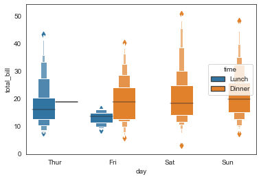
#多变量分类箱型图,hue

ax = sns.boxenplot(x='day', y='total_bill',

                   data=tip_datas,hue='time',

                   linewidth=2.5)
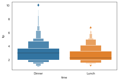
#多变量排序箱型图,order

ax = sns.boxenplot(x='time', y='tip',

                   data=tip_datas,order=['Dinner','Lunch']

                  )
ax = sns.boxenplot(x='day', y='total_bill',

                   data=tip_datas)

#添加散点图

ax = sns.stripplot(x='day', y='total_bill', data=tip_datas,

                   size=4,jitter=True, color="gray"

                  )
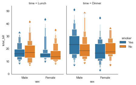
#分栏箱型图

g = sns.catplot(x="sex", y="total_bill",

                hue="smoker", col="time",

                data=tip_datas, kind="boxen",

                height=4, aspect=.7)
#其他参数,scale\k_depth

sns.boxenplot(x='day', y='total_bill', data=tip_datas,

           width=0.8,

           linewidth=12,

           scale='area',          #设置框大小:"linear"、"exponential"、"area"

           k_depth='proportion',  #设置框的数量: "proportion"、"tukey"、"trustworthy"

          )
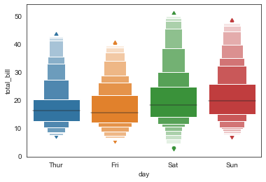
sns.boxenplot(x='day', y='total_bill', data=tip_datas,

           width=0.8,

           linewidth=12,

           scale='linear',          #设置框大小:"linear"、"exponential"、"area"

           k_depth='proportion',  #设置框的数量: "proportion"、"tukey"、"trustworthy"

          )
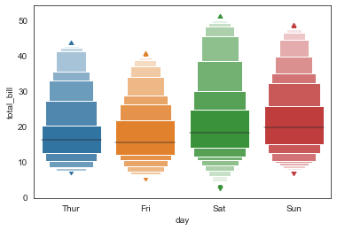
sns.boxenplot(x='day', y='total_bill', data=tip_datas,

           width=0.8,

           linewidth=12,

           scale='exponential',          #设置框大小:"linear"、"exponential"、"area"

           k_depth='proportion',       #设置框的数量: "proportion"、"tukey"、"trustworthy"

          )

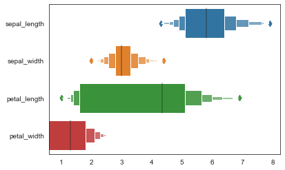
#多变量横向箱型图,orient

iris_datas = sns.load_dataset('iris', data_home='seaborn-data')

ax = sns.boxenplot(data=iris_datas, orient='h')
Seaborn分布数据可视化---箱型分布图的更多相关文章
- seaborn分布数据可视化:直方图|密度图|散点图
系统自带的数据表格(存放在github上https://github.com/mwaskom/seaborn-data),使用时通过sns.load_dataset('表名称')即可,结果为一个Dat ...
- Python图表数据可视化Seaborn:1. 风格| 分布数据可视化-直方图| 密度图| 散点图
conda install seaborn 是安装到jupyter那个环境的 1. 整体风格设置 对图表整体颜色.比例等进行风格设置,包括颜色色板等调用系统风格进行数据可视化 set() / se ...
- Python图表数据可视化Seaborn:2. 分类数据可视化-分类散点图|分布图(箱型图|小提琴图|LV图表)|统计图(柱状图|折线图)
1. 分类数据可视化 - 分类散点图 stripplot( ) / swarmplot( ) sns.stripplot(x="day",y="total_bill&qu ...
- seaborn分类数据可视化:散点图|箱型图|小提琴图|lv图|柱状图|折线图
一.散点图stripplot( ) 与swarmplot() 1.分类散点图stripplot( ) 用法stripplot(x=None, y=None, hue=None, data=None, ...
- seaborn分类数据可视化
转载:https://cloud.tencent.com/developer/article/1178368 seaborn针对分类型的数据有专门的可视化函数,这些函数可大致分为三种: 分类数据散点图 ...
- seaborn线性关系数据可视化:时间线图|热图|结构化图表可视化
一.线性关系数据可视化lmplot( ) 表示对所统计的数据做散点图,并拟合一个一元线性回归关系. lmplot(x, y, data, hue=None, col=None, row=None, p ...
- 用seaborn对数据可视化
以下用sns作为seaborn的别名 1.seaborn整体布局设置 sns.set_syle()函数设置图的风格,传入的参数可以是"darkgrid", "whiteg ...
- Python Seaborn综合指南,成为数据可视化专家
概述 Seaborn是Python流行的数据可视化库 Seaborn结合了美学和技术,这是数据科学项目中的两个关键要素 了解其Seaborn作原理以及使用它生成的不同的图表 介绍 一个精心设计的可视化 ...
- Seaborn数据可视化入门
在本节学习中,我们使用Seaborn作为数据可视化的入门工具 Seaborn的官方网址如下:http://seaborn.pydata.org 一:definition Seaborn is a Py ...
- 第六篇:R语言数据可视化之数据分布图(直方图、密度曲线、箱线图、等高线、2D密度图)
数据分布图简介 中医上讲看病四诊法为:望闻问切.而数据分析师分析数据的过程也有点相似,我们需要望:看看数据长什么样:闻:仔细分析数据是否合理:问:针对前两步工作搜集到的问题与业务方交流:切:结合业务方 ...
随机推荐
- 适配http分发Directory.Build.props文件,需要替换默认的微软sdk:8.0映像
背景 我们是把Directory.Build.props及其Import的文件,都放在http://dev.amihome.cn 那么docker build的时候,也是需要下载Directory.B ...
- 八: Mysql配置文件的使用
# Mysql配置文件的使用 1. 配置文件格式 与在命令行中指定启动选项不同的是,配置文件中的启动选项被划分为若干个组,丽个组有一个组名, 用中括号 [ ]扩起来,像这样: 像这个配置文件里就定义了 ...
- Java --- 多线程 创建线程的方式四: 使用线程池
1 package bytezero.thread2; 2 3 import java.security.Provider; 4 import java.util.concurrent.Executo ...
- C++//常用排序算法 sort //打乱 random_shuffle //merge 两个容器元素合并,并储存到另一容器中(相同的有序序列) //reverse 将容器内的元素进行反转
1 //常用排序算法 sort //打乱 random_shuffle 2 //merge 两个容器元素合并,并储存到另一容器中(相同的有序序列) 3 //reverse 将容器内的元素进行反转 4 ...
- 2022年RPA行业发展十大趋势,六千字长文助你看懂RPA
2022年RPA行业发展十大趋势,六千字长文助你看懂RPA 2022年RPA行业如何发展?十大趋势助你看懂RPA行业未来 这里有2022年RPA行业发展的十大趋势,关注RPA的朋友定要收藏! 文/王吉 ...
- C#版开源免费的Bouncy Castle密码库
前言 今天大姚给大家分享一款C#版开源.免费的Bouncy Castle密码库:BouncyCastle. 项目介绍 BouncyCastle是一款C#版开源.免费的Bouncy Castle密码库, ...
- vscode git冲突 1. git stash 2. 更新代码 3. git stash pop 4.提交代码
vscode git冲突 1. git stash 2. 更新代码 3. git stash pop 4.提交代码
- vitepress 发布到 gitee上的build命令 自动设置base
docs.vitepress\config.js const argv = require('minimist')(process.argv.slice(2)) const build = argv. ...
- 关于hashCode和equals重写
规则 只要重写equals,就必须重写hashCode. 用Set存储对象或者用对象作为Map的键时,必须重写hashCode.也就是说,当需要用对象的哈希值来判断对象是否相等时必须重写hashCod ...
- WPF之资源
目录 WPF对象资源的定义和查找 动态.静态使用资源 向程序添加二进制资源 字符串资源 非字符串资源 使用Pack URI路径访问二进制资源 WPF不但支持程序级的传统资源,同时还推出了独具特色的对象 ...