iOS - UIToolbar
前言
	NS_CLASS_AVAILABLE_IOS(2_0) __TVOS_PROHIBITED @interface UIToolbar : UIView <UIBarPositioning>

	@available(iOS 2.0, *)						   public class UIToolbar : UIView, UIBarPositioning
- 工具条控件 UIToolbar 用做工具条按钮项(UIBarButtonItem)的容器,可以盛放一个或者多个工具条按钮项,一般放置在界面顶部或者底部。如果要针对工具条按钮项自定义视图,可以使用 UIToolbarDelegate 设置。
1、UIToolbar 的创建
Objective-C
	// 创建 UIToolbar 工具条,工具条上面可以放一些导航专用按钮项

	UIToolbar *toolbar = [[UIToolbar alloc] initWithFrame:CGRectMake(0, 20, self.view.bounds.size.width, 44)];

	[self.view addSubview:toolbar];

	// 创建工具条 UIBarButtonItem 按钮项

	// 创建编辑按钮

	UIBarButtonItem *editButton = [[UIBarButtonItem alloc]

                                   initWithBarButtonSystemItem:UIBarButtonSystemItemEdit

                                                        target:self

                                                        action:@selector(editClick)];

	// 创建刷新按钮

	UIBarButtonItem *refreshButton = [[UIBarButtonItem alloc]

	                                   initWithBarButtonSystemItem:UIBarButtonSystemItemRefresh

	                                                        target:self

	                                                        action:@selector(refreshClick)];

	// 创建弹簧按钮

	UIBarButtonItem *flexibleButton = [[UIBarButtonItem alloc]

	                                    initWithBarButtonSystemItem:UIBarButtonSystemItemFlexibleSpace

	                                                         target:nil

	                                                         action:nil];

	// 将按钮项添加到工具条,通过数组给工具条设置一些导航按钮

	toolbar.items = @[editButton, flexibleButton, refreshButton];
Swift
    // 创建 UIToolbar 工具条,工具条上面可以放一些导航专用按钮项

    let toolbar:UIToolbar = UIToolbar(frame: CGRectMake(0, 20, self.view.bounds.size.width, 44))

    self.view.addSubview(toolbar)

    // 创建工具条 UIBarButtonItem 按钮项

    // 创建编辑按钮

    let editButton:UIBarButtonItem = UIBarButtonItem(barButtonSystemItem: .Edit,

                                                                  target: self,

                                                                  action: #selector(UiToolbar.editClick))

    // 创建刷新按钮

    let refreshButton:UIBarButtonItem = UIBarButtonItem(barButtonSystemItem: .Refresh,

                                                                     target: self,

                                                                     action: #selector(UiToolbar.refreshClick))

    // 创建弹簧按钮

    let flexibleButton:UIBarButtonItem = UIBarButtonItem(barButtonSystemItem: .FlexibleSpace,

                                                                      target:nil,

                                                                      action:nil)

    // 将按钮项添加到工具条,通过数组给工具条设置一些导航按钮

    toolbar.items = [editButton, flexibleButton, refreshButton]
2、UIBarButtonItem 的创建
Objective-C
系统类按钮
/*
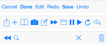
UIBarButtonSystemItemDone, Done
UIBarButtonSystemItemCancel, Cancel
UIBarButtonSystemItemEdit, Edit
UIBarButtonSystemItemSave, Save
UIBarButtonSystemItemUndo, Undo
UIBarButtonSystemItemRedo, Redo
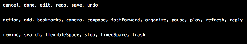
UIBarButtonSystemItemAdd, 加号 图标按钮
UIBarButtonSystemItemFlexibleSpace, 弹簧 按钮,将 button 推向两边
UIBarButtonSystemItemFixedSpace, 弹簧 按钮,将 button 推向两边,
可设间距 fixedSpaceButton.width = 50;
UIBarButtonSystemItemCompose, 撰写 图标按钮
UIBarButtonSystemItemReply, 答复 图标按钮
UIBarButtonSystemItemAction, 详情 图标按钮
UIBarButtonSystemItemOrganize, 文件夹 图标按钮
UIBarButtonSystemItemBookmarks, 书籍 图标按钮
UIBarButtonSystemItemSearch, 搜索 图标按钮
UIBarButtonSystemItemRefresh, 刷新 图标按钮
UIBarButtonSystemItemStop, X 号 图标按钮
UIBarButtonSystemItemCamera, 相机 图标按钮
UIBarButtonSystemItemTrash, 删除 图标按钮
UIBarButtonSystemItemPlay, 播放 图标按钮
UIBarButtonSystemItemPause, 暂停 图标按钮
UIBarButtonSystemItemRewind, 快退 图标按钮
UIBarButtonSystemItemFastForward, 快进 图标按钮
*/
UIBarButtonItem *done = [[UIBarButtonItem alloc] initWithBarButtonSystemItem:UIBarButtonSystemItemDone
target:self
action:@selector(buttonClick)];
文本类按钮
	/*

		UIBarButtonItemStylePlain        默认按钮风格;按下时会闪动

		UIBarButtonItemStyleBordered     与 UIBarButtonItemStylePlain 相同,但显示的按钮有边框, NS_ENUM_DEPRECATED_IOS

		UIBarButtonItemStyleDone         显示一个蓝色按钮,提醒用户编辑完毕时应该点触(tap)该按钮。

	*/

	UIBarButtonItem *titleBtn = [[UIBarButtonItem alloc] initWithTitle:@"按钮"

	                                                             style:UIBarButtonItemStylePlain

	                                                            target:self

	                                                            action:@selector(buttonClick)];
图片类按钮
	// 对图片进行处理,以原图的样式显示,否则显示为蓝色块

	UIImage *image1 = [[UIImage imageNamed:@"001"] imageWithRenderingMode:UIImageRenderingModeAlwaysOriginal];

	UIBarButtonItem *imageBtn1 = [[UIBarButtonItem alloc] initWithImage:image1

			                                                       style:UIBarButtonItemStylePlain

			                                                      target:self

			                                                      action:@selector(buttonClick)];

	UIImage *image2 = [[UIImage imageNamed:@"002"] imageWithRenderingMode:UIImageRenderingModeAlwaysOriginal];

	UIImage *image3 = [[UIImage imageNamed:@"004"] imageWithRenderingMode:UIImageRenderingModeAlwaysOriginal];

	UIBarButtonItem *imageBtn2 = [[UIBarButtonItem alloc] initWithImage:image2

                                                   landscapeImagePhone:image3

	                                                              style:UIBarButtonItemStyleDone

	                                                             target:self

	                                                             action:@selector(buttonClick)];
自定义视图类按钮
	UIProgressView *progress = [[UIProgressView alloc] initWithProgressViewStyle:UIProgressViewStyleBar];

	progress.frame = CGRectMake(0, 0, 80, 20);

	progress.progress = 0.5;

	progress.progressTintColor = [UIColor greenColor];

	progress.trackTintColor = [UIColor redColor];

	UIBarButtonItem *viewBtn = [[UIBarButtonItem alloc] initWithCustomView:progress];
Swift
系统类按钮
	/*

    	UIBarButtonSystemItemDone,           Done

    	UIBarButtonSystemItemCancel,         Cancel

    	UIBarButtonSystemItemEdit,           Edit

    	UIBarButtonSystemItemSave,           Save

    	UIBarButtonSystemItemUndo,           Undo

    	UIBarButtonSystemItemRedo,           Redo

    	UIBarButtonSystemItemAdd,            加号 图标按钮

    	UIBarButtonSystemItemFlexibleSpace,  弹簧 按钮,将 button 推向两边

    	UIBarButtonSystemItemFixedSpace,     弹簧 按钮,将 button 推向两边,

    	                                     可设间距 fixedSpaceButton.width = 50;

    	UIBarButtonSystemItemCompose,        撰写 图标按钮

    	UIBarButtonSystemItemReply,          答复 图标按钮

    	UIBarButtonSystemItemAction,         详情 图标按钮

    	UIBarButtonSystemItemOrganize,       文件夹 图标按钮

    	UIBarButtonSystemItemBookmarks,      书籍 图标按钮

    	UIBarButtonSystemItemSearch,         搜索 图标按钮

    	UIBarButtonSystemItemRefresh,        刷新 图标按钮

    	UIBarButtonSystemItemStop,           X 号 图标按钮

    	UIBarButtonSystemItemCamera,         相机 图标按钮

    	UIBarButtonSystemItemTrash,          删除 图标按钮

    	UIBarButtonSystemItemPlay,           播放 图标按钮

    	UIBarButtonSystemItemPause,          暂停 图标按钮

    	UIBarButtonSystemItemRewind,         快退 图标按钮

    	UIBarButtonSystemItemFastForward,    快进 图标按钮

	*/

	let done:UIBarButtonItem = UIBarButtonItem(barButtonSystemItem: .Done,

	                                                        target: self,

	                                                        action: #selector(UiToolbar.buttonClick))
文本类按钮
	/*

		case Plain        默认按钮风格;按下时会闪动

		case Bordered     与 UIBarButtonItemStylePlain 相同,但显示的按钮有边框, NS_ENUM_DEPRECATED_IOS

		case Done         显示一个蓝色按钮,提醒用户编辑完毕时应该点触(tap)该按钮。

	*/

	let titleBtn:UIBarButtonItem = UIBarButtonItem(title: "按钮",

	                                               style: UIBarButtonItemStyle.Plain,

	                                              target: self,

	                                              action: #selector(UiToolbar.buttonClick))
图片类按钮
	// 对图片进行处理,以原图的样式显示,否则显示为蓝色块

	let image1:UIImage = UIImage(named: "001")!.imageWithRenderingMode(.AlwaysOriginal)

	let imageBtn1:UIBarButtonItem = UIBarButtonItem(image: image1,

                                                    style: UIBarButtonItemStyle.Plain,

                                                   target: self,

                                                   action: #selector(UiToolbar.buttonClick))

	let image2:UIImage = UIImage(named: "002")!.imageWithRenderingMode(.AlwaysOriginal)

	let image3:UIImage = UIImage(named: "004")!.imageWithRenderingMode(.AlwaysOriginal)

	let imageBtn2:UIBarButtonItem = UIBarButtonItem(image: image2,

                                      landscapeImagePhone: image3,

                                                    style: UIBarButtonItemStyle.Plain,

                                                   target: self,

                                                   action: #selector(UiToolbar.buttonClick))
自定义视图类按钮
	let progress:UIProgressView = UIProgressView(progressViewStyle: UIProgressViewStyle.Bar)

	progress.frame = CGRectMake(0, 0, 80, 20)

	progress.progress = 0.5

	progress.progressTintColor = UIColor.greenColor()

	progress.trackTintColor = UIColor.redColor()

	let viewBtn:UIBarButtonItem = UIBarButtonItem(customView: progress)
3、navigation 中的 toolBar
navigationController 自带的 toolbar 属性是所有添加在 navigationController 上的视图所共用的,是属于 navigationController 的,不是属于每个 ViewController 的,但 toolbar 上显示的内容的是每个 ViewController 的,需要在每个 ViewController 上单独设置。
toolbar 的显示状态会被带到已经显示过的 ViewController 上,跳转到未显示过的 ViewController 时,toolbar 再次被隐藏。
Objective-C
	// 显示 toolBar,toolBar 默认是隐藏的,首先需要让它显示出来,默认在屏幕的最下方

	self.navigationController.toolbarHidden = NO;

	// 向 toolBar 添加按钮,最多只能显示 8 个,往 self.navigationController.toolbarItems 上添加时无用

	self.toolbarItems = buttonArray;
Swift
	// 显示 toolBar,toolBar 默认是隐藏的,首先需要让它显示出来,默认在屏幕的最下方

	self.navigationController!.toolbarHidden = false

	// 向 toolBar 添加按钮,最多只能显示 8 个,往 self.navigationController.toolbarItems 上添加时无用

	self.toolbarItems = buttonArray
iOS - UIToolbar的更多相关文章
- iOS:UIToolBar控件的使用
UIToolBar控件:是经常使用的一个工具条控件,虽然在上面可以添加子控件,但是toolbar中只能添加UIBarButtonItem类型的子控件,其他子控件会被包装成这种类型的,例如UIButto ...
- iOS UIToolBar的使用
UIToolBar存在于UINavigationController导航栏控制器中.并且默认被隐藏. 当设置UIToolBar显示,或者存在UITabBarController且tabbar被隐藏的时 ...
- iOS:UIToolBar、toolbarItems、BarButtonItem的几种关系
工具栏:ToolBar 工具栏项目:Bar Button Item 调节按钮位置的固定调节:Fixed Space Bar Button Item 调节按钮位置的灵活调节:Flexible Space ...
- ios 开发UI篇— UIToolbar
前言 NS_CLASS_AVAILABLE_IOS(2_0) __TVOS_PROHIBITED @interface UIToolbar : UIView <UIBarPositioning& ...
- iOS 开发 中级:UIToolbar,UINavigationBar,UITabBar,UIBarButtonItem,UITabBarItem自定义方法总结
原文: http://blog.csdn.net/songrotek/article/details/8692866?utm_source=tuicool 对于UIToolbar,UINavigat ...
- iOS开发——UI篇Swift篇&UIToolbar
UIToolbar class UIToolBarUISearchBar: UIViewController,UISearchBarDelegate { var titleString:String! ...
- [iOS基础控件 - 6.10.3] DatePicker & UIToolBar
A.需求 1. 学习DatePicker的基本配置 2.使用TextField召唤指定类型的输入键盘View,这里使用DatePicker 3.给输入键盘上方加上一个UIToolBar,实现如关闭键盘 ...
- 【iOS发展-70】点菜系统案例:使用文本框inputView和inputAccessoryView串联UIPickerView、UIDatePicker和UIToolBar
(1)效果 (2)先在storyboard中设计界面,然后源码(直接在ViewController中码) #import "ViewController.h" @interface ...
- 【IOS 开发】基本 UI 控件详解 (UIDatePicker | UIPickerView | UIStepper | UIWebView | UIToolBar )
转载注明出处 : http://blog.csdn.net/shulianghan/article/details/50348982 一. 日期选择器 (UIDatePicker) UIDatePic ...
随机推荐
- ExtJS4.2 根据数据库记录构建树形菜单
背景:最近用ExtJS4.2做一个系统,需要在前端展示资源菜单,为树形结构,该树形结构是从数据库动态加载的. ExtJS的树形结构大致有两种情况: 1.静态树形结构,此处不多说,看API就能简单明白: ...
- 给NIOS II CPU添加一颗澎湃的心——sysclk的使用
给NIOS II CPU添加一颗澎湃的心——系统时钟的使用 本实验介绍如何在Qsys中添加一个定时器作为NIOS II的心跳定时器,并在NIOS II中软件编程使用该定时器. 将上一个实验watchd ...
- canvas 动画
1.随机产生形状,做360度运转,带有一个开始开始按钮一个停止按钮 var canvas=$('.mycanvas'); canvas.attr("width",500);//$( ...
- U3D UGUI学习1 - 层级环境
就像主动碰撞检测需要刚体,刚体需要Mesh Filter.Unity的一些组件都需要基础配置. UGUI的基础配置和NGUI差不多,把NGUI的那些中间件全部削减干净,甚至连快捷键也没有. 1.基础层 ...
- yum mysql on centos 7
参考:https://www.linode.com/docs/databases/mysql/how-to-install-mysql-on-centos-7 centos 7上没有办法使用yum i ...
- [Django_1_0]初次见面
Django 初次见面 文章将写安装和第一次使用时候的操作.文章是照着文档做的,但是以后的内容会有不一样. 安装 pip install django 我这里是使用python3的,也可以使用 pip ...
- 阿里巴巴Double分布式服务框架
开发人员梁飞的blog : http://javatar.iteye.com/ 梁飞关于Double框架的专访: http://www.iteye.com/magazines/103 Double项目 ...
- PKCS10生成证书csr
public static String genCSR(String subject, String alg,String provider) throws InvalidKeyException, ...
- IOS自定义仪表盘
登录|注册 周海锋 的专栏 Objective-C/Cocos2d/Cocos2d-x/Php/JS 目录视图 摘要视图 订阅 2016软考项目经理实战班 学院周年礼-顶 ...
- 我的android学习经历29
四大组件之广播接收者BroadcastReceiver 新建广播接收器 需要新建一个类继承类BroadcastReceiver,并且重写其中的方法onReceive(),不要在这个方法中添加过多的逻辑 ...