
vue2.0 之 douban (二)创建自定义组件tabbar
1.大体布局
这个组件分为两部分:第一个是组件的外层容器,第二个是组件的子容器item,子组件里面又分为图片和文字组合。子组件有2个状态,一个默认灰色的状态,一个选中状态,我们来实现一下这个组件的布局
Index.vue
<template>

  <div class="m-tabbar">

    <a class="m-tabbar-item is-active">

      <span class="m-tabbar-item-icon">

        <img src="../assets/images/ic_tab_home_normal.png" alt="">

      </span>

      <span class="m-tabbar-item-text">

        首页

      </span>

    </a>

    <a class="m-tabbar-item">

      <span class="m-tabbar-item-icon">

        <img src="../assets/images/ic_tab_subject_normal.png" alt="">

      </span>

      <span class="m-tabbar-item-text">

        书影音

      </span>

    </a>

    <a class="m-tabbar-item">

      <span class="m-tabbar-item-icon">

        <img src="../assets/images/ic_tab_status_normal.png" alt="">

      </span>

      <span class="m-tabbar-item-text">

        广播

      </span>

    </a>

    <a class="m-tabbar-item">

      <span class="m-tabbar-item-icon">

        <img src="../assets/images/ic_tab_group_normal.png" alt="">

      </span>

      <span class="m-tabbar-item-text">

        小组

      </span>

    </a>

    <a class="m-tabbar-item">

      <span class="m-tabbar-item-icon">

        <img src="../assets/images/ic_tab_profile_normal.png" alt="">

      </span>

      <span class="m-tabbar-item-text">

        我的

      </span>

    </a>

  </div>

</template>

<script>

export default {

}

</script>

<style lang="less">

.m-tabbar{

    display: flex;

    flex-direction: row;

    position: fixed;

    bottom: 0;

    left: 0;

    right: 0;

    width: 100%;

    overflow: hidden;

    height: 50px;

    background: #fff;

    border-top: 1px solid #e4e4e4;

    .m-tabbar-item{

      flex: 1;

      text-align: center;

      .m-tabbar-item-icon{

          display: block;

          padding-top: 2px;

          img{

              width: 28px;

              height: 28px;

          }

      }

      .m-tabbar-item-text{

          display: block;

          font-size: 10px;

          color:#949494;

      }

      &.is-active{

          .m-tabbar-item-text{

              color: #42bd56;

          }

      }

  }

}

</style>
效果图:

2.组件化
先在components文件夹下面,新建两个组件,通过这两个组件来组合实现我们底部的tab组件:
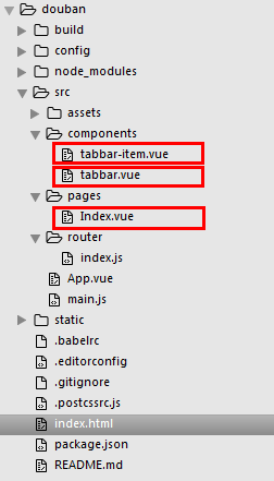
(一)一个是tabbar-item.vue,实现子组件的item项
tabbar-item.vue
<template>

  <a class="m-tabbar-item" >

    <span class="m-tabbar-item-icon"><slot name="icon-normal"></slot></span>

    <span class="m-tabbar-item-text"><slot></slot></span>

  </a>

</template>

<style lang="less">

.m-tabbar-item{

  flex: 1;

  text-align: center;

  .m-tabbar-item-icon{

    display: block;

    padding-top: 2px;

    img{

      width: 28px;

      height: 28px;

    }

  }

  .m-tabbar-item-text{

    display: block;

    font-size: 10px;

    color:#949494;

  }

  &.is-active{

    .m-tabbar-item-text{

      color: #42bd56;

    }

  }

}

</style>
(二)一个是tabbar.vue,实现tab的外层容器
tabbar.vue
<template>

  <div class="m-tabbar">

    <slot></slot>

  </div>

</template>

<style lang="less">

.m-tabbar{

  display: flex;

  flex-direction: row;

  position: fixed;

  bottom: 0;

  left: 0;

  right: 0;

  width: 100%;

  overflow: hidden;

  height: 50px;

  background: #fff;

  border-top: 1px solid #e4e4e4;

}

</style>
在Index.vue中组合这两个组件,实现tab组件效果
Index.vue
<template>

  <div>

    <m-tabbar>

      <m-tabbar-item id='tab1'>

        <img src="../assets/images/ic_tab_home_normal.png" alt="" slot="icon-normal">

        首页

      </m-tabbar-item>

      <m-tabbar-item id='tab2'>

        <img src="../assets/images/ic_tab_subject_normal.png" alt="" slot="icon-normal">

        书影音

      </m-tabbar-item>

      <m-tabbar-item id='tab3'>

        <img src="../assets/images/ic_tab_status_normal.png" alt="" slot="icon-normal">

        广播

      </m-tabbar-item>

      <m-tabbar-item id='tab4'>

        <img src="../assets/images/ic_tab_group_normal.png" alt="" slot="icon-normal">

        小组

      </m-tabbar-item>

       <m-tabbar-item id='tab5'>

        <img src="../assets/images/ic_tab_profile_normal.png" alt="" slot="icon-normal">

        我的

      </m-tabbar-item>

    </m-tabbar>

  </div>

</template>

<script>

  import mTabbar from '../components/tabbar'

  import mTabbarItem from '../components/tabbar-item'

  export default {

    name: 'index',

    components: {

      mTabbar,

      mTabbarItem

    }

  }

</script>
效果图:

3.实现点击切换的效果
步骤一:
先给Index.vue里面的tab组件加上v-model 来进行数据双向绑定,通过select来达到选择item,在item里面再添加一个选中的active图片
Index.vue
<template>

  <div>

    <m-tabbar v-model="select">

      <m-tabbar-item id='tab1'>

        <img src="../assets/images/ic_tab_home_normal.png" alt="" slot="icon-normal">

        <img src="../assets/images/ic_tab_home_active.png" alt="" slot="icon-active">

        首页

      </m-tabbar-item>

      <m-tabbar-item id='tab2'>

        <img src="../assets/images/ic_tab_subject_normal.png" alt="" slot="icon-normal">

        <img src="../assets/images/ic_tab_subject_active.png" alt="" slot="icon-active">

        书影音

      </m-tabbar-item>

      <m-tabbar-item id='tab3'>

        <img src="../assets/images/ic_tab_status_normal.png" alt="" slot="icon-normal">

        <img src="../assets/images/ic_tab_status_active.png" alt="" slot="icon-active">

        广播

      </m-tabbar-item>

      <m-tabbar-item id='tab4'>

        <img src="../assets/images/ic_tab_group_normal.png" alt="" slot="icon-normal">

        <img src="../assets/images/ic_tab_group_active.png" alt="" slot="icon-active">

        小组

      </m-tabbar-item>

      <m-tabbar-item id='tab5'>

        <img src="../assets/images/ic_tab_profile_normal.png" alt="" slot="icon-normal">

        <img src="../assets/images/ic_tab_profile_active.png" alt="" slot="icon-active">

        我的

      </m-tabbar-item>

    </m-tabbar>

  </div>

</template>

<script>

  import mTabbar from '../components/tabbar'

  import mTabbarItem from '../components/tabbar-item'

  export default {

    name: 'index',

    components: {

      mTabbar,

      mTabbarItem

    },

    data() {

      return {

        select:"tab1"

      }

    }

  }

</script>
步骤二:
tabbar.vue里面通过props来传递数据vaule
tabbar.vue
<template>

  <div class="m-tabbar">

    <slot></slot>

  </div>

</template>

<script>

  import mTabbarItem from './tabbar-item';

  export default {

    props: ['value']

  }

</script>

<style lang="less">

.m-tabbar{

  display: flex;

  flex-direction: row;

  position: fixed;

  bottom: 0;

  left: 0;

  right: 0;

  width: 100%;

  overflow: hidden;

  height: 50px;

  background: #fff;

  border-top: 1px solid #e4e4e4;

}

</style>
步骤三:
tabbar-item.vue组件:根据父组件的value和当前组件的id判断是否为选中状态,通过 $parent.$emit('input',id) - 触发父组件的自定义事件,添加选中的图片,根据isActive来显示隐藏
tabbar-item.vue
<template>

    <a class="m-tabbar-item" :class="{'is-active':isActive}" @click="$parent.$emit('input',id)">

        <span class="m-tabbar-item-icon" v-show="!isActive"><slot name="icon-normal"></slot></span>

        <span class="m-tabbar-item-icon" v-show="isActive"><slot name="icon-active"></slot></span>

        <span class="m-tabbar-item-text"><slot></slot></span>

    </a>

</template>

<script>

    export default{

        props: ['id'],

        computed: {

            isActive(){

               if(this.$parent.value===this.id){

                   return true;

               }

            }

        }

    }

</script>

<style lang="less">

.m-tabbar-item{

    flex: 1;

    text-align: center;

    .m-tabbar-item-icon{

        display: block;

        padding-top: 2px;

        img{

            width: 28px;

            height: 28px;

        }

    }

    .m-tabbar-item-text{

        display: block;

        font-size: 10px;

        color:#949494;

    }

    &.is-active{

        .m-tabbar-item-text{

            color: #42bd56;

        }

    }

}

</style>
效果图:

.
vue2.0 之 douban (二)创建自定义组件tabbar的更多相关文章
- vue2.0 + vux (二)Footer组件
1.Footer组件 Footer.vue <!-- 底部 footer --> <template> <div> <tabbar> <!-- 综 ...
- HTML5 UI框架Kendo UI Web中如何创建自定义组件(二)
在前面的文章<HTML5 UI框架Kendo UI Web自定义组件(一)>中,对在Kendo UI Web中如何创建自定义组件作出了一些基础讲解,下面将继续前面的内容. 使用一个数据源 ...
- HTML5 UI框架Kendo UI Web教程:创建自定义组件(三)
Kendo UI Web包 含数百个创建HTML5 web app的必备元素,包括UI组件.数据源.验证.一个MVVM框架.主题.模板等.在前面的2篇文章<HTML5 Web app开发工具Ke ...
- 微信小程序 发现之旅(二)—— 自定义组件
组件化的项目开发中,组件应当划分为三个层次:组件.模块.页面 微信小程序已经为开发者封装好了基础组件,页面文件(pages)也有了详细的规定 而模块就需要自行开发,并且要和页面文件区分开,这就涉及到自 ...
- vue1.0和vue2.0的区别(二)
这篇我们继续之前的vue1.0和vue2.0的区别(一)继续说 四.循环 学过vue的同学应该知道vue1.0是不能添加重复数据的,否则它会报错,想让它重复添加也不是不可以,不过需要定义别的东西 而v ...
- 第三部分:Android 应用程序接口指南---第二节:UI---第十二章 自定义组件
第12章 自定义组件 Android平台提供了一套完备的.功能强大的组件化模型用于搭建用户界面,这套组件化模型以View和 ViewGroup这两个基础布局类为基础.平台本身已预先实现了多种用于构建界 ...
- Yii2.0 高级模版编写使用自定义组件(component)
翻译自:http://www.yiiframework.com/wiki/760/yii-2-0-write-use-a-custom-component-in-yii2-0-advanced-tem ...
- vue2.0 之 douban (三)创建header组件
1.分析 首页的header背景是绿色的,并且有一个搜索框,其他页面都是灰色的背景,在header的左侧,是一个返回按钮,右侧,有分享或者评论等图标,中间就是header的标题.我们先不做有搜索框的h ...
- vue2.0 之 douban (四)创建Swipe图片轮播组件
swiper中文文档:http://www.swiper.com.cn 1.我们在components文件夹里创建一个swipe组件,将需要用到的js以及css文件复制到assets/lib文件夹下, ...
随机推荐
- Luogu P1864 [NOI2009]二叉查找树
题目 \(v\)表示权值,\(F\)表示频率. 首先我们显然可以把这个权值离散化. 然后我们想一下,这个东西它是一棵树对吧,但是我们改变权值会引起其树形态的改变,这样很不好做,所以我们考虑把它转化为序 ...
- HNUSTOJ-1695 跳格子(略感头疼)
1695: 跳格子 时间限制: 1 Sec 内存限制: 128 MB提交: 230 解决: 57[提交][状态][讨论版] 题目描述 逸夫楼的大厅的地面有10行10列的石砖,我们用坐标(x,y)来 ...
- python中session的使用
- 【转】Hadoop 1.x中fsimage和edits合并实现
在NameNode运行期间,HDFS的所有更新操作都是直接写到edits中,久而久之edits文件将会变得很大:虽然这对NameNode运行时候是没有什么影响的,但是我们知道当NameNode重启的时 ...
- 探索ASP.Net Core 3.0系列二:聊聊ASP.Net Core 3.0 中的Startup.cs
原文:探索ASP.Net Core 3.0系列二:聊聊ASP.Net Core 3.0 中的Startup.cs 前言:.NET Core 3.0 SDK包含比以前版本更多的现成模板. 在本文中,我将 ...
- luogu P5340 [TJOI2019]大中锋的游乐场
传送门 要求经过路径汉堡的点和可乐的点个数之差绝对值\(\le k\),所以可以考虑dp,\(f_{i,j}\)表示到点\(i\),汉堡的点个数减可乐的点的个数为\(j\)的最短距离,注意一下负下标处 ...
- gulp程序怎么跑起来 及 使用中遇到的常见错误
gulp常见问题 问题一:Error: cannot find module 'gulp-concat' #16 解答:需要先npm install,然后执行gulp gulp安装及使用 一.安装no ...
- Hive配置日志
1. 重命名hive/conf文件夹下的hive-log4j 2. 修改hive.log.dir参数,如果不修改默认hive.log位于/tmp/{user}下面,一般来说使用在hive目录下自己创建 ...
- vue项目,webpack中配置src路径别名及使用
1.项目结构: 2.在build文件夹下的webpack.base.conf.js文件中设置src的路径别名. 3.在js文件或者vue文件的script标签中使用: (1).js文件中导入示例: ( ...
- 对数据集做标准化处理的几种方法——基于R语言
数据集——iris(R语言自带鸢尾花包) 一.scale函数 scale函数默认的是对制定数据做均值为0,标准差为1的标准化.它的两个参数center和scale: 1)center和scale默认为 ...