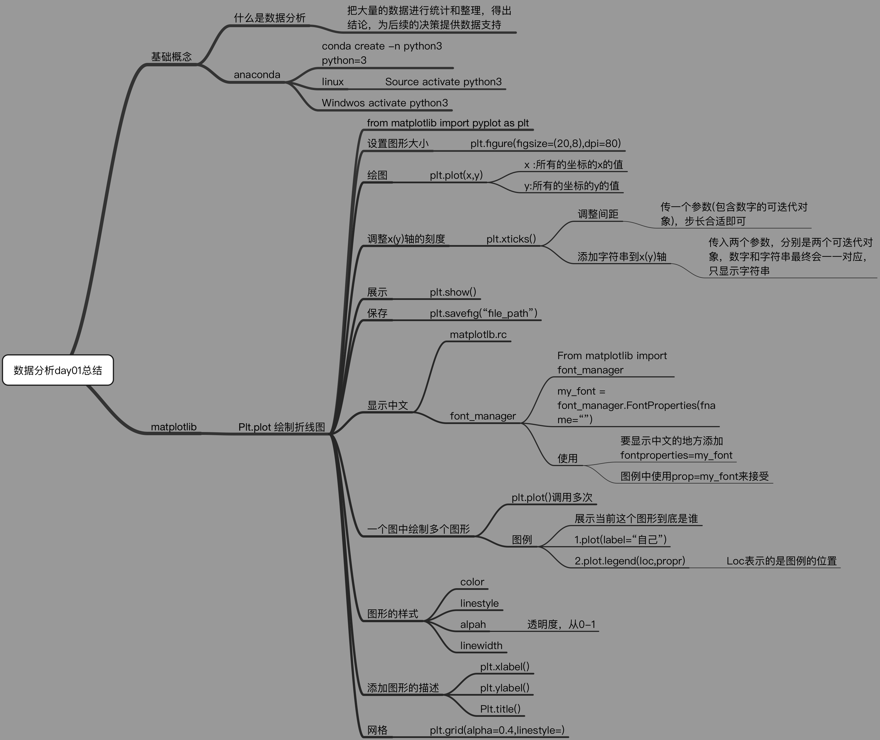
Matplotlib 绘制折线图
Matplotlib
matplotlib: 最流行的Python底层绘图库,主要做数据可视化图表,名字取材于MATLAB,模仿MATLAB构建
绘制折线图
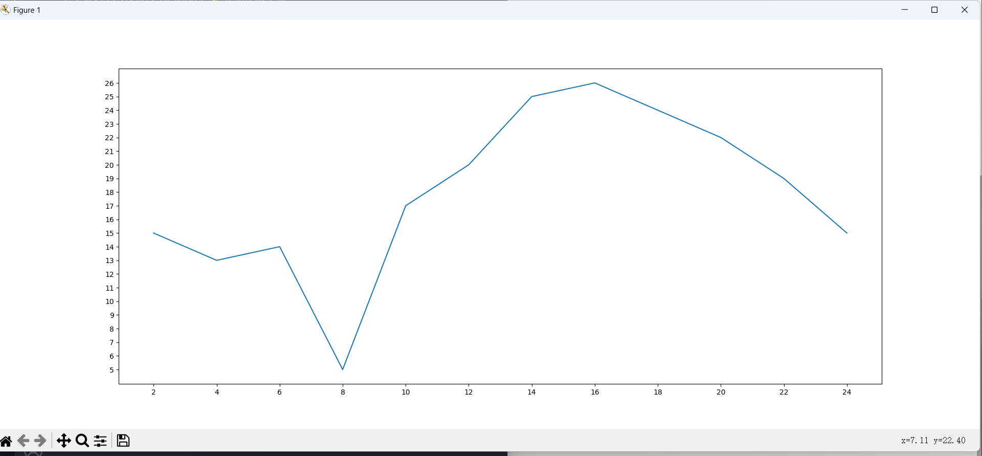
绘制两小时的温度变化
from matplotlib import pyplot as plt

x = range(2, 26, 2)

y = [15, 13, 14, 5, 17, 20, 25, 26, 24, 22, 19, 15]

# 全局变量fig figure方法(figsize画板尺寸=(长float,宽float), dpi=整数int)

fig = plt.figure(figsize=(20, 8), dpi=80)

# 传入X坐标和Y坐标,并绘图

plt.plot(x, y)

# 调整X轴刻度,传入的列表密集与否,决定X轴的密集程度

plt.xticks(x)

# 调整X轴刻度同理

plt.yticks(range(min(y), max(y)+1))

# savefig方法,传入一个路径

plt.savefig("./t1.png")

# 展示

plt.show()
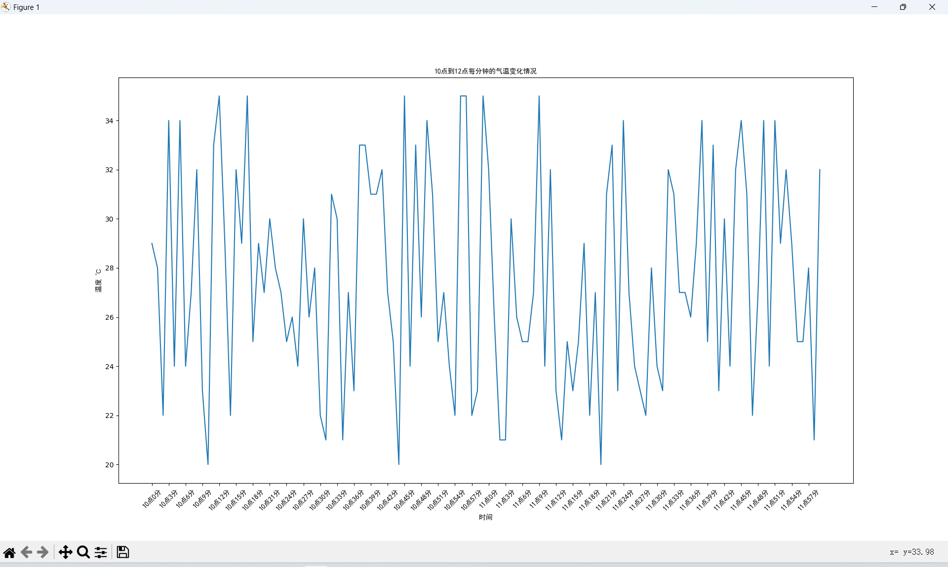
from matplotlib import pyplot as plt

import random

from matplotlib import font_manager

x = range(0, 120)

y = [random.randint(20, 35) for i in range(120)]

# C:\Windows\Fonts\simhei.ttf 字体路径

# 实例化font_manager

my_font = font_manager.FontProperties(fname="C:\Windows\Fonts\simhei.ttf")

plt.figure(figsize=(20, 8), dpi=80)

plt.plot(x, y)

# 调整x轴的刻度

_xtick_labels = ["10点{}分".format(i) for i in range(60)]

_xtick_labels += ["11点{}分".format(i) for i in range(60)]

# 取步长,数字和字符串一一对应,数据的长度与数据的刻度一笔一致

# param: rotation=旋转角度(int)

# param: fontproperties=实例化的字体(object)

plt.xticks(list(x)[::3], _xtick_labels[::3],

           rotation=45, fontproperties=my_font)

# 添加描述信息

plt.xlabel("时间", fontproperties=my_font)  # X轴标签

plt.ylabel("温度 ℃", fontproperties=my_font)  # Y轴标签

plt.title("10点到12点每分钟的气温变化情况", fontproperties=my_font)  # 标题

plt.show()
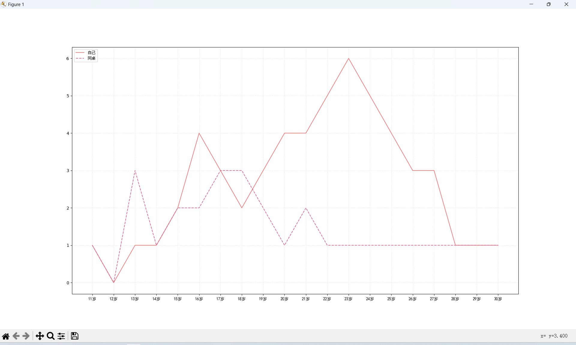
模拟11岁到30岁自己和同桌交女朋友的走势
# coding=utf-8

from matplotlib import pyplot as plt

from matplotlib import font_manager

my_font = font_manager.FontProperties(fname="C:\Windows\Fonts\simhei.ttf")

y_1 = [1, 0, 1, 1, 2, 4, 3, 2, 3, 4, 4, 5, 6, 5, 4, 3, 3, 1, 1, 1]

y_2 = [1, 0, 3, 1, 2, 2, 3, 3, 2, 1, 2, 1, 1, 1, 1, 1, 1, 1, 1, 1]

x = range(11, 31)

# 设置图形大小

plt.figure(figsize=(20, 8), dpi=80)

plt.plot(x, y_1, label="自己", color="red")

plt.plot(x, y_2, label="同桌", color="#DB7093", linestyle="--")

# 设置x轴刻度

_xtick_labels = ["{}岁".format(i) for i in x]

plt.xticks(x, _xtick_labels, fontproperties=my_font)

# plt.yticks(range(0,9))

# 绘制网格

plt.grid(alpha=0.4, linestyle=':')

# 添加图例

plt.legend(prop=my_font, loc="upper left")

# 展示

plt.show()
绘制折线图总结
Matplotlib 绘制折线图的更多相关文章
- python使用matplotlib绘制折线图教程
Matplotlib是一个Python工具箱,用于科学计算的数据可视化.借助它,Python可以绘制如Matlab和Octave多种多样的数据图形.下面这篇文章主要介绍了python使用matplot ...
- Python开发【模块】:matplotlib 绘制折线图
matplotlib 1.安装matplotlib ① linux系统安装 # 安装matplotlib模块 $ sudo apt-get install python3-matplotlib # 如 ...
- 【Python】matplotlib绘制折线图
一.绘制简单的折线图 import matplotlib.pyplot as plt squares=[1,4,9,16,25] plt.plot(squares) plt.show() 我们首先导入 ...
- 1 matplotlib绘制折线图
from matplotlib import pyplot as plt #设置图形大小 plt.figure(figsize=(20,8),dpi=80) plt.plot(x,y,color=&q ...
- matplotlib之折线图
1.案例一 # coding=utf-8 from matplotlib import pyplot as plt import random # 设置字体相关 from matplotlib imp ...
- Python绘制折线图
一.Python绘制折线图 1.1.Python绘制折线图对应代码如下图所示 import matplotlib.pyplot as pltimport numpy as np from pylab ...
- 用canvas绘制折线图
<!DOCTYPE html> <html lang="en"> <head> <meta charset="UTF-8&quo ...
- php中用GD绘制折线图
php中用GD绘制折线图,代码如下: Class Chart{ private $image; // 定义图像 private $title; // 定义标题 private $ydata; // 定 ...
- python中matplotlib画折线图实例(坐标轴数字、字符串混搭及标题中文显示)
最近在用python中的matplotlib画折线图,遇到了坐标轴 "数字+刻度" 混合显示.标题中文显示.批量处理等诸多问题.通过学习解决了,来记录下.如有错误或不足之处,望请指 ...
- UUChart的使用--iOS绘制折线图
UUChart是一个用于绘制图表的第三方,尤其适合去绘制折线图. 二.下载地址: https://github.com/ZhipingYang/UUChartView 三.使用 第一步.首先我们将下载 ...
随机推荐
- 后端框架的学习----mybatis框架(6、日志)
六.日志 如果一个数据库操作,出现了异常,我们需要排错,日志就是最好的帮手 setting设置 <settings> <setting name="logImpl" ...
- C语言两个升序递增链表逆序合并为一个降序递减链表,并去除重复元素
#include"stdafx.h" #include<stdlib.h> #define LEN sizeof(struct student) struct stud ...
- Linux系统命令基础
Linux系统命令基础 前面咱们已经成功安装了Linux系统--centos7,那么现在奔向Linux命令行的世界. Linux命令格式 1.一般情况下,[参数]是可选的,一些情况下[文件或路径]也是 ...
- Python基础之面向对象:3、继承与派生
面向对象 一.三大特征之继承 python三大特征: 封装.继承.多态 三者中继承最为核心,实际应用对,感受较为直观 封装和多态略微抽象 1.继承的概念 继承的含义: 在现实生活中,继承表示人与人 ...
- JS学习笔记 (四) 数组进阶
1.基本知识 1.数组是值的有序集合.每个值叫做一个元素,而每个元素在数组中的位置称为索引,以数字表示,以0开始. 2.数组是无类型的.数组元素可以是任意类型,并且同一个数组中的不同元素也可能有不同的 ...
- ES 客户端 RestHighLevelClient Connection reset by peer 亲测有效 2022-11-05
导读 最新公司ES集群老出现连接关闭,进而导致查询|写入ES时报错,报错日志显示如下 [2m2022-10-23 14:13:10.088[0;39m - [31mERROR[0;39m - [35m ...
- Jenkinsfile Pipeline 使用 SSH 连接
前提 首先你需要将用到的 SSH 私钥保存到 Jenkins 的凭据中,这样你会获得一个 credentialId.这不是本文主要的内容,故不在此展开赘述,详情可参考官方文档:https://www. ...
- xshell调整字体大小
1. 进入设置 %default%:默认对全部终端生效 如果想对单一终端单独设置,可先进入会话管理,针对单一会话单独调整 2. 点击外观配置,修改字体大小
- vs2019中使用Git,新建项目时总提示部分项目位于解决方案文件夹外
最终还是用Git工具传上去的. 小伙子,用Git Bush或者Git CMD 和Git GUI传吧 我是用Git GUI. Git GUI汉化.感谢大佬 https://blog.csdn.net/u ...
- jquery &&、||
$(function(){ $('.mainall').textbox({}); var r = 5; r=r==2&&r*8||r*3; alert(r); }); &&am ...