[UWP]实现Picker控件
1. 前言
在WPF中,很多打开下拉框(Popup或Flyout)选择一个结果值的控件,除了ComboBox等少数例外,这种控件都以-Picker做名称后缀。因为要打开关闭下拉框和计算下拉框的弹出位置, 这类控件实现起来还挺麻烦的。Silverlight Toolkit中贴心地提供了一个Picker控件,可以作为这类控件的基类,省略了大量代码。
2. 现在的问题
由于UWP中有Flyout,-Picker控件的实现其实算是相当轻松的。如ColorPicker的官方文档就介绍了使用Flyout承载ColorPicker的实现代码。但是做起来还是有一些问题:
- 在有“确定/取消”按钮的Flyout中,即使选择了值,如果没有点击“确定”按钮也不更新结果值。
- 在Flyout打开的状态,还是希望它所属的按钮有某种已被按下的状态显示,典型的如ComboBox、Extended WPF Toolkit的ColorPicker、WinForm的DateTimePicker,或其它大部分Windows的控件那样:

上面第一点是硬性要求,所有-Picker类控件都会实现这点(偶尔也见到没做好的)。第二点就比较麻烦了,UWP几乎完全没有理会这点。其实WPF/Silverlight时代即已经开始忽略这点UI需求了,但我还是希望可以注意这些UI的细节,毕竟UWP就经常被诟病UI细节缺失。
3. 我的解决方案
于是我决定实现一个UWP的Picker类。
3.1 定义外观
SilverlightToolkit的Picker相当复杂,UI有三个VisualStateGroup,两个TemplatPart:
[TemplateVisualState(GroupName = "PopupStates", Name = "PopupClosed")]

[TemplatePart(Name = "DropDownToggle", Type = typeof (ToggleButton))]

[TemplateVisualState(GroupName = "PopupStates", Name = "PopupOpened")]

[TemplateVisualState(GroupName = "CommonStates", Name = "Normal")]

[TemplateVisualState(GroupName = "CommonStates", Name = "MouseOver")]

[TemplateVisualState(GroupName = "CommonStates", Name = "Pressed")]

[TemplateVisualState(GroupName = "CommonStates", Name = "Disabled")]

[TemplateVisualState(GroupName = "FocusStates", Name = "Focused")]

[TemplateVisualState(GroupName = "FocusStates", Name = "Unfocused")]

[TemplatePart(Name = "Popup", Type = typeof (Popup))]

public abstract class Picker : Control, IUpdateVisualState
我不想做到这么复杂,只有一个名为PopupStatesName的VisualStateGroup(沿用Silverlight Toolkit的命名),一个Flyout,一组“确定/取消”按钮就够了。
[TemplateVisualState(Name = PopupClosedName, GroupName = PopupStatesName)]

[TemplateVisualState(Name = PopupOpenedName, GroupName = PopupStatesName)]

[TemplatePart(Name = AcceptButtonName, Type = typeof(Button))]

[TemplatePart(Name = DismissButtonName, Type = typeof(Button))]

[TemplatePart(Name = FlyoutName, Type = typeof(FlyoutBase))]

public abstract class Picker : HeaderedContentControl

{

    private const string PopupClosedName = "PopupClosed";

    private const string PopupOpenedName = "PopupOpened";

    private const string PopupStatesName = "PopupStates";

    private const string FlyoutName = "Flyout";

    private const string AcceptButtonName = "AcceptButton";

    private const string DismissButtonName = "DismissButton";
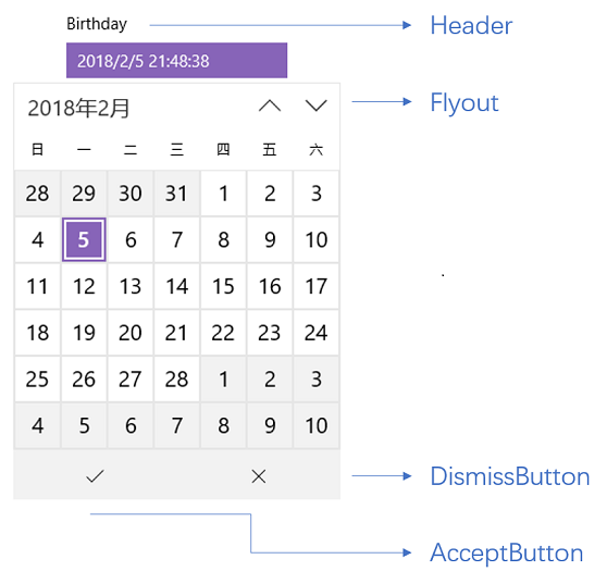
此为下文中MyDatePicker的运行效果。
3.2 IsOpen属性
Picker中提供一个bool IsDropDownOpen属性,用于控制下拉框是否打开。无论是AcceptButton或DismissButton的点击事件,或者Flyout的Closed事件都会调用这个属性。
protected virtual void OnIsDropDownOpenChanged(bool oldValue, bool newValue)

{

    if (_flyout == null)

        return;

    if (newValue)

        _flyout.ShowAt(this);

    else

        _flyout.Hide();

}

protected virtual void OnFlyoutClosed(object e)

{

    IsDropDownOpen = false;

}

protected virtual void OnAccept(RoutedEventArgs e)

{

    IsDropDownOpen = false;

}

protected virtual void OnDismiss(RoutedEventArgs e)

{

    IsDropDownOpen = false;

}

protected override void UpdateVisualState(bool useTransitions)

{

    base.UpdateVisualState(useTransitions);

    VisualStateManager.GoToState(this, IsDropDownOpen ? PopupOpenedName : PopupClosedName, useTransitions);

}
3.3 实际应用:实现一个MyDatePicker
需要实现一个MyDatePicker,可以继承Picker,Default Style如下,不少内容都是参考DatePicker:
<Style TargetType="local:MyDatePicker">
<Setter Property="IsTabStop"
Value="False" />
<Setter Property="FontFamily"
Value="{ThemeResource ContentControlThemeFontFamily}" />
<Setter Property="FontSize"
Value="{ThemeResource ControlContentThemeFontSize}" />
<Setter Property="Template">
<Setter.Value>
<ControlTemplate TargetType="local:MyDatePicker">
<StackPanel x:Name="LayoutRoot"
Margin="{TemplateBinding Padding}">
<local:HeaderedContentControl Header="{TemplateBinding Header}"
HeaderTemplate="{TemplateBinding HeaderTemplate}">
<ToggleButton x:Name="DateButton"
Content="{TemplateBinding DateTime}"
IsEnabled="{TemplateBinding IsEnabled}"
IsChecked="{Binding RelativeSource={RelativeSource Mode=TemplatedParent}, Path=IsDropDownOpen,Mode=TwoWay}"
HorizontalAlignment="Stretch"
HorizontalContentAlignment="Stretch">
<FlyoutBase.AttachedFlyout>
<Flyout Placement="Bottom"
x:Name="Flyout">
<Flyout.FlyoutPresenterStyle>
<Style TargetType="FlyoutPresenter">
<Setter Property="Padding"
Value="0" />
<Setter Property="BorderThickness"
Value="0" />
<Setter Property="Template">
<Setter.Value>
<ControlTemplate TargetType="FlyoutPresenter">
<ContentPresenter Background="{TemplateBinding Background}"
BorderBrush="{TemplateBinding BorderBrush}"
BorderThickness="{TemplateBinding BorderThickness}"
Content="{TemplateBinding Content}"
ContentTemplate="{TemplateBinding ContentTemplate}"
ContentTransitions="{TemplateBinding ContentTransitions}"
Margin="{TemplateBinding Padding}"
HorizontalAlignment="{TemplateBinding HorizontalContentAlignment}"
VerticalAlignment="{TemplateBinding VerticalContentAlignment}" />
</ControlTemplate>
</Setter.Value>
</Setter>
</Style>
</Flyout.FlyoutPresenterStyle>
<Grid>
<Grid.RowDefinitions>
<RowDefinition />
<RowDefinition Height="Auto" />
</Grid.RowDefinitions>
<CalendarView x:Name="Calendar"
Style="{TemplateBinding CalendarViewStyle}" />
<Grid Grid.Row="1"
Height="45"
x:Name="AcceptDismissHostGrid">
<Grid.ColumnDefinitions>
<ColumnDefinition Width="*" />
<ColumnDefinition Width="*" />
</Grid.ColumnDefinitions>
<Button x:Name="AcceptButton"
Grid.Column="0"
Content=""
FontFamily="{ThemeResource SymbolThemeFontFamily}"
FontSize="16"
HorizontalAlignment="Stretch"
VerticalAlignment="Stretch"
Style="{StaticResource DateTimePickerFlyoutButtonStyle}"
Margin="0,2,0,0" />
<Button x:Name="DismissButton"
Grid.Column="1"
Content=""
FontFamily="{ThemeResource SymbolThemeFontFamily}"
FontSize="16"
HorizontalAlignment="Stretch"
VerticalAlignment="Stretch"
Style="{StaticResource DateTimePickerFlyoutButtonStyle}"
Margin="0,2,0,0" />
</Grid>
</Grid>
</Flyout>
</FlyoutBase.AttachedFlyout>
</ToggleButton>
</local:HeaderedContentControl>
</StackPanel>
</ControlTemplate>
</Setter.Value>
</Setter>
</Style>
注意这里的ToggleButton使用TwoWay Binding将IsChecked绑定到Picker的IsDropDownOpen属性,通过IsChecked属性与Flyout的Show/Hide关联起来。
另外,Flyout里放了一个CalendarView,用于选择日期。
在MyDatePicker.cs里除了属性,主要的内容是这段代码:
protected override void OnAccept(RoutedEventArgs e)

{

    base.OnAccept(e);

    if (_calendar != null && _calendar.SelectedDates.Any())

        DateTime = _calendar.SelectedDates.First().DateTime;

}
重写OnAccept(即点击AcceptButton触发的事件)并为DateTime选择值。
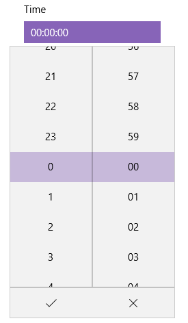
3.4 实际应用:实现一个MyTimePicker
使用TemplatePart的一个重要原则是:即使ControlTemplate中缺少声明的TemplatePart,模板化控件也不会报错,只会缺少部分功能。
根据这个原则实现的MyTimePicker就缺少了AcceptButton和DismissButton,因为使用了TimePickerFlyout,这个控件本身就有AcceptButton和DismissButton按钮。
<Style TargetType="local:MyTimePicker">

    <Setter Property="IsTabStop"

            Value="False" />

    <Setter Property="FontFamily"

            Value="{ThemeResource ContentControlThemeFontFamily}" />

    <Setter Property="FontSize"

            Value="{ThemeResource ControlContentThemeFontSize}" />

    <Setter Property="Template">

        <Setter.Value>

            <ControlTemplate TargetType="local:MyTimePicker">

                <StackPanel x:Name="LayoutRoot"

                            Margin="{TemplateBinding Padding}">

                    <local:HeaderedContentControl Header="{TemplateBinding Header}"

                                                  HeaderTemplate="{TemplateBinding HeaderTemplate}">

                        <ToggleButton x:Name="DateButton"

                                      Content="{Binding RelativeSource={RelativeSource Mode=TemplatedParent},Path=Time,Converter={StaticResource TimeSpanToStringConverter}}"

                                      IsEnabled="{TemplateBinding IsEnabled}"

                                      IsChecked="{Binding RelativeSource={RelativeSource Mode=TemplatedParent}, Path=IsDropDownOpen,Mode=TwoWay}"

                                      HorizontalAlignment="Stretch"

                                      HorizontalContentAlignment="Stretch">

                            <FlyoutBase.AttachedFlyout>

                                <TimePickerFlyout x:Name="Flyout"  Placement="Bottom"/>

                            </FlyoutBase.AttachedFlyout>

                        </ToggleButton>

                    </local:HeaderedContentControl>

                </StackPanel>

            </ControlTemplate>

        </Setter.Value>

    </Setter>

</Style>
protected override void OnApplyTemplate()

{

    base.OnApplyTemplate();

    _timePickerFlyout = GetTemplateChild(FlyoutName) as TimePickerFlyout;

    if (_timePickerFlyout != null)

        _timePickerFlyout.TimePicked += OnTimePicked;

    UpdateTimePicerFlyoutPickedTime();

    UpdateVisualState(false);

}

protected virtual void OnTimeChanged(TimeSpan oldValue, TimeSpan newValue)

{

    UpdateTimePicerFlyoutPickedTime();

}

protected override void OnIsDropDownOpenChanged(bool oldValue, bool newValue

{

    base.OnIsDropDownOpenChanged(oldValue, newValue);

    if (newValue)

        UpdateTimePicerFlyoutPickedTime();

}

private void UpdateTimePicerFlyoutPickedTime()

{

    if (_timePickerFlyout != null)

        _timePickerFlyout.Time = Time;

}

private void OnTimePicked(TimePickerFlyout sender, TimePickedEventArgs args)

{

    Time = args.NewTime;

}
4. 结语
细心的话会发现Picker虽然定义了PopupStates这个VisualStateGroup,但从来没用到。其实这是为了将来可能会用到这个这组状态而预留的。值得一提的是Picker不止可以针对弹出Flyout的控件,将ToggleButton和它的Flyout换成Expander也一样适用。
有了Picker类后确实方便了很多。其实Silverlight虽然死了,但开源的Silverlight Toolkit中有不少内容都可用作参考。本来还想给出Silverlight Toolkit中Picker的源码地址作为参考,但最近CodePlex关闭服务了。有兴趣的人仍可直接下载Silverlight Toolkit的源码,毕竟还是挺有趣的。
Silverlight Toolkit - CodePlex Archive
5. 参考
Guidelines for date and time controls
6. 源码
[UWP]实现Picker控件的更多相关文章
- Objective-C ,ios,iphone开发基础:picker控件详解与使用,(实现省市的二级联动)
第一步:新建一个单视图(single view)的工程, 命名为pickerTest,不要勾选下面两个选项,第一个是新版本里面的,第二个是单元测试,现在用不着. 点击next ->creat之 ...
- Date Time Picker控件
Step1 在界面中添加一个Date Time Picker控件,ID为:IDC_DATETIMEPICKER1 Step2 该控件关联变量 CDateTimeCtrl m_dateCtrl; Ste ...
- picker控件详解与使用,(实现省市的二级联动)
picker控件详解与使用,(实现省市的二级联动) 第一步:新建一个单视图(single view)的工程, 命名为pickerTest,不要勾选下面两个选项,第一个是新版本里面的,第二个是单元测试, ...
- UWP 用Thumb 控件仿制一个可拖动悬浮 Button
参考了 http://www.cnblogs.com/zhanggaoxing/p/6403430.html,并加以改进. 最终效果::: Thumb 的原生事件 DragStarted,DragDe ...
- VS2010 MFC中 Date Time Picker控件的使用
1. 在工具箱中找到Date Time Picker控件,然后拖放到对话框上. 2. 在其属性中按自己的需求做一些设置. Format 属性:Long Date (长日期):****年**月**日 S ...
- UWP开发之控件:用WebView做聊天框
目录 说明 WebView存在的价值 使用WebView的几个重要技巧 使用WebView做的聊天框 说明 大家都知道,无论是之前的Winform.WPF还是现在的IOS.Android开发中,都存在 ...
- UWP自动填充控件AutoSuggestBox小优化
UWP提供的AutoSuggestBox本身非常好用,在项目中经常用到,但是当我们使用时发现一下不人性化的设置,例子1如下: <Page x:Class="SelfInkCanvas. ...
- UWP 播放媒体控件
最近我的uwp需要有一个有声朗读的功能,like this 点击声音按钮就可以有声朗读了.这里主要是用了媒体播放的控件. 一般我们把需求分为两种: 一种是不需要呈现播放器的样子,只需要用户点击一下别的 ...
- [UWP] 使用SemanticZoom控件
在写一个看新闻软件的时候,用到了SemanticZoom控件,遇到了一些问题,比如如何根据首字母分类,以及放大视图中有数据的和没数据的通过背景色或前景色区分,幸运的是,all solved. 先来个效 ...
随机推荐
- Java与算法之(2) - 快速排序
快速排序的基本思路是,每次选定数列中的一个基准数,将小于基准数的数字都放到基准数左边,大于基准数的数字都放到基准数右边.然后再分别对基准数左右的两个数列分别重复以上过程.仍以4 3 6 2 7 1 5 ...
- Machine Learning - week 4 - Non-linear Hypotheses
为什么计算机图像识别很难呢?因为我们看到的是汽车,而计算机看到的是表示颜色的 RGB 数值.计算机需要根据这些数值来判断. 如果图片是 50 * 50 像素,那么一共有 2500 个像素点.如果是 Q ...
- 洛谷 P3370 【模板】字符串哈希
洛谷 P3370 [模板]字符串哈希 题目描述 如题,给定N个字符串(第i个字符串长度为Mi,字符串内包含数字.大小写字母,大小写敏感),请求出N个字符串中共有多少个不同的字符串. 友情提醒:如果真的 ...
- 51nod 1231 记分牌
链接:http://www.51nod.com/onlineJudge/questionCode.html#!problemId=1231 一个得分合法等价于前k小的得分之和大于等于$\frac{k* ...
- poj1830:开关问题
链接:http://poj.org/problem?id=1830 某天“佐理慧学姐”突然来问了我这道题. 诶,窝只会线性基,但是好像搞不了方案数啊…… 啃题解吧. woc!线性代数哦,就是那种我不会 ...
- c++(八皇后)
八皇后是一道很具典型性的题目.它的基本要求是这样的:在一个8*8的矩阵上面放置8个物体,一个矩阵点只允许放置一个物体,任意两个点不能在一行上,也不能在一列上,不能在一条左斜线上,当然也不能在一条右斜线 ...
- 织梦CMS首页调用分类信息栏目及列表方法
不懂代码,搜索学习一晚上,都是说调用特定栏目分类信息列表的,用这个代码 {dede:arclistsg row='10' titlelen='24' orderby='pubdate' channel ...
- dedecms内容页调用图片集文档的图集图片
2016-8-26 0 条评论 dedecms模板制作 3,209 ℃ 织梦dedecms设置了图片集内容模型的网站栏目文档可以上传图集图片,并提供了单页多图样式.幻灯片样式.多缩略图样式三种表现方式 ...
- LNMP环境的搭建
http://blog.csdn.net/wzy_1988/article/details/8438355#
- 邓_thinkphp口试
描述php框架开发 通过提供一个开发Web程序的基本架构,PHP开发框架把PHPWeb程序开发摆到了流水线上.换句话说,PHP开发框架有助于促进快速软件开发(RAD),这节约了你的时间,有助于创建更为 ...