
Seaborn分布数据可视化---统计分布图
统计分布图
barplot()
sns.barplot(

    x=None,

    y=None,

    hue=None,

    data=None,

    order=None,

    hue_order=None,

    estimator=<function mean at 0x000001DA64AD3DC8>,

    ci=95,

    n_boot=1000,

    units=None,

    orient=None,

    color=None,

    palette=None,

    saturation=0.75,

    errcolor='.26',

    errwidth=None,

    capsize=None,

    dodge=True,

    ax=None,

    **kwargs,

)

Docstring:

Show point estimates and confidence intervals as rectangular bars.

A bar plot represents an estimate of central tendency for a numeric

variable with the height of each rectangle and provides some indication of

the uncertainty around that estimate using error bars. Bar plots include 0

in the quantitative axis range, and they are a good choice when 0 is a

meaningful value for the quantitative variable, and you want to make

comparisons against it.

For datasets where 0 is not a meaningful value, a point plot will allow you

to focus on differences between levels of one or more categorical

variables.

It is also important to keep in mind that a bar plot shows only the mean

(or other estimator) value, but in many cases it may be more informative to

show the distribution of values at each level of the categorical variables.

In that case, other approaches such as a box or violin plot may be more

appropriate.

Input data can be passed in a variety of formats, including:

- Vectors of data represented as lists, numpy arrays, or pandas Series

  objects passed directly to the ``x``, ``y``, and/or ``hue`` parameters.

- A "long-form" DataFrame, in which case the ``x``, ``y``, and ``hue``

  variables will determine how the data are plotted.

- A "wide-form" DataFrame, such that each numeric column will be plotted.

- An array or list of vectors.

In most cases, it is possible to use numpy or Python objects, but pandas

objects are preferable because the associated names will be used to

annotate the axes. Additionally, you can use Categorical types for the

grouping variables to control the order of plot elements.

This function always treats one of the variables as categorical and

draws data at ordinal positions (0, 1, ... n) on the relevant axis, even

when the data has a numeric or date type.

See the :ref:`tutorial <categorical_tutorial>` for more information.

Parameters

----------

x, y, hue : names of variables in ``data`` or vector data, optional

    Inputs for plotting long-form data. See examples for interpretation.

data : DataFrame, array, or list of arrays, optional

    Dataset for plotting. If ``x`` and ``y`` are absent, this is

    interpreted as wide-form. Otherwise it is expected to be long-form.

order, hue_order : lists of strings, optional

    Order to plot the categorical levels in, otherwise the levels are

    inferred from the data objects.

estimator : callable that maps vector -> scalar, optional

    Statistical function to estimate within each categorical bin.

ci : float or "sd" or None, optional

    Size of confidence intervals to draw around estimated values.  If

    "sd", skip bootstrapping and draw the standard deviation of the

    observations. If ``None``, no bootstrapping will be performed, and

    error bars will not be drawn.

n_boot : int, optional

    Number of bootstrap iterations to use when computing confidence

    intervals.

units : name of variable in ``data`` or vector data, optional

    Identifier of sampling units, which will be used to perform a

    multilevel bootstrap and account for repeated measures design.

orient : "v" | "h", optional

    Orientation of the plot (vertical or horizontal). This is usually

    inferred from the dtype of the input variables, but can be used to

    specify when the "categorical" variable is a numeric or when plotting

    wide-form data.

color : matplotlib color, optional

    Color for all of the elements, or seed for a gradient palette.

palette : palette name, list, or dict, optional

    Colors to use for the different levels of the ``hue`` variable. Should

    be something that can be interpreted by :func:`color_palette`, or a

    dictionary mapping hue levels to matplotlib colors.

saturation : float, optional

    Proportion of the original saturation to draw colors at. Large patches

    often look better with slightly desaturated colors, but set this to

    ``1`` if you want the plot colors to perfectly match the input color

    spec.

errcolor : matplotlib color

    Color for the lines that represent the confidence interval.

errwidth : float, optional

    Thickness of error bar lines (and caps).

capsize : float, optional

    Width of the "caps" on error bars.

dodge : bool, optional

    When hue nesting is used, whether elements should be shifted along the

    categorical axis.

ax : matplotlib Axes, optional

    Axes object to draw the plot onto, otherwise uses the current Axes.

kwargs : key, value mappings

    Other keyword arguments are passed through to ``plt.bar`` at draw

    time.

Returns

-------

ax : matplotlib Axes

    Returns the Axes object with the plot drawn onto it.

See Also

--------

countplot : Show the counts of observations in each categorical bin.

pointplot : Show point estimates and confidence intervals using scatterplot

            glyphs.

catplot : Combine a categorical plot with a class:`FacetGrid`.
x、y、hue:< data中的变量名词或者向量 >

data中用于绘制图表的变量名

data:< DataFrame, 数组, 数组列表 >

是用于绘图的数据集

order、hue_order:< 字符串列表 >

绘制类别变量的顺序,若没有,则会从数据对象中推断绘图顺序

estimator:< 映射向量 -> 标量 >

统计函数用于估计每个分类纸条中的值

ci:< float or “sd” or None >

估计值周围的置信区间大小。若输入的是sd,会跳过bootstrapping的过程,只绘制数据的标准差;

若输入的是None,不会执行bootstrapping,而且错误条也不会绘制

n_boot:< int >

计算置信区间需要的 Boostrap 迭代次数。

units:< data中的变量名词或向量 >

采样单元的标识符,用于执行多级 bootstrap 并解释重复测量设计。

orient:< “v” 或 “h” >

绘图的方向(垂直或水平)。这通常是从输入变量的数据类型推断出来的,但是可以用来指定“分类”变量是数字还是宽格式数据。

color:< matplotlib color >

作用于所有元素的颜色,或者渐变色的种子。

palette:< palette name, list, or dict >

不同级别的 hue 变量的颜色。 颜色要能被 [color_palette()]解释(seaborn.color_palette.html#seaborn.color_palette “seaborn.color_palette”), 或者一个能映射到 matplotlib 颜色的字典。

saturation:< float >

原始饱和度与绘制颜色的比例。大的色块通常在稍微不饱和的颜色下看起来更好,但是如果希望打印颜色与输入颜色规格完全匹配,请将其设置为1。

errcolor:< matplotlib color >

表示置信区间的线的颜色。

errwidth:< float >

误差条的线的厚度。

capsize:< float >

误差条端部的宽度。

dodge : < 布尔型 >

当使用色调嵌套时,元素是否应该沿分类轴移动。

ax:< matplotlib Axes >

指定一个 Axes 用于绘图,如果不指定,则使用当前的 Axes。

kwargs:< key, value mappings >

其他的关键词参数在绘图时通过 plt.bar 传入。
误差线表示数据误差(或不确定性)范围,以更准确的方式呈现数据。误差线可以用标准差(standard deviation,SD)、标准误(standard error,SE)和置信区间表示,使用时可选用任意一种表示方法并作相应说明即可。当误差线比较“长”时,一般要么是数据离散程度大,要么是数据样本少。
#垂直柱状图 + 误差线

ax = sns.barplot(x='day', y='total_bill', data=tip_datas)

#横向分布,通过x和y轴数据调换设置

ax = sns.barplot(x='total_bill', y='day', data=tip_datas)

#hue设置分类

ax = sns.barplot(x='day', y='total_bill', data=tip_datas, hue='sex')

#hue设置分组分类

tip_datas['weekend'] = tip_datas['day'].isin(['Sat','Sun'])

ax = sns.barplot(x='day', y='total_bill', data=tip_datas, hue='weekend')

#ci设置估计值的置信区间大小,'sd'表示标准差,默认ci=95%

ax = sns.barplot(x='day', y='total_bill', data=tip_datas, ci='sd')

#capsize设置误差线端盖横线

ax = sns.barplot(x='day', y='total_bill', data=tip_datas, capsize=.2)

#分栏显示catplot() =  barplot() + FacetGrid()

g = sns.catplot(x='sex', y='total_bill',

                hue='smoker', col='time',

                data=tip_datas, kind='bar',

                height=4, aspect=.7

               )

countplot()
绘制计数数据的柱状图。
sns.countplot(

    x=None,

    y=None,

    hue=None,

    data=None,

    order=None,

    hue_order=None,

    orient=None,

    color=None,

    palette=None,

    saturation=0.75,

    dodge=True,

    ax=None,

    **kwargs,

)

Docstring:

Show the counts of observations in each categorical bin using bars.

A count plot can be thought of as a histogram across a categorical, instead

of quantitative, variable. The basic API and options are identical to those

for :func:`barplot`, so you can compare counts across nested variables.

Input data can be passed in a variety of formats, including:

- Vectors of data represented as lists, numpy arrays, or pandas Series

  objects passed directly to the ``x``, ``y``, and/or ``hue`` parameters.

- A "long-form" DataFrame, in which case the ``x``, ``y``, and ``hue``

  variables will determine how the data are plotted.

- A "wide-form" DataFrame, such that each numeric column will be plotted.

- An array or list of vectors.

In most cases, it is possible to use numpy or Python objects, but pandas

objects are preferable because the associated names will be used to

annotate the axes. Additionally, you can use Categorical types for the

grouping variables to control the order of plot elements.

This function always treats one of the variables as categorical and

draws data at ordinal positions (0, 1, ... n) on the relevant axis, even

when the data has a numeric or date type.

See the :ref:`tutorial <categorical_tutorial>` for more information.

Parameters

----------

x, y, hue : names of variables in ``data`` or vector data, optional

    Inputs for plotting long-form data. See examples for interpretation.

data : DataFrame, array, or list of arrays, optional

    Dataset for plotting. If ``x`` and ``y`` are absent, this is

    interpreted as wide-form. Otherwise it is expected to be long-form.

order, hue_order : lists of strings, optional

    Order to plot the categorical levels in, otherwise the levels are

    inferred from the data objects.

orient : "v" | "h", optional

    Orientation of the plot (vertical or horizontal). This is usually

    inferred from the dtype of the input variables, but can be used to

    specify when the "categorical" variable is a numeric or when plotting

    wide-form data.

color : matplotlib color, optional

    Color for all of the elements, or seed for a gradient palette.

palette : palette name, list, or dict, optional

    Colors to use for the different levels of the ``hue`` variable. Should

    be something that can be interpreted by :func:`color_palette`, or a

    dictionary mapping hue levels to matplotlib colors.

saturation : float, optional

    Proportion of the original saturation to draw colors at. Large patches

    often look better with slightly desaturated colors, but set this to

    ``1`` if you want the plot colors to perfectly match the input color

    spec.

dodge : bool, optional

    When hue nesting is used, whether elements should be shifted along the

    categorical axis.

ax : matplotlib Axes, optional

    Axes object to draw the plot onto, otherwise uses the current Axes.

kwargs : key, value mappings

    Other keyword arguments are passed to ``plt.bar``.

Returns

-------

ax : matplotlib Axes

    Returns the Axes object with the plot drawn onto it.

See Also

--------

barplot : Show point estimates and confidence intervals using bars.

catplot : Combine a categorical plot with a class:`FacetGrid`.
#分类计数柱状图:countplot

titanic = sns.load_dataset('titanic', data_home='seaborn-data')

titanic

#单分类变量计数,x轴,纵向

ax = sns.countplot(x='class', data=titanic)

#单分类变量计数,y轴,横向

ax = sns.countplot(y='class', data=titanic)

#多变量分类计数

ax = sns.countplot(x='class', hue='who', data=titanic)

#facecolor设置填充颜色,edgecolor设置边框

ax = sns.countplot(x='who', data=titanic,

                   facecolor=(0, 0, 0, 0),

                   linewidth=5,

                   edgecolor=sns.color_palette('dark', 3)

                  )

#分栏绘制 : catplot() = countplot() + FaceGrid()

g = sns.catplot(x='class', hue='who', col='survived',

                  data=titanic, kind='count',

                  height=4, aspect=.7)

pointplot()
绘制带误差线的散点图。
sns.pointplot(

    x=None,

    y=None,

    hue=None,

    data=None,

    order=None,

    hue_order=None,

    estimator=<function mean at 0x000001DA64AD3DC8>,

    ci=95,

    n_boot=1000,

    units=None,

    markers='o',

    linestyles='-',

    dodge=False,

    join=True,

    scale=1,

    orient=None,

    color=None,

    palette=None,

    errwidth=None,

    capsize=None,

    ax=None,

    **kwargs,

)

Docstring:

Show point estimates and confidence intervals using scatter plot glyphs.

A point plot represents an estimate of central tendency for a numeric

variable by the position of scatter plot points and provides some

indication of the uncertainty around that estimate using error bars.

Point plots can be more useful than bar plots for focusing comparisons

between different levels of one or more categorical variables. They are

particularly adept at showing interactions: how the relationship between

levels of one categorical variable changes across levels of a second

categorical variable. The lines that join each point from the same ``hue``

level allow interactions to be judged by differences in slope, which is

easier for the eyes than comparing the heights of several groups of points

or bars.

It is important to keep in mind that a point plot shows only the mean (or

other estimator) value, but in many cases it may be more informative to

show the distribution of values at each level of the categorical variables.

In that case, other approaches such as a box or violin plot may be more

appropriate.

Input data can be passed in a variety of formats, including:

- Vectors of data represented as lists, numpy arrays, or pandas Series

  objects passed directly to the ``x``, ``y``, and/or ``hue`` parameters.

- A "long-form" DataFrame, in which case the ``x``, ``y``, and ``hue``

  variables will determine how the data are plotted.

- A "wide-form" DataFrame, such that each numeric column will be plotted.

- An array or list of vectors.

In most cases, it is possible to use numpy or Python objects, but pandas

objects are preferable because the associated names will be used to

annotate the axes. Additionally, you can use Categorical types for the

grouping variables to control the order of plot elements.

This function always treats one of the variables as categorical and

draws data at ordinal positions (0, 1, ... n) on the relevant axis, even

when the data has a numeric or date type.

See the :ref:`tutorial <categorical_tutorial>` for more information.

Parameters

----------

x, y, hue : names of variables in ``data`` or vector data, optional

    Inputs for plotting long-form data. See examples for interpretation.

data : DataFrame, array, or list of arrays, optional

    Dataset for plotting. If ``x`` and ``y`` are absent, this is

    interpreted as wide-form. Otherwise it is expected to be long-form.

order, hue_order : lists of strings, optional

    Order to plot the categorical levels in, otherwise the levels are

    inferred from the data objects.

estimator : callable that maps vector -> scalar, optional

    Statistical function to estimate within each categorical bin.

ci : float or "sd" or None, optional

    Size of confidence intervals to draw around estimated values.  If

    "sd", skip bootstrapping and draw the standard deviation of the

    observations. If ``None``, no bootstrapping will be performed, and

    error bars will not be drawn.

n_boot : int, optional

    Number of bootstrap iterations to use when computing confidence

    intervals.

units : name of variable in ``data`` or vector data, optional

    Identifier of sampling units, which will be used to perform a

    multilevel bootstrap and account for repeated measures design.

markers : string or list of strings, optional

    Markers to use for each of the ``hue`` levels.

linestyles : string or list of strings, optional

    Line styles to use for each of the ``hue`` levels.

dodge : bool or float, optional

    Amount to separate the points for each level of the ``hue`` variable

    along the categorical axis.

join : bool, optional

    If ``True``, lines will be drawn between point estimates at the same

    ``hue`` level.

scale : float, optional

    Scale factor for the plot elements.

orient : "v" | "h", optional

    Orientation of the plot (vertical or horizontal). This is usually

    inferred from the dtype of the input variables, but can be used to

    specify when the "categorical" variable is a numeric or when plotting

    wide-form data.

color : matplotlib color, optional

    Color for all of the elements, or seed for a gradient palette.

palette : palette name, list, or dict, optional

    Colors to use for the different levels of the ``hue`` variable. Should

    be something that can be interpreted by :func:`color_palette`, or a

    dictionary mapping hue levels to matplotlib colors.

errwidth : float, optional

    Thickness of error bar lines (and caps).

capsize : float, optional

    Width of the "caps" on error bars.

ax : matplotlib Axes, optional

    Axes object to draw the plot onto, otherwise uses the current Axes.

Returns

-------

ax : matplotlib Axes

    Returns the Axes object with the plot drawn onto it.

See Also

--------

barplot : Show point estimates and confidence intervals using bars.

catplot : Combine a categorical plot with a class:`FacetGrid`.
#数据

tip_datas

#单个分类变量统计点图

ax = sns.pointplot(x='time', y='total_bill', data=tip_datas)

#多个分类变量统计点图

ax = sns.pointplot(x='time', y='total_bill', hue='smoker', data=tip_datas)

#多个分类变量统计点图,dodge设置点的位置错开

ax = sns.pointplot(x='time', y='total_bill',

                   hue='smoker', data=tip_datas, dodge=True)

#多个分类变量统计点图,markers设置点的类型,linestyle设置线类型

ax = sns.pointplot(x='time', y='total_bill',

                   hue='smoker',

                   markers=['o','x'],

                   linestyles=['-','--'],

                   data=tip_datas)

#纵向分布

ax = sns.pointplot(x='tip', y='day', data=tip_datas)

#纵向分布,join设置是否连线

ax = sns.pointplot(x='tip', y='day', data=tip_datas, join=False)

#以中位值median作为估计值

from numpy import median

ax = sns.pointplot(x='tip', y='day', data=tip_datas, join=False, estimator=median)

#ci设置置信区间

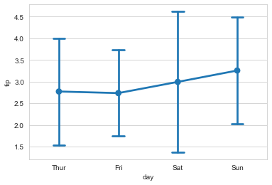
ax = sns.pointplot(x='day', y='tip', data=tip_datas, ci='sd')

#capsize设置误差线端帽

ax = sns.pointplot(x='day', y='tip', data=tip_datas, ci='sd', capsize=.2)
#catplot() = pointplot() + FaceGrid()

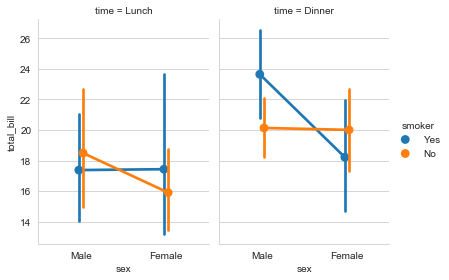
g = sns.catplot(x='sex', y='total_bill', data=tip_datas,

                hue='smoker', col='time', kind='point',

                dodge=True, height=4, aspect=.7

               )
Seaborn分布数据可视化---统计分布图的更多相关文章
- seaborn分布数据可视化:直方图|密度图|散点图
系统自带的数据表格(存放在github上https://github.com/mwaskom/seaborn-data),使用时通过sns.load_dataset('表名称')即可,结果为一个Dat ...
- Python图表数据可视化Seaborn:1. 风格| 分布数据可视化-直方图| 密度图| 散点图
conda install seaborn 是安装到jupyter那个环境的 1. 整体风格设置 对图表整体颜色.比例等进行风格设置,包括颜色色板等调用系统风格进行数据可视化 set() / se ...
- seaborn分类数据可视化
转载:https://cloud.tencent.com/developer/article/1178368 seaborn针对分类型的数据有专门的可视化函数,这些函数可大致分为三种: 分类数据散点图 ...
- seaborn线性关系数据可视化:时间线图|热图|结构化图表可视化
一.线性关系数据可视化lmplot( ) 表示对所统计的数据做散点图,并拟合一个一元线性回归关系. lmplot(x, y, data, hue=None, col=None, row=None, p ...
- seaborn分类数据可视化:散点图|箱型图|小提琴图|lv图|柱状图|折线图
一.散点图stripplot( ) 与swarmplot() 1.分类散点图stripplot( ) 用法stripplot(x=None, y=None, hue=None, data=None, ...
- 用seaborn对数据可视化
以下用sns作为seaborn的别名 1.seaborn整体布局设置 sns.set_syle()函数设置图的风格,传入的参数可以是"darkgrid", "whiteg ...
- Python Seaborn综合指南,成为数据可视化专家
概述 Seaborn是Python流行的数据可视化库 Seaborn结合了美学和技术,这是数据科学项目中的两个关键要素 了解其Seaborn作原理以及使用它生成的不同的图表 介绍 一个精心设计的可视化 ...
- Seaborn数据可视化入门
在本节学习中,我们使用Seaborn作为数据可视化的入门工具 Seaborn的官方网址如下:http://seaborn.pydata.org 一:definition Seaborn is a Py ...
- geotrellis使用(十五)使用Bokeh进行栅格数据可视化统计
Geotrellis系列文章链接地址http://www.cnblogs.com/shoufengwei/p/5619419.html 目录 前言 实现方案 总结 一.前言 之前有篇文章 ...
- Python图表数据可视化Seaborn:2. 分类数据可视化-分类散点图|分布图(箱型图|小提琴图|LV图表)|统计图(柱状图|折线图)
1. 分类数据可视化 - 分类散点图 stripplot( ) / swarmplot( ) sns.stripplot(x="day",y="total_bill&qu ...
随机推荐
- vmware虚拟机出现此电脑无法运行win11,虚拟机中安装win11系统教程
一.点击新建虚拟机 二.选择自定义安装 三.默认 四.选择win11镜像 五.选择windows 六.命名 七.勾选安全引导 八.两个处理器即可 九.最低4G内存,接下来一直默认点下一步即可 十.创建 ...
- 7、mysql的缓存优化
概述 开启Mysql的查询缓存,当执行完全相同的SQL语句的时候,服务器就会直接从缓存中读取结果,当数据被修改,之前的缓存会失效,修改比较频繁的表不适合做查询缓存. 操作流程 客户端发送一条查询给服务 ...
- WPF --- 触摸屏下的两个问题
引言 本片文章分享一下之前遇到的WPF应用在触摸屏下使用时的两个问题. 场景 具体场景就是一个配置界面, ScrollViewer 中包含一个StackPanel 然后纵向堆叠,已滚动的方式查看,然后 ...
- 火柴 基于everything的搜索软件 软件推荐 Ctrl+Ctrl 显示 tab转换 本机搜索和网络搜索
https://www.huochaipro.com/
- WPF之认识XAML
目录 新建项目 剖析XAML代码 参考资料 新建项目 在Visual Studio 2019中使用WPF项目模板建立一个最简单的WPF项目,如下图所示: 可以看到,项目里面主要有两个分支: App.x ...
- 基于ESP8266的JSON解析实例分析
什么是JSON? JSON(JavaScript Object Notation) 是一种轻量级的数据交换格式.采用完全独立于编程语言的文本格式来存储和表示数据.其简洁和层次结构清晰的特点使得 J ...
- 【开源库推荐】#2 AndroidUtilCode Android常用工具类大全(附API使用说明)
Blankj/AndroidUtilCode: Android developers should collect the following utils(updating). Download Gr ...
- 一张图搞清楚wait、sleep、join、yield四者区别,面试官直接被征服!
写在开头 在线程的生命周期中,不同状态之间切换时,可以通过调用sleep().wait().join().yield()等方法进行线程状态控制,针对这一部分知识点,面试官们也会做做文章,比如问你这些方 ...
- 大年学习linux(第六节---软件安装)
六.软件安装 rpm RPM软件包的管理工具 补充说明 rpm命令 是RPM软件包的管理工具.rpm原本是Red Hat Linux发行版专门用来管理Linux各项套件的程序,由于它遵循GPL规则且功 ...
- 《世嘉新人培训教材—游戏开发》2DGraphics1项目cmake构建
<世嘉新人培训教材-游戏开发>作为经典的游戏开发教程,提供了相关样例代码供我们进行开发使用.但是该样例是基于VS进行编写构建的,而本人日常喜欢CLion进行C/C++开发,于是准备使用cm ...