
《Python数据可视化之matplotlib实践》 源码 第二篇 精进 第五章
图 5.1
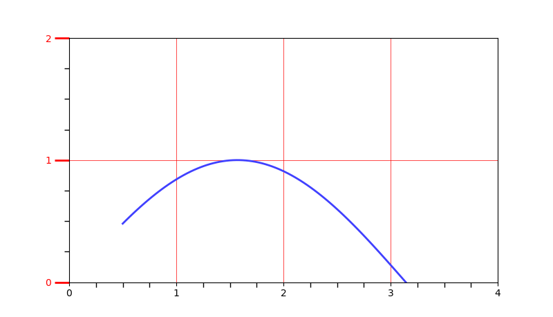


import matplotlib.pyplot as plt

import numpy as np

from matplotlib.ticker import AutoMinorLocator, MultipleLocator, FuncFormatter

x=np.linspace(0.5, 3.5, 100)

y=np.sin(x)

fig=plt.figure(figsize=(8, 8))

ax=fig.add_subplot(111)

ax.xaxis.set_major_locator(MultipleLocator(1.0))

ax.yaxis.set_major_locator(MultipleLocator(1.0))

ax.xaxis.set_minor_locator(AutoMinorLocator(4))

ax.yaxis.set_minor_locator(AutoMinorLocator(4))

def minor_tick(x, pos):

    if not x%1.0:

        return ""

    return "%.2f"%x

ax.xaxis.set_minor_formatter(FuncFormatter(minor_tick))

ax.tick_params("y", which='major',length=15, width=2.0, colors='r')

ax.tick_params(which='minor', length=5, width=1.0, labelsize=10, labelcolor='0.25')

ax.set_xlim(0, 4)

ax.set_ylim(0, 2)

ax.plot(x, y, c=(0.25, 0.25, 1.00), lw=2, zorder=10)

# ax.plot(x, y, c=(0.25, 0.25, 1.00), lw=2, zorder=0)

ax.grid(linestyle='-', linewidth=0.5, color='r', zorder=0)

# ax.grid(linestyle='-', linewidth=0.5, color='r', zorder=10)

# ax.grid(linestyle='--', linewidth=0.5, color='0.25', zorder=0)

plt.show()
-------------------------------------------------------------------------------------
图 5.2

import matplotlib.pyplot as plt

import numpy as np

fig=plt.figure(facecolor=(1.0, 1.0, 0.9412))

ax=fig.add_axes([0.1, 0.4, 0.5, 0.5])

for ticklabel in ax.xaxis.get_ticklabels():

    ticklabel.set_color("slateblue")

    ticklabel.set_fontsize(18)

    ticklabel.set_rotation(30)

for ticklabel in ax.yaxis.get_ticklabels():

    ticklabel.set_color("lightgreen")

    ticklabel.set_fontsize(20)

    ticklabel.set_rotation(2)

plt.show()
-------------------------------------------------------------------------------------
图 5.3
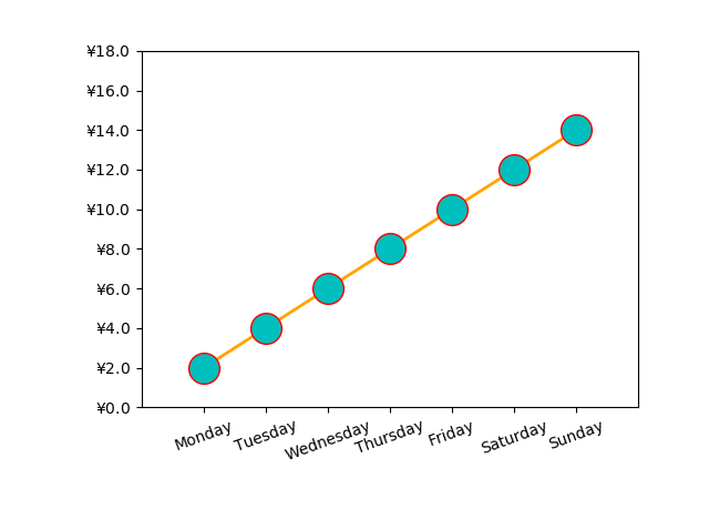
import matplotlib.pyplot as plt

import numpy as np

from calendar import month_name, day_name

from matplotlib.ticker import FormatStrFormatter

fig=plt.figure()

ax=fig.add_axes([0.2, 0.2, 0.7, 0.7])

x=np.arange(1, 8, 1)

y=2*x

ax.plot(x, y, ls='-', lw=2, color='orange', marker='o',

                                    ms=20, mfc='c', mec='r')

ax.yaxis.set_major_formatter(FormatStrFormatter(r"$\yen%1.1f$"))

plt.xticks(x, day_name[0:7], rotation=20)

ax.set_xlim(0, 8)

ax.set_ylim(0, 18)

plt.show()
-------------------------------------------------------------------------------------
图 5.4
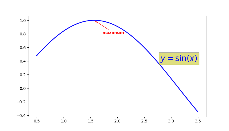
import matplotlib.pyplot as plt

import numpy as np

x=np.linspace(0.5, 3.5, 100)

y=np.sin(x)

fig=plt.figure(figsize=(8, 8))

ax=fig.add_subplot(111)

ax.plot(x, y, c='b', ls='-', lw=2)

ax.annotate("maximum", xy=(np.pi/2, 1.0), xycoords='data',

            xytext=((np.pi/2)+0.15, 0.8), textcoords="data",

            weight="bold", color='r',

            arrowprops=dict(arrowstyle='->', connectionstyle='arc3', color='r'))

ax.text(2.8, 0.4, "$y=\sin(x)$", fontsize=20, color='b',

               bbox=dict(facecolor='y', alpha=0.5))

plt.show()
-------------------------------------------------------------------------------------
图 5.5
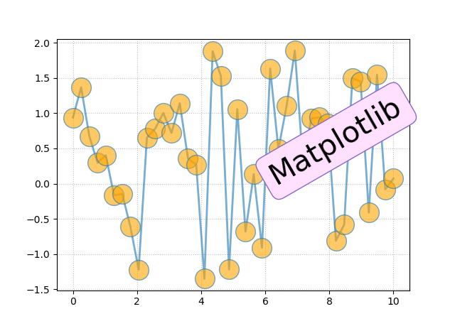
import matplotlib.pyplot as plt

import numpy as np

x=np.linspace(0.0, 10, 40)

y=np.random.randn(40)

plt.plot(x, y, ls='-', lw=2, marker='o', ms=20, mfc='orange', alpha=0.6)

plt.grid(ls=':', color='gray', alpha=0.5)

plt.text(6, 0, 'Matplotlib', size=30, rotation=30.0,

         bbox=dict(boxstyle='round', ec='#8968CD', fc='#FFE1FF'))

plt.show()
-------------------------------------------------------------------------------------
图 5.6
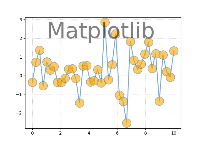
import matplotlib.pyplot as plt

import numpy as np

x=np.linspace(0.0, 10, 40)

y=np.random.randn(40)

plt.plot(x, y, ls='-', lw=2, marker='o', ms=20, mfc='orange', alpha=0.6)

plt.grid(ls=':', color='gray', alpha=0.5)

plt.text(1, 2, 'Matplotlib', size=50, alpha=0.5)

plt.show()
-------------------------------------------------------------------------------------
图 5.7
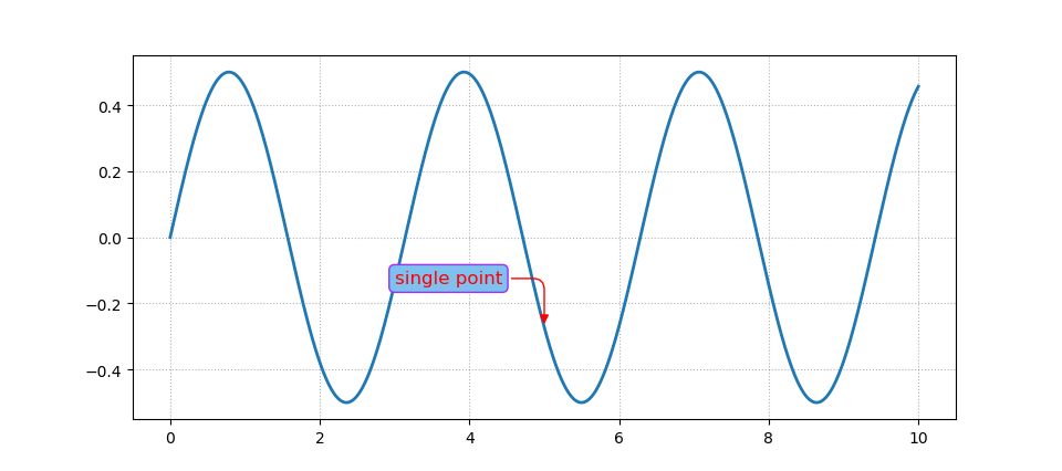
import matplotlib.pyplot as plt

import numpy as np

x=np.linspace(0, 10, 2000)

y=np.sin(x)*np.cos(x)

fig=plt.figure()

ax=fig.add_subplot(111)

ax.plot(x, y, ls='-', lw=2)

bbox=dict(boxstyle='round', fc='#7EC0EE', ec='#9B30FF')

arrowprops=dict(arrowstyle='-|>', color='r',

                connectionstyle='angle, angleA=0, angleB=90, rad=10')

ax.annotate("single point", (5, np.sin(5)*np.cos(5)),

            xytext=(3, np.sin(3)*np.cos(3)),

            fontsize=12, color='r', bbox=bbox, arrowprops=arrowprops)

ax.grid(ls=":", color='gray', alpha=0.6)

plt.show()
-------------------------------------------------------------------------------------
图 5.8
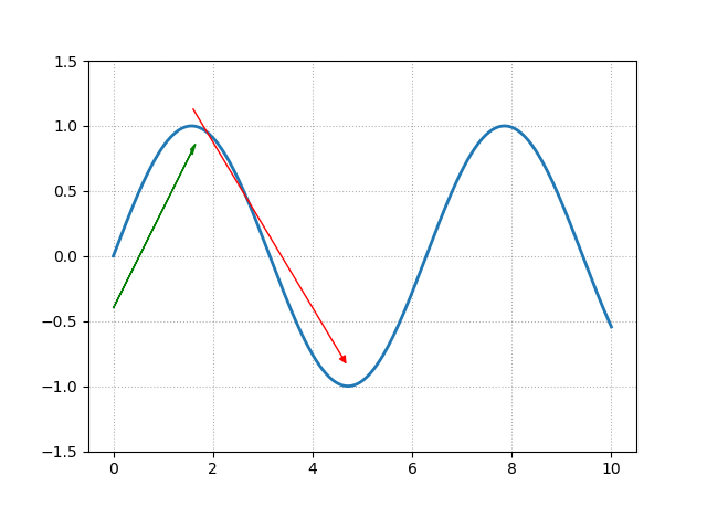
import matplotlib.pyplot as plt

import numpy as np

x=np.linspace(0, 10, 2000)

y=np.sin(x)

fig=plt.figure()

ax=fig.add_subplot(111)

ax.plot(x, y, ls='-', lw=2)

ax.set_ylim(-1.5, 1.5)

arrowprops=dict(arrowstyle='-|>', color='r')

ax.annotate("", (3*np.pi/2, np.sin(3*np.pi/2)+0.15),

            xytext=(np.pi/2, np.sin(np.pi/2)+0.15), color='r', arrowprops=arrowprops)

ax.arrow(0.0, -0.4, np.pi/2, 1.2, head_width=0.05, head_length=0.1, fc='g', ec='g')

ax.grid(ls=':', color='gray', alpha=0.6)

plt.show()
-------------------------------------------------------------------------------------
图 5.9
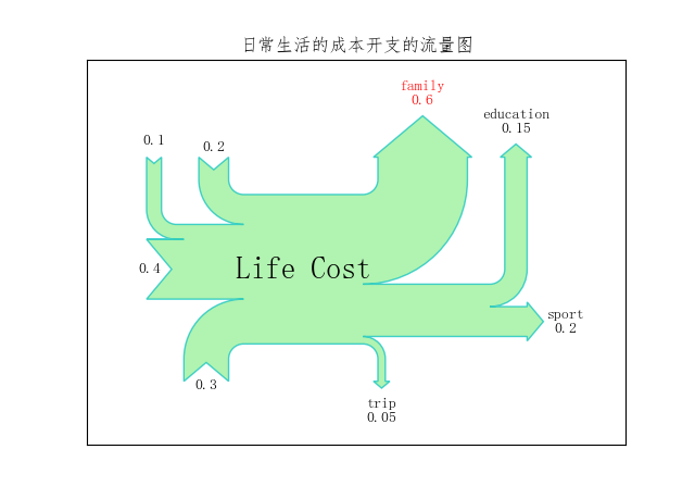
import matplotlib.pyplot as plt

import matplotlib as mpl

import numpy as np

from matplotlib.sankey import Sankey

mpl.rcParams["font.sans-serif"]=['FangSong']

mpl.rcParams['axes.unicode_minus']=False

flows=[0.2, 0.1, 0.4, 0.3, -0.6, -0.05, -0.15, -0.2]

labels=['', '', '', '', 'family', 'trip', 'education', 'sport']

orientations=[1, 1, 0, -1, 1, -1, 1, 0]

sankey=Sankey()

sankey.add(flows=flows, labels=labels, orientations=orientations, color='c',

           fc='lightgreen', patchlabel='Life Cost', alpha=0.7)

diagrams=sankey.finish()

diagrams[0].texts[4].set_color('r')

diagrams[0].texts[4].set_weight('bold')

diagrams[0].text.set_fontsize(20)

diagrams[0].text.set_fontweight('bold')

plt.title("日常生活的成本开支的流量图")

plt.show()
-------------------------------------------------------------------------------------
图 5.10

import matplotlib.pyplot as plt

import matplotlib.patheffects as pes

import numpy as np

x=np.linspace(0.5, 3.5, 100)

y=np.sin(x)

fontsize=23

plt.plot(x, y, ls='--', lw=2)

title='$y=\sin({x})$'

xaxis_label='$x\_axis$'

yaxis_label="$y\_axis$"

title_text_obj=plt.title(title, fontsize=fontsize, va='bottom')

xaxis_label_text_obj=plt.xlabel(xaxis_label,

                                fontsize=fontsize-3, alpha=1.0)

yaxis_label_text_obj=plt.ylabel(yaxis_label,

                                fontsize=fontsize-3, alpha=1.0)

title_text_obj.set_path_effects([pes.withSimplePatchShadow()])

pe=pes.withSimplePatchShadow(offset=(1, -1), shadow_rgbFace='r', alpha=0.3)

xaxis_label_text_obj.set_path_effects([pe])

yaxis_label_text_obj.set_path_effects([pe])

plt.show()
-------------------------------------------------------------------------------------
图 5.11
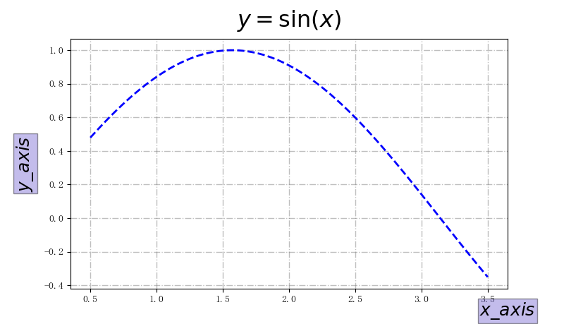
import matplotlib.pyplot as plt

import numpy as np

x=np.linspace(0.5, 3.5, 100)

y=np.sin(x)

fig=plt.figure(figsize=(8, 8))

ax=fig.add_subplot(111)

box=dict(facecolor='#6959CD', pad=2, alpha=0.4)

ax.plot(x, y, c='b', ls='--', lw=2)

title='$y=\sin({x})$'

xaxis_label='$x\_axis$'

yaxis_label="$y\_axis$"

ax.set_xlabel(xaxis_label, fontsize=18, bbox=box)

ax.set_ylabel(yaxis_label, fontsize=18, bbox=box)

ax.set_title(title, fontsize=23, va='bottom')

ax.yaxis.set_label_coords(-0.08, 0.5)

ax.xaxis.set_label_coords(1.0, -0.05)

ax.grid(ls='-.', lw=1, color='gray', alpha=0.5)

plt.show()
-------------------------------------------------------------------------------------
《Python数据可视化之matplotlib实践》 源码 第二篇 精进 第五章的更多相关文章
- Python数据可视化——使用Matplotlib创建散点图
Python数据可视化——使用Matplotlib创建散点图 2017-12-27 作者:淡水化合物 Matplotlib简述: Matplotlib是一个用于创建出高质量图表的桌面绘图包(主要是2D ...
- python 数据可视化(matplotlib)
matpotlib 官网 :https://matplotlib.org/index.html matplotlib 可视化示例:https://matplotlib.org/gallery/inde ...
- Python数据可视化库-Matplotlib(一)
今天我们来学习一下python的数据可视化库,Matplotlib,是一个Python的2D绘图库 通过这个库,开发者可以仅需要几行代码,便可以生成绘图,直方图,功率图,条形图,错误图,散点图等等 废 ...
- Python数据可视化之Matplotlib实现各种图表
数据分析就是将数据以各种图表的形式展现给领导,供领导做决策用,因此熟练掌握饼图.柱状图.线图等图表制作是一个数据分析师必备的技能.Python有两个比较出色的图表制作框架,分别是Matplotlib和 ...
- 重温《STL源码剖析》笔记 第五章
源码之前,了无秘密 ——侯杰 序列式容器 关联式容器 array(build in) RB-tree vector set heap map priority-queue multiset li ...
- Python数据可视化利器Matplotlib,绘图入门篇,Pyplot介绍
Pyplot matplotlib.pyplot是一个命令型函数集合,它可以让我们像使用MATLAB一样使用matplotlib.pyplot中的每一个函数都会对画布图像作出相应的改变,如创建画布.在 ...
- Python数据可视化库-Matplotlib(二)
我们接着上次的继续讲解,先讲一个概念,叫子图的概念. 我们先看一下这段代码 import matplotlib.pyplot as plt fig = plt.figure() ax1 = fig.a ...
- Python数据可视化之matplotlib
常用模块导入 import numpy as np import matplotlib import matplotlib.mlab as mlab import matplotlib.pyplot ...
- python数据可视化(matplotlib)
- python数据可视化-matplotlib入门(7)-从网络加载数据及数据可视化的小总结
除了从文件加载数据,另一个数据源是互联网,互联网每天产生各种不同的数据,可以用各种各样的方式从互联网加载数据. 一.了解 Web API Web 应用编程接口(API)自动请求网站的特定信息,再对这些 ...
随机推荐
- ETL工具-nifi干货系列 第五讲 处理器GenerateFlowFile
1.今天我们一起来学习处理器GenerateFlowFile.这个处理器创建带有随机数据或自定义内容的 FlowFiles.GenerateFlowFile 对于负载测试.配置和模拟非常有用.从工具栏 ...
- helm常用命令
一.helm常用命令 1.查看帮助 helm help 2.创建一个chart包模板 格式: helm create [releasename] 例子: $helm create hello-worl ...
- Java 获取当前时间的年、月、日、小时、分钟、秒数
public static void getDateTime() throws ParseException{ Calendar now = Calendar.getInstance(); Syste ...
- Java中的Collection集合(单列集合)
1.集合概述 集合:集合是java中提供的一种容器,可以用来存储多个数据. 集合与数组的区别: (1)数组的长度是固定的,集合的长度是可变的. (2)数组中存储的是同一类型的元素,可以存储基本数据类型 ...
- Java代码规范及异常汇总 非空异常 NullPointerException
Java规范及异常汇总1.java.lang.NullPointerException: nullorderReq.getId() != -1 修改为: orderReq.getId() != nul ...
- python 二次封装logging,打印日志文件名正确,且正确写入/结合pytest执行,日志不输出的问题
基于之前日志问题,二次封装日志后,导致日志输出的文件名不对,取到的文件一直都是当前二次封装的log的文件名,基于这个问题,做了优化,详细看 https://www.cnblogs.com/cuitan ...
- 加速鸿蒙生态共建,蚂蚁mPaaS助力鸿蒙原生应用开发创新
6月21日-23日,2024华为开发者大会(HDC 2024)如期举行.在22日的[鸿蒙生态伙伴SDK]分论坛中,正式发布了[鸿蒙生态伙伴SDK市场],其中蚂蚁数科旗下移动开发平台mPaaS(以下简称 ...
- ARM 命名规则和ARM 版本
结论:我们所接触到提到的命名规则,应该分成两类. 基于ARM Architecture版本的"指令集架构"命名规则:例如armv6, armv7, armv7s, arm64 等系 ...
- 浅谈性能测试稳定性 Constant Throughput Timer(常数吞吐量定时器)
在性能测试过程中总会收到一些需求如:单接口每秒并发20,这种并发持续60秒,通过负载测试查看系统稳定性,今天就让我们来浅谈一下这种场景如何去实现性能测试~ 这种场景可以用两种方法去实现: 一.我们通过 ...
- ComfyUI进阶篇:ComfyUI核心节点(一)
ComfyUI进阶篇:ComfyUI核心节点(一) 前言: 学习ComfyUI是一场持久战.当你掌握了ComfyUI的安装和运行之后,会发现大量五花八门的节点.面对各种各样的工作流和复杂的节点种类,可 ...