柱状图bar
1.bar的基本设置宽度和圆角
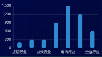
let box1 = document.getElementById('box1')

  let myEcharts = echarts.init(box1)

  let option = {

    title: {

      text: '柱状图-就业行业',

      left: 'center',

      textStyle: {

        color: '#fff',

        fontSize: 14,

        fontWeight: 400

      }

    },

    tooltip: {

      show: true,

      trigger: 'axis',

      axisPointer: {

        type: 'shadow'

      }

    },

    legend: {

      data: ['2019'],

      right: 10,

      textStyle: {

        color: '#fff',

        fontSize: 14,

        fontWeight: 400

      }

    },

    grid: {

      left: "4%",

      top: "20%",

      right: "4%",

      bottom: "4%",

      containLabel: true

    },

    xAxis: {

      type: 'category',

      axisLine: {

        show: false

      },

      axisTick: {

        show: false

      },

      axisLabel: {

        color: "rgba(255,255,255,.6)",

        fontSize: "12"

      },

      data: ["旅游行业",

        "教育培训",

        "游戏行业",

        "医疗行业",

        "电商行业",

        "社交行业",

        "金融行业"]

    },

    yAxis: {

      axisLine: {

        show: true,

        lineStyle: { color: 'rgba(255,255,255,.1)' }

      },

      axisTick: {

        show: true

      },

      axisLabel: {

        color: "rgba(255,255,255,.6)",

        fontSize: "12"

      },

      splitLine: {

        lineStyle: {

          color: 'rgba(255,255,255,.1)'

        }

      }

    },

    series: [{

      name: '2019',

      type: 'bar',

      barWidth: '35%', // 宽度

      itemStyle: {

        color: '#2F89CF',

        barBorderRadius: 5, //圆角

      },

      data: [200, 300, 300, 900, 1500, 1200, 600],

    }]

  }

  myEcharts.setOption(option)
2.柱状图-单色渐变+标签设置

// box6 bar单色渐变+标签设置

(function () {

  let box6 = document.getElementById('box6')

  let myEcharts = echarts.init(box6)

  let option = {

    title: {

      text: '柱状图-单色渐变+标签设置',

      left: 'center',

      textStyle: {

        color: '#fff',

        fontSize: 14,

        fontWeight: 400

      }

    },

    grid: {

      left: "4%",

      top: "10%",

      right: "0%",

      bottom: "0%",

      containLabel: true

    },

    xAxis: [{

      type: 'category',

      data: ['2016', '2017', '2018', '2019', '2020'],

      axisLine: {

        show: false

      },

      axisTick: {

        show: false

      },

      axisLabel: {

        margin: 10,

        color: "rgba(255,255,255,.6)",

        fontSize: "12"

      },

    }],

    yAxis: [{

      min: 0,

      max: 100,

      axisLabel: {

        formatter: '{value}%',

        color: "rgba(255,255,255,.6)",

        fontSize: 12

      },

      axisLine: {

        lineStyle: {

          color: 'rgba(255,255,255,.1)'

        }

      },

      axisTick: {

        show: false

      },

      splitLine: {

        lineStyle: {

          color: 'rgba(131,101,101,0.2)',

          type: 'dashed',

        }

      }

    }],

    series: [{

      type: 'bar',

      data: [40, 90, 30, 84, 56].sort((a, b) => b - a),

      barWidth: '30%',

      itemStyle: {

        barBorderRadius: 30,

        color: new echarts.graphic.LinearGradient(0, 0, 0, 1, [{

          offset: 0,

          color: '#0CED92',// 0% 处的颜色 柱子最高点的位置

        }, {

          offset: 1,

          color: 'transparent',// 100% 处的颜色 坐标轴的位置

        }], false),

      },

      label: {

        show: true,

        fontSize: 12,

        position: 'top',

        color: '#fff',

        // 不写formatter默认显示value值

        formatter: (params) => {//单独对第一个label使用样式

          if (params.dataIndex === 0) {

            return `{firstLabel|${params.value}}`

          }

        },

        rich: {//使用富文本编辑字体样式

          firstLabel: {

            color: 'red',

            fontSize: 18,

            fontWeight: 700

          }

        }

      }

    }]

  };

  myEcharts.setOption(option)
3.bar一个系列配多种颜色 color可以设置formatter函数
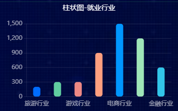
let box7 = document.getElementById('box7')

    let myEcharts = echarts.init(box7)

    let option = {

      color: ['#006cff', '#60cda0', '#ed8884', '#ff9f7f', '#0096ff', '#9fe6b8', '#32c5e9', '#1d9dff'],

      title: {

        text: '柱状图-就业行业',

        left: 'center',

        textStyle: {

          color: '#fff',

          fontSize: 14,

          fontWeight: 400

        }

      },

      tooltip: {

        show: true,

        trigger: 'axis',

        axisPointer: {

          type: 'shadow'

        }

      },

      grid: {

        left: "4%",

        top: "20%",

        right: "4%",

        bottom: "4%",

        containLabel: true

      },

      xAxis: {

        type: 'category',

        axisLine: {

          show: false

        },

        axisTick: {

          show: false

        },

        axisLabel: {

          color: "rgba(255,255,255,.6)",

          fontSize: "12"

        },

        data: ["旅游行业",

          "教育培训",

          "游戏行业",

          "医疗行业",

          "电商行业",

          "社交行业",

          "金融行业"]

      },

      yAxis: {

        axisLine: {

          show: true,

          lineStyle: { color: 'rgba(255,255,255,.1)' }

        },

        axisTick: {

          show: true

        },

        axisLabel: {

          color: "rgba(255,255,255,.6)",

          fontSize: "12"

        },

        splitLine: {

          lineStyle: {

            color: 'rgba(255,255,255,.1)'

          }

        }

      },

      series: [{

        name: '2019',

        type: 'bar',

        barWidth: '35%', //

        itemStyle: {

          barBorderRadius: 5,

          color: function (params) {

            return option.color[params.dataIndex]

          }

        },

        data: [200, 300, 300, 900, 1500, 1200, 600],

      }]

    };

    myEcharts.setOption(option)
4.一个系列配多个渐变颜色

 let box8 = document.getElementById('box8')

  let myEcharts = echarts.init(box8)

  let option = {

    title: {

      text: '柱状图-一个系列配多个渐变颜色',

      left: 'center',

      textStyle: {

        color: '#fff',

        fontSize: 14,

        fontWeight: 400

      }

    },

    tooltip: {

      show: true,

      trigger: 'axis',

      axisPointer: {

        type: 'shadow'

      }

    },

    grid: {

      left: "4%",

      top: "20%",

      right: "4%",

      bottom: "4%",

      containLabel: true

    },

    xAxis: {

      type: 'category',

      axisLine: {

        show: false

      },

      axisTick: {

        show: false

      },

      axisLabel: {

        color: "rgba(255,255,255,.6)",

        fontSize: "12"

      },

      data: ["旅游行业",

        "教育培训",

        "游戏行业",

        "医疗行业",

        "电商行业",

        "社交行业",

        "金融行业"]

    },

    yAxis: {

      axisLine: {

        show: true,

        lineStyle: { color: 'rgba(255,255,255,.1)' }

      },

      axisTick: {

        show: true

      },

      axisLabel: {

        color: "rgba(255,255,255,.6)",

        fontSize: "12"

      },

      splitLine: {

        lineStyle: {

          color: 'rgba(255,255,255,.1)'

        }

      }

    },

    series: [{

      name: '2019',

      type: 'bar',

      barWidth: '35%', //

      itemStyle: {

        barBorderRadius: 5,

        color: function (params) {

          let colorList = [['#006cff', 'transparent'],

          ['#60cda0', 'transparent'],

          ['#ed8884', 'transparent'],

          ['#ff9f7f', 'transparent'],

          ['#0096ff', 'transparent'],

          ['#9fe6b8', 'transparent'],

          ['#32c5e9', 'transparent'],

          ['#1d9dff', 'transparent'],];

          let index = params.dataIndex;

          // 数据过多就重头开始选择颜色

          if (params.dataIndex >= colorList.length) {

            index = params.dataIndex - colorList.length;

          }

          return new echarts.graphic.LinearGradient(0, 0, 0, 1, [{

            offset: 0,

            color: colorList[index][0],// 0% 处的颜色 柱子最高点的位置

          },

          {

            offset: 1, color: 'transparent',// 100% 处的颜色 坐标轴的位置

          }], false)

        },

      },

      data: [500, 860, 430, 900, 1200, 600, 660],

    }]

  };

  myEcharts.setOption(option)
5.柱状图两个系列


// 11 柱状图两个系列

(function () {

  let box11 = document.getElementById('box11')

  let mycharts = echarts.init(box11)

  let option = {

    title: {

      text: '11柱状图两个系列',

      left: 'center',

      textStyle: {

        color: '#fff',

        fontSize: 14,

        fontWeight: 400

      }

    },

    // backgroundColor: '#091C3D',

    tooltip: { //提示框组件

      trigger: 'axis',

      formatter: '{b}<br />{a0}: {c0}<br />{a1}: {c1}',

      axisPointer: {

        type: 'shadow',

        label: {

          backgroundColor: '#6a7985'

        }

      },

      textStyle: {

        color: '#fff',

        fontStyle: 'normal',

        fontFamily: '微软雅黑',

        fontSize: 12,

      }

    },

    grid: {

      left: '3%',

      right: '3%',

      bottom: '3%',

      top: '20%',

      //    padding:'0 0 10 0',

      containLabel: true,

    },

    legend: {//图例组件,颜色和名字

      show: false,

      right: '10%',

      top: '30%',

      itemGap: 10,

      itemWidth: 50,

      itemHeight: 10,

      data: [{

        name: '健康度',

        //icon:'image://../wwwroot/js/url2.png', //路径

      },

      {

        name: '可用度',

      }],

      textStyle: {

        color: '#a8aab0',

        fontStyle: 'normal',

        fontFamily: '微软雅黑',

        fontSize: 12,

      }

    },

    xAxis: [

      {

        type: 'category',

        //    boundaryGap: true,//坐标轴两边留白

        data: ['22:18', '22:23', '22:25', '22:28', '22:30', '22:33', '22:35', '22:40', '22:18', '22:23', '22:25'],

        axisLabel: { //坐标轴刻度标签的相关设置。

          interval: 0,//设置为 1,表示『隔一个标签显示一个标签』

          color: '#4c9bfd',

          fontStyle: 'normal',

          fontFamily: '微软雅黑',

          fontSize: 12,

          rotate: 50,

        },

        axisTick: {//坐标轴刻度相关设置。

          show: false,

        },

        axisLine: {//坐标轴轴线相关设置

          lineStyle: {

            color: '#fff',

            opacity: 0.2

          }

        },

        splitLine: { //坐标轴在 grid 区域中的分隔线。

          show: false,

        }

      }

    ],

    yAxis:

    {

      type: 'value',

      // splitNumber: 5,

      axisLabel: {

        color: '#4c9bfd',

        fontStyle: 'normal',

        fontFamily: '微软雅黑',

        fontSize: 12,

      },

      axisLine: {

        show: false

      },

      axisTick: {

        show: false

      },

      splitLine: {

        show: true,

        lineStyle: {

          color: 'rgba(255,255,255,.1)'

        }

      }

    }

    ,

    series: [

      {

        name: '健康度',

        type: 'bar',

        data: [10, 15, 30, 45, 55, 60, 62, 80, 80, 62, 60],

        barWidth: 10,

        barGap: '10%',//柱间距离

        label: {//图形上的文本标签

          show: true,

          position: 'top',

          color: '#a8aab0',

          fontStyle: 'normal',

          fontFamily: '微软雅黑',

          fontSize: 12,

        },

        itemStyle: {

          show: true,

          barBorderRadius: 30,

          color: new echarts.graphic.LinearGradient(0, 0, 0, 1, [{

            offset: 0,

            color: '#0CED92'

          }, {

            offset: 1,

            color: 'transparent'

          }]),

        }

      },

      {

        name: '可用度',

        type: 'bar',

        data: [8, 5, 25, 30, 35, 55, 62, 78, 65, 55, 60],

        barWidth: 10,

        barGap: 0,//柱间距离

        // label: {//图形上的文本标签

        show: true,

        position: 'top',

        textStyle: {

          color: '#a8aab0',

          fontStyle: 'normal',

          fontFamily: '微软雅黑',

          fontSize: 12,

        },

        itemStyle: {

          show: true,

          barBorderRadius: 30,

          color: '#DFA68E'

        },

      }

    ]

  };

  mycharts.setOption(option)

})();
6.横向双坐标Ybar 一个bar 做背景

  let box12 = document.getElementById('box12')

  let mycharts = echarts.init(box12)

  let y1Data = ['大米', '玉米', '蔬菜', '鸡蛋', '坚果']

  let y2Data = [50000000, 22000000, 10000000, 5000000, 1]

  let y2DataMax = Math.max(...y2Data)

  let option = {

    grid: {

      left: '5%',

      right: '5%',

      bottom: '5%',

      top: '10%',

      containLabel: true

    },

    tooltip: {

      trigger: 'axis',

      axisPointer: {

        type: 'none'

      },

      formatter: function (params) {

        console.log('params: ', params);

        return params[0].name + '<br/>' +

          "<span style='display:inline-block;margin-right:5px;border-radius:10px;width:9px;height:9px;background-color:rgba(36,207,233,0.9)'></span>" +

          params[0].seriesName + ' : ' + Number((params[0].value.toFixed(4) / 10000).toFixed(2)).toLocaleString() + ' 万元<br/>'

      }

    },

    xAxis: {

      show: false,

      type: 'value'

    },

    yAxis: [

      // 左边Y轴

      {

        type: 'category',

        show: true,

        inverse: true,

        axisLabel: {

          show: true,

          textStyle: {

            color: '#fff'

          },

        },

        splitLine: {

          show: false

        },

        axisTick: {

          show: false

        },

        axisLine: {

          show: false

        },

        data: y1Data //系列

      },

      //右边Y轴

      {

        type: 'category',

        show: true,

        inverse: true,

        axisTick: 'none',

        axisLine: 'none',

        axisLabel: {

          color: '#ffffff',

          fontSize: '12',

          formatter: value =>

            value > 10000 ? (value / 10000).toLocaleString() + '万' : value.toLocaleString()

        },

        data: y2Data //实际的值 跟下面一模一样

      }],

    series: [

      {

        name: '金额',

        type: 'bar',

        zlevel: 1,

        barWidth: '35%',

        itemStyle: {

          barBorderRadius: 30,

          color: new echarts.graphic.LinearGradient(0, 0, 1, 0, [{

            offset: 0,

            color: 'rgb(57,89,255,1)'

          }, {

            offset: 1,

            color: 'rgb(46,200,207,1)'

          }]),

        },

        label: {//图形上的文本标签

          show: false, //可以开启

          position: 'inside',

          color: 'yellow',

          fontStyle: 'normal',

          fontFamily: '微软雅黑',

          fontSize: 12,

          formatter: (params) => {

            let value = params.value * 100 / y2DataMax

            return value >= 1 ? `${value}%` : '0%'

          }

        },

        data: y2Data //实际的值

      },

      {

        name: '背景',

        type: 'bar',

        zlevel: 0,

        barWidth: '35%',

        barGap: '-100%',

        data: Array(y2Data.length).fill(y2DataMax),//取数据最大值复制Array(3).fill(5)

        itemStyle: {

          color: 'rgba(24,31,68,1)',

          barBorderRadius: 30,

        },

      },

    ]

  };

  mycharts.setOption(option)
带图标 多行显示文本
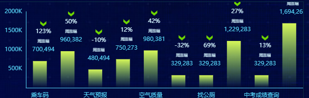
// 15服务排行

// box6 bar单色渐变+标签设置

(function () {

  let xData = ['乘车码', '公积金查询', '天气预报', '风险点查询', '空气质量',

    '消费券', '找公厕', '社保服务', '中考成绩查询', '高考成绩查询']

  let yData = [700494, 960382, 480494, 750273, 980381,

    329283, 329283, 1229283, 329283, 1694263]

  let yPercentData = ['123%', '50%', '-10%', '12%', '42%', '-32%',

    '69%', '27%', '13%', '-3%']

  // 格式化数据的函数注意放的位置

  //格式化Y左边轴的label数据 value就是yData的每一项数据

  let formatYAxisLabel = value => {

    return value === 0 ? ' ' : `${value / 1000}K`

  }

  // 格式化seriesBar的数据显示,回调函数是params{object}

  // params.dataIndex ;params.value

  // 三位数字逗号隔开显示

  let formatSeriesBar = params => {

    // return `{firstLabel|${params.value}}`

    return `

    {arrow|}

    {percentLabel|${yPercentData[params.dataIndex]}}

    {weeklyGainsLabel|周涨幅}

    {firstLabel|${ (params.value || 0).toString().replace(/(\d)(?=(?:\d{3})+$)/g, '$1,')}}

    `

  }

  let option = {

    grid: {

      left: "2%",

      top: "10%",

      right: "0%",

      bottom: "0%",

      containLabel: true

    },

    xAxis: [{

      type: 'category',

      data: [], //默认空数组

      axisLine: {

        show: true,

        lineStyle: {

          color: '#5ADDFF'

        }

      },

      axisTick: {

        show: false

      },

      axisLabel: {

        margin: 10,

        color: "#5ADDFF",

        fontSize: "12"

      },

    }],

    yAxis: [{

      splitNumber: 3,

      axisLabel: {

        color: "#5ADDFF",

        fontSize: 12,

        formatter: formatYAxisLabel

      },

      axisLine: {

        lineStyle: {

          color: '#5ADDFF'

        }

      },

      axisTick: {

        show: false

      },

      splitLine: {

        show: false

      }

    }],

    series: [{

      type: 'bar',

      data: [],//默认空数组

      barWidth: '50%',

      itemStyle: {

        // barBorderRadius: 30,

        color: new echarts.graphic.LinearGradient(0, 0, 0, 1, [{

          offset: 0,

          color: 'rgba(214,246,88,1)'

          // color: '#D6F658',// 0% 处的颜色 柱子最高点的位置

        }, {

          offset: 1,

          // color: '#98FB7C',// 100% 处的颜色 坐标轴的位置

          color: 'rgba(152,251,124,0)'

        }], false),

      },

      label: {

        show: true,

        fontSize: 12,

        fontWeight: 500,

        position: 'top',

        color: '#5ADDFF',

        // 不写formatter默认显示value值

        formatter: formatSeriesBar,

        rich: {//使用富文本编辑字体样式

          arrow: {

            backgroundColor: {

              // image: '/img/red.png',

              image: '../img/green.png'

            },

            height: 12,

            align: 'center',

          },

          percentLabel: {

            color: '#D5F6FF',

            fontSize: 12,

            fontWeight: 500,

            align: 'center',

            lineHeight: 20

          },

          weeklyGainsLabel: {

            color: '#D5F6FF',

            fontSize: 8,

            fontWeight: 500,

            align: 'center',

            padding: [7, 0, 6, 0],

          },

          valueLabel: {

            color: '#5ADDFF',

            fontSize: 12,

            fontWeight: 500,

            align: 'center'

          }

        }

      },

    }]

  };

  // 给图标填充数据

  function setData() {

    option.xAxis[0].data = xData

    option.series[0].data = yData //降序

  }

  function draw() {

    let myEcharts = echarts.init(document.getElementById('box15'))

    myEcharts.setOption(option)

  }

  setData() //赋值

  draw() //画图

})();
柱状图bar的更多相关文章
- 基于matplotlib的数据可视化 - 柱状图bar
柱状图bar 柱状图常用表现形式为: plt.bar(水平坐标数组,高度数组,宽度比例,ec=勾边色,c=填充色,label=图例标签) 注:当高度值为负数时,柱形向下 1 语法 bar(*args, ...
- DevExpress中ChartControl柱状图(Bar)用法
我的数据 代码如下: 1 2 3 4 5 6 7 8 9 10 11 12 13 14 15 16 17 18 19 20 21 22 23 chartControl1.Series.Clear(); ...
- Matplotlib中柱状图bar使用
一.函数原型 matplotlib.pyplot.bar(left, height, alpha=1, width=0.8, color=, edgecolor=, label=, lw=3) 1. ...
- matplotlib 柱状图 Bar Chart 样例及参数
def bar_chart_generator(): l = [1,2,3,4,5] h = [20, 14, 38, 27, 9] w = [0.1, 0.2, 0.3, 0 ...
- matplotlib 柱状图、饼图;直方图、盒图
#-*- coding: utf-8 -*- import matplotlib.pyplot as plt import numpy as np import matplotlib as mpl m ...
- hist和bar画图关系
1.hist是绘制直方图,直方图显示了数据值的分布情况. 1>n = hist(Y,n) 将向量Y中的元素分到n个等间隔的范围内(默认为10个间隔),并返回每个范围内元素的个数作为一 ...
- JupyterLab绘制:柱状图,饼状图,直方图,散点图,折线图
JupyterLab绘图 喜欢python的同学,可以到 https://v3u.cn/(刘悦的技术博客) 里面去看看,爬虫,数据库,flask,Django,机器学习,前端知识点,JavaScrip ...
- pyecharts v1 版本 学习笔记 柱状图
柱状图 bar 基本演示例子 from pyecharts import options as opts from pyecharts.charts import Bar c =( Bar().add ...
- 爬取房价信息并制作成柱状图XPath,pyecharts
以长沙楼盘为例,看一下它的房价情况如何url = https://cs.newhouse.fang.com/house/s/b91/ 一.页面 二.分析页面源代码 我们要获得的数据就是名字和价格,先来 ...
随机推荐
- 030_go语言中的通道关闭
代码演示 package main import "fmt" func main() { jobs := make(chan int, 5) done := make(chan b ...
- 微信小程序--家庭记账小账本(三)
家庭记账小账本打算先通过微信小程序来实现,昨天就去注册了解了一下微信小程序,感觉比较复杂而且困难.如何将ecplise源代码与小程序连接,如何建立数据库等等都困扰了我.查阅网上的资料也没有很大的进展. ...
- 排查Mysql突然变慢的一次过程
排查Mysql突然变慢的一次过程 上周客户说系统突然变得很慢,而且时不时的蹦出一个 404 和 500,弄得真的是很没面子,而恰巧出问题的时候正在深圳出差,所以一直没有时间 看问题,一直到今天,才算是 ...
- Hexo博客部署到远程仓库(Conding、Gitee、Github)
一.本地环境搭建 1.安装Git Git可以有效.高速的处理各种项目版本管理.也就是用来管理你的hexo博客文章,上传到GitHub的工具. Git下载地址 安装好了之后使用git -version查 ...
- 2020-04-08:为什么TCP握手需要三次?
假想一下,如果我们去掉了第三次呢?如果只是第二次建立的话,服务端和客户端就已经建立,但是如果客户端没有收到服务端的回应?这个时候,客户端认为没有建立,服务端却为认为建立成功,并保存了必要的资源,如果出 ...
- C#开发笔记之05-迭代器中的状态机(State Machine)到底是什么?
C#开发笔记概述 该文章的最新版本已迁移至个人博客[比特飞],单击链接 https://www.byteflying.com/archives/961 访问. 状态机可以理解为实现了备忘录模式(仅作为 ...
- C#LeetCode刷题之#599-两个列表的最小索引总和(Minimum Index Sum of Two Lists)
问题 该文章的最新版本已迁移至个人博客[比特飞],单击链接 https://www.byteflying.com/archives/3802 访问. 假设Andy和Doris想在晚餐时选择一家餐厅,并 ...
- 认识与学习BASH①——鸟叔的Linux私房菜
文章目录 认识与学习BASH① 认识BASH 壳程序 多种shells Bash shell 的功能 type :查询指令是否为Bash shell 的内置指令 指令的换行输入和快速删除 Shell的 ...
- Android ScrollView嵌套ViewPager,嵌套的ViewPager无法显示
记录:ScrollView嵌套ViewPager,嵌套的ViewPager无法显示 项目中所需要布局:LinearLayout中包含(orientation="vertical") ...
- 用mysqldump备份数据库
格式:/usr/local/mysql/bin/mysqldump -hip -Pport -uuser -ppasswd --set-gtid-purged=off --database aa & ...