【Flutter学习】基本组件之基本按钮组件
一,概述
- 由于Flutter是跨平台的,所以有适用于Android和iOS的两种风格的组件。一套是Google极力推崇的Material,一套是iOS的Cupertino风格的组件。无论哪种风格,都是通用的。
- 概述Flutter 里有很多的 Button 组件很多,常见的按钮组件有:RaisedButton、FlatButton、IconButton、OutlineButton、ButtonBar、FloatingActionButton 等。
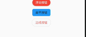
- RaisedButton :凸起的按钮,其实就是 Material Design 风格的 Button
- FlatButton : 扁平化的按钮
- OutlineButton:线框按钮
- IconButton : 图标按钮
- ButtonBar: 按钮组
- FloatingActionButton:浮动按钮
二,常用属性
在flutter中,按钮组件有以下常用属性:
- onPressed :
必填参数,按下按钮时触发的回调,接收一个方法,传 null 表示按钮禁用,会显示禁用相关样式
- child :文本控件
- textColor :文本颜色
- color :文本颜色
- disabledColor :按钮禁用时的颜色
- disabledTextColor :按钮禁用时的文本颜色
- splashColor :点击按钮时水波纹的颜色
- highlightColor :点击(长按)按钮后按钮的颜色
- elevation :阴影的范围,值越大阴影范围越大
- padding :内边距
- shape :设置按钮的形状
三,基本使用
- RaisedButton :凸起的按钮,其实就是 Material Design 风格的 Button
- 构造函数
RaisedButton({

    Key key,

  //点击按钮的回调出发事件

    @required VoidCallback onPressed,

  //水波纹高亮变化回调

    ValueChanged<bool> onHighlightChanged,

  //按钮的样式(文字颜色、按钮的最小大小,内边距以及shape)[ Used with [ButtonTheme] and [ButtonThemeData] to define a button's base

//colors, and the defaults for the button's minimum size, internal padding,and shape.]

    ButtonTextTheme textTheme,

    //文字颜色

    Color textColor,

    //按钮被禁用时的文字颜色

    Color disabledTextColor,

    //按钮的颜色

    Color color,

    //按钮被禁用时的颜色

    Color disabledColor,

    //按钮的水波纹亮起的颜色

    Color highlightColor,

    //水波纹的颜色

    Color splashColor,

    //按钮主题高亮

    Brightness colorBrightness,

    //按钮下面的阴影长度

    double elevation,

    //按钮高亮时的下面的阴影长度

    double highlightElevation,

    double disabledElevation,

    EdgeInsetsGeometry padding,

    ShapeBorder shape,

    Clip clipBehavior = Clip.none,

    MaterialTapTargetSize materialTapTargetSize,

    Duration animationDuration,

    Widget child,

} - code
RaisedButton(

            textTheme: ButtonTextTheme.accent,

            color: Colors.teal,

            highlightColor: Colors.deepPurpleAccent,

            splashColor: Colors.deepOrangeAccent,

            colorBrightness: Brightness.dark,

            elevation: 50.0,

            highlightElevation: 100.0,

            disabledElevation: 20.0,

            onPressed: () {

              //TODO

            },

            child: Text(

              'RaisedButton',

              style: TextStyle(color: Colors.white, fontSize: ),

            ),

) - 效果

- 构造函数
- FlatButton : 扁平化的Material按钮
- 构造函数
FlatButton({

    Key key,

    @required VoidCallback onPressed,

    ValueChanged<bool> onHighlightChanged,

    ButtonTextTheme textTheme,

    Color textColor,

    Color disabledTextColor,

    Color color,

    Color disabledColor,

    Color highlightColor,

    Color splashColor,

    Brightness colorBrightness,

    EdgeInsetsGeometry padding,

    ShapeBorder shape,

    Clip clipBehavior = Clip.none,

    MaterialTapTargetSize materialTapTargetSize,

    @required Widget child,

}) - code
FlatButton(

        onPressed: () {},

        child: Text(

          "FlatBtn",

          style: TextStyle(fontSize: , color: Colors.deepPurple),

)); - 效果

- 构造函数
- OutlineButton:线框按钮(OutlineButton是一个有默认边线且背景透明的按钮,也就是说我们设置其边线和颜色是无效的,其他属性跟MaterialButton中属性基本一致)
- 构造函数
const OutlineButton({

    Key key,

    @required VoidCallback onPressed,

    ButtonTextTheme textTheme,

    Color textColor,

    Color disabledTextColor,

    Color color,

    Color focusColor,

    Color hoverColor,

    Color highlightColor,

    Color splashColor,

    double highlightElevation,

    this.borderSide,

    this.disabledBorderColor,

    this.highlightedBorderColor,

    EdgeInsetsGeometry padding,

    ShapeBorder shape,

    Clip clipBehavior,

    FocusNode focusNode,

    Widget child,

  }) : assert(highlightElevation == null || highlightElevation >= 0.0),

       super(

         key: key,

         onPressed: onPressed,

         textTheme: textTheme,

         textColor: textColor,

         disabledTextColor: disabledTextColor,

         color: color,

         focusColor: focusColor,

         hoverColor: hoverColor,

         highlightColor: highlightColor,

         splashColor: splashColor,

         highlightElevation: highlightElevation,

         padding: padding,

         shape: shape,

         clipBehavior: clipBehavior,

         focusNode: focusNode,

         child: child,

); - code
/*带边线的按钮*/

class outlineBtn extends StatelessWidget {

  _log() {

    print("点击了边线按钮");

  }

  @override

  Widget build(BuildContext context) {

    // TODO: implement build

    return OutlineButton(

      onPressed: _log,

      child: Text("边线按钮"),

      textColor: Colors.red,

      splashColor: Colors.green,

      highlightColor: Colors.black,

      shape: BeveledRectangleBorder(

        side: BorderSide(

          color: Colors.red,

          width: ,

        ),

        borderRadius: BorderRadius.circular(),

      ),

    );

  }

} - 效果
- 构造函数
- IconButton : 图标按钮(图标按钮,按下时会产生水波纹效果)
- 构造函数
IconButton({

//这几个属性跟前面讲的几个差不多,这里就不再讲了。如有疑问,请留言。

    Key key,

    this.iconSize = 24.0,

    this.padding = const EdgeInsets.all(8.0),

    this.alignment = Alignment.center,

    @required this.icon,

    this.color,

    this.highlightColor,

    this.splashColor,

    this.disabledColor,

    @required this.onPressed,

    this.tooltip

}) - 示例图
- 效果

- 构造函数
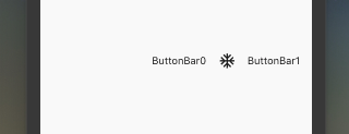
- ButtonBar: 按钮组(水平排列的按钮组)
- 构造函数
const ButtonBar({

    Key key,

//子组件的间隔样式

    this.alignment = MainAxisAlignment.end,

    this.mainAxisSize = MainAxisSize.max,

//子children

    this.children = const <Widget>[],

  })
code
class FlutterButtonBar extends StatelessWidget {

  @override

  Widget build(BuildContext context) {

    return ButtonBar(children: <Widget>[

      Text("ButtonBar0"),

      Icon(Icons.ac_unit),

      Text("ButtonBar1")

    ], );

  }

}
效果
- 构造函数
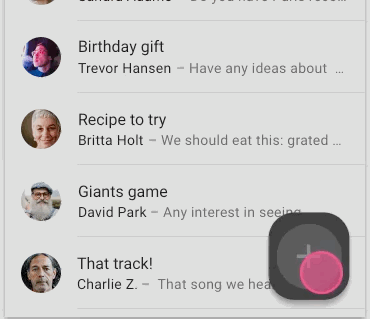
- FloatingActionButton:浮动按钮
- 构造函数
FloatingActionButton({

    Key key,

    //  按钮上的组件,可以是Text、icon, etc.

    this.child,

    //长按提示

    this.tooltip,

    // child的颜色(尽在child没有设置颜色时生效)

    this.foregroundColor,

    //背景色,也就是悬浮按键的颜色

    this.backgroundColor,

    this.heroTag = const _DefaultHeroTag(),

    //阴影长度

    this.elevation = 6.0,

    //高亮时阴影长度

    this.highlightElevation = 12.0,

    //按下事件回调

    @required this.onPressed,

    //是小图标还是大图标

    this.mini = false,

    //按钮的形状(例如:矩形Border,圆形图标CircleBorder)

    this.shape = const CircleBorder(),

    this.clipBehavior = Clip.none,

    this.materialTapTargetSize,

    this.isExtended = false,

}) - code
FloatingActionButton(

      child: Icon(Icons.access_alarm),

      tooltip: "ToolTip",

      foregroundColor: Colors.white,

      backgroundColor: Colors.deepPurple,

      shape: const Border(),

      onPressed: () {

        //click callback

      },

) - 效果
- 构造函数
【Flutter学习】基本组件之基本按钮组件的更多相关文章
- Flutter学习笔记(11)--文本组件、图标及按钮组件
如需转载,请注明出处:Flutter学习笔记(10)--容器组件.图片组件 文本组件 文本组件(text)负责显示文本和定义显示样式,下表为text常见属性 Text组件属性及描述 属性名 类型 默认 ...
- Flutter学习笔记(10)--容器组件、图片组件
如需转载,请注明出处:Flutter学习笔记(10)--容器组件.图片组件 上一篇Flutter学习笔记(9)--组件Widget我们说到了在Flutter中一个非常重要的理念"一切皆为组件 ...
- Flutter学习笔记(12)--列表组件
如需转载,请注明出处:Flutter学习笔记(12)--列表组件 在日常的产品项目需求中,经常会有列表展示类的需求,在Android中常用的做法是收集数据源,然后创建列表适配器Adapter,将数据源 ...
- 22Flutter中的常见的按钮组件 以及自定义按钮组件
/* Flutter中的常见的按钮组件 以及自定义按钮组件 一.Flutter中的按钮组件介绍 Flutter里有很多的Button组件,常见的按钮组件有:RaisedButton/FlatButto ...
- Flutter 中的常见的按钮组件 以及自定义按钮组件
Flutter 里有很多的 Button 组件很多,常见的按钮组件有:RaisedButton.FlatButton. IconButton.OutlineButton.ButtonBar.Float ...
- Flutter学习(一)之MaterialApp和Scaffold组件使用详解
一,前言: MaterialApp和Scaffold是Flutter提供的两个Widget,其中: MaterialApp是一个方便的Widget,它封装了应用程序实现Material Design所 ...
- Flutter——FloatingActionButton组件(浮动按钮组件)
FloatingActionButton 简称 FAB ,可以实现浮动按钮,也可以实现类似闲鱼 app 的地步凸起导航. 属性名称 属性值 child 子视图,一般为 Icon,不推荐使用文字 ...
- Flutter学习笔记(9)--组件Widget
如需转载,请注明出处:Flutter学习笔记(9)--组件Widget 在Flutter中,所有的显示都是Widget,Widget是一切的基础,我们可以通过修改数据,再用setState设置数据(调 ...
- 第二百零七节,jQuery EasyUI,MenuButton(菜单按钮)组件
jQuery EasyUI,MenuButton(菜单按钮)组件 学习要点: 1.加载方式 2.属性列表 3.方法列表 本节课重点了解 EasyUI 中 MenuButton(菜单按钮)组件的使用方法 ...
随机推荐
- xshell 挪动文件夹
cp -rp /home/d001 /home/Documents 复制/home下d001到/home下Documents -r 是遍历目录,即复制整个目录-p 是保留原有属性 查看的命令是cat ...
- Python--nfs服务+计划任务crond服务+shell介绍
nfs服务 NFS 是Network File System的缩写,即网络文件系统. 功能是通过网络让不同的机器.不同的操作系统能够彼此分享个别的数据,让应用程序在客户端通过网络访问位于服务器磁盘中的 ...
- sql语句采用数字方式的排序
select z.xymc 省份,y.xm 办理人,s.bt 标题,x.createtime 创建时间, nvl2(t.jssj,t.jssj,'未接收') 接收时间 fr ...
- 自己封装 vue 组件 和 插件
vue 组件 一.组件的创建,两种方法.(本质上是1.2两种,vue文件,只是创建了一个 组件选项对象,仅是一个js对象)1.定义组件:Vue.component('button-counter', ...
- 在 MacBook 上安装 Ubuntu
建立ubuntu 安裝U盤,加入usb port,按住option key 開機,正常安裝. 完成後,會缺少wifi drive sudo apt-get install bcmwl-kernel-s ...
- Python3 tkinter 界面布局(转自https://blog.csdn.net/junjun5156/article/details/72510927)
所谓布局,就是指控制窗体容器中各个控件(组件)的位置关系.tkinter 共有三种几何布局管理器,分别是:pack布局,grid布局,place布局. pack布局 使用 pack布局,将向容器中添加 ...
- Windows下搭建Wampserver+Wordpress
安装wordpress windows 下载安装包 百度云 提取码:qxzp 安装wamp WampServer就是Windows Apache Mysql PHP集成安装环境,即在window下的a ...
- 洛谷 P3455 [POI2007]ZAP-Queries (莫比乌斯函数)
题目链接:P3455 [POI2007]ZAP-Queries 题意 给定 \(a,b,d\),求 \(\sum_{x=1}^{a} \sum_{y=1}^{b}[gcd(x, y) = d]\). ...
- 2018 ICPC Asia Singapore Regional A. Largest Triangle (计算几何)
题目链接:Kattis - largesttriangle Description Given \(N\) points on a \(2\)-dimensional space, determine ...
- PAT甲级——A1149DangerousGoodsPackaging【25】
When shipping goods with containers, we have to be careful not to pack some incompatible goods into ...