安卓Design包之NavigationView结合DrawerLayout,toolbar的使用,FloatingActionButton
注意:使用前需要添加Design依赖包,使用toolbar时需要隐藏标题头
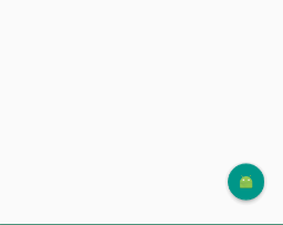
FloatingActionButton
悬浮按钮:FloatingActionButton是重写ImageView的,所有FloatingActionButton拥有ImageView的一切属性。
- app:backgroundTint - 设置FAB的背景颜色。
- app:rippleColor - 设置FAB点击时的背景颜色。
- app:borderWidth - 该属性尤为重要,如果不设置0dp,那么在4.1的sdk上FAB会显示为正方形,而且在5.0以后的sdk没有阴影效果。所以设置为borderWidth="0dp"。
- app:elevation - 默认状态下FAB的阴影大小。
- app:pressedTranslationZ - 点击时候FAB的阴影大小。
- app:fabSize - 设置FAB的大小,该属性有两个值,分别为normal和mini,对应的FAB大小分别为56dp和40dp。
- src - 设置FAB的图标,Google建议符合Design设计的该图标大小为24dp。
- app:layout_anchor - 设置FAB的锚点,即以哪个控件为参照点设置位置。
- app:layout_anchorGravity - 设置FAB相对锚点的位置,值有 bottom、center、right、left、top等。
    <android.support.design.widget.FloatingActionButton

            android:layout_width="wrap_content"

            android:layout_height="wrap_content"

            android:layout_alignParentBottom = "true"

            android:layout_alignParentRight = "true"

            android:layout_margin="20dp"

            android:src="@mipmap/ic_launcher"/>
效果:
:
NavigationView
通过提供抽屉导航所需的框架让实现更简单,同时它还能够直接通过菜单资源文件直接生成导航元素。把NavigationView作为DrawerLayout的内容视图来使用。NavigationView处理好了和状态栏的关系,可以确保NavigationView在API21+设备上正确的和状态栏交互。
xml文件:
利用drawerLayout作为父布局,可以实现侧滑的功能
<?xml version="1.0" encoding="utf-8"?>

<android.support.v4.widget.DrawerLayout xmlns:android="http://schemas.android.com/apk/res/android"

    xmlns:tools="http://schemas.android.com/tools"

    xmlns:app="http://schemas.android.com/apk/res-auto"

    android:id="@+id/drawer_layout"

    android:layout_width="match_parent"

    android:layout_height="match_parent"

    android:paddingBottom="@dimen/activity_vertical_margin"

    tools:context="fanggao.qf.toolbar_drawerlayout_navigationview_floactionbar_snackbar.MainActivity">

<!--主界面-->

    <RelativeLayout

        android:layout_width="match_parent"

        android:layout_height="match_parent">

        <android.support.v7.widget.Toolbar

            android:id="@+id/toolbar"

            android:layout_width="match_parent"

            android:layout_height="wrap_content">

            <!--自定义布局-->

        </android.support.v7.widget.Toolbar>

        <!--悬浮的圆-->

        <android.support.design.widget.FloatingActionButton

            android:layout_width="wrap_content"

            android:layout_height="wrap_content"

            android:layout_alignParentBottom = "true"

            android:layout_alignParentRight = "true"

            android:layout_margin="20dp"

            android:src="@mipmap/ic_launcher"/>

    </RelativeLayout>

<!--左侧菜单   android:layout_gravity = "start" 在布局的左侧-->

<android.support.design.widget.NavigationView

    android:layout_width="250dp"

    android:layout_height="match_parent"

    android:layout_gravity = "start"

    app:headerLayout = "@layout/layout_header"

    app:menu="@menu/menu"/>

</android.support.v4.widget.DrawerLayout>
layout_header.xml
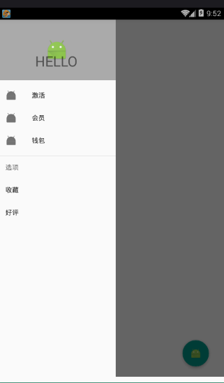
侧滑菜单中的标题头:
<?xml version="1.0" encoding="utf-8"?>

<RelativeLayout xmlns:android="http://schemas.android.com/apk/res/android"

    android:layout_width="match_parent"

    android:layout_height="match_parent"

    android:background="#aaaaaa">

    <ImageView

        android:id="@+id/img_icon"

        android:layout_width="wrap_content"

        android:layout_height="wrap_content"

        android:layout_centerInParent="true"

        android:src="@mipmap/ic_launcher"/>

    <TextView

        android:layout_width="wrap_content"

        android:layout_height="wrap_content"

        android:text="HELLO"

        android:layout_below="@id/img_icon"

        android:textSize="30sp"

        android:layout_margin="20dp"

        android:layout_centerHorizontal="true"/>

</RelativeLayout>
注意:
 <!--有group就会有分割线了

        android:checked="true" 在菜单项中图片就会显示为蓝色  false就会为灰色

        所以会导致图片全部为灰色,解决办法:

        方法1.在布局文件中添加app:itemIconTint="@color/blue"属性,表示设置图片的颜色全都为蓝色

        方法2.在java代码中:NavigationView navigationView = (NavigationView)findViewById(R.id.navigation_view);

             navigationView.setItemIconTintList(null);  -->
menu.xml菜单布局
<?xml version="1.0" encoding="utf-8"?>

<menu xmlns:android="http://schemas.android.com/apk/res/android">

    <!-- menu支持分组和子标题,但是子标题不支持icon-->

    <!--单选-->

    <group>

        <item

            android:title="激活"

            android:icon="@mipmap/ic_launcher">

        </item>

        <item

            android:title="会员"

            android:icon="@mipmap/ic_launcher">

        </item>

        <item

            android:title="钱包"

            android:icon="@mipmap/ic_launcher">

        </item>

    </group>

    <!--菜单-->

    <item

        android:title="选项"

        android:icon="@mipmap/ic_launcher">

        <menu>

            <item

            android:title="收藏"></item>

            <item

                android:title="好评"></item>

        </menu>

    </item>

</menu>
main:
public class MainActivity extends AppCompatActivity {

    private Toolbar toolbar;

    private DrawerLayout drawerLayout;

    @Override

    protected void onCreate(Bundle savedInstanceState) {

        super.onCreate(savedInstanceState);

        setContentView(R.layout.activity1_main);

        toolbar = (Toolbar) findViewById(R.id.toolbar);

        drawerLayout = (DrawerLayout) findViewById(R.id.drawer_layout);

        //设置主标题

        toolbar.setTitle("标题");

        //设置副标题

        toolbar.setSubtitle("标题的子类");

        //设置图标

        toolbar.setLogo(R.mipmap.ic_launcher);

        //设置Toolbar和DrawerLayout实现动画和联动

        this.setSupportActionBar(toolbar);

        //左侧菜单与toolbar联动

        // 给左上角图标的左边加上一个返回的图标

        getSupportActionBar().setDisplayHomeAsUpEnabled(true);

        getSupportActionBar().setHomeButtonEnabled(true); //设置返回键可用

        //ActionBarDrawerToggle可以监听抽屉开合事件,可以认为是DrawerListener的子类

        //声明mDrawerToggle对象,其中R.string.open和R.string.close简单可以用"open"和"close"替代

        ActionBarDrawerToggle actionBarDrawerToggle = new ActionBarDrawerToggle(MainActivity.this, drawerLayout,toolbar, R.string.open, R.string.close){

            @Override

            public void onDrawerOpened(View drawerView) {

                super.onDrawerOpened(drawerView);

                Log.i("tag", "onDrawerOpened: ");

            }

            @Override

            public void onDrawerClosed(View drawerView) {

                super.onDrawerClosed(drawerView);

                Log.i("tag", "onDrawerClosed: ");

            }

        };

        //使得图标和抽屉拉合保持同步

        actionBarDrawerToggle.syncState();

        //监听实现侧边栏的拉开和闭合,即抽屉drawer的闭合和打开

        drawerLayout.addDrawerListener(actionBarDrawerToggle);

    }

}
效果: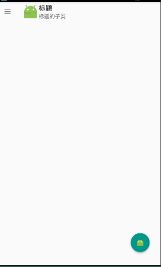
安卓Design包之NavigationView结合DrawerLayout,toolbar的使用,FloatingActionButton的更多相关文章
- 安卓Design包之CoordinatorLayout配合AppBarLayout,ToolBar,TabLaout的使用
转载: CoordinatorLayout配合AppBarLayout,Toolbar和TabLayout的使用 控件的简单介绍: AppBarLayout:它是继承LinerLayout实现的一个V ...
- 安卓Design包之Toolbar控件的使用
转自:ToolBar的使用 ToolBar的出现是为了替换之前的ActionBar的各种不灵活使用方式,相反,ToolBar的使用变得非常灵活,因为它可以让我们自由往里面添加子控件.低版本要使用的话, ...
- 安卓Design包之TabLayout控件的使用
转自: 安卓Design包之TabLayout控件的简单使用 Google在2015的IO大会上,给我们带来了更加详细的Material Design设计规范,同时,也给我们带来了全新的Android ...
- 安卓Design包之AppBar和Toolbar的联用
前面讲了Design包的的CoordinatorLayout和SnackBar的混用,现在继续理解Design包的AppBar; AppBarLayout跟它的名字一样,把容器类的组件全部作为AppB ...
- 安卓Design包之超强控件CoordinatorLayout与SnackBar的简单使用
在前面的Design中,学习使用了TabLayout,NavigationView与DrawerLayout实现的神奇效果,今天就带来本次Design包中我认为最有意义的控件CoordinatorLa ...
- 安卓Design包下的TextInputLayout和FloatingActionButton的简单使用
终于介绍到Design包的最后的东西了. 也很简单,一个是TextInputLayout. TextInputLayout作为一个父容器,包含一个新的EditText,可以给EditText添加意想不 ...
- 安卓Design包之TabLayout控件的简单使用
Google在2015的IO大会上,给我们带来了更加详细的Material Design设计规范,同时,也给我们带来了全新的Android Design Support Library,在这个supp ...
- 安卓Design包之CollapsingToolbarLayout(可折叠的工具栏布局)的简单使用
转自: CollapsingToolbarLayout的使用 注意:使用前需要添加Design依赖包,使用toolbar时需要隐藏标题头 CollapsingToolbarLayout作用是提供了一个 ...
- 安卓Design之NavigationView的使用
前面讲解了Design包下的TabLayout的使用,下面将带来NavagationView和DrawLayout以及toolbar的联动. 项目已经同步至:https://github.com/na ...
随机推荐
- anaconda在linux下的安装注意事项
不应该做什么 官网原文: Installation Instructions Linux Install These instructions explain how to install Anaco ...
- java console ( mac osx ) 命令行编码
方法 vi ~/.bash_profile #添加新行, UTF-8表示你平台的编码方式 #例如你是GBK.GB18030的 #替换成你平台console可现实字符编码即可 export JAVA_T ...
- openstack配置增加
控制节点nova配置增加 vif_plugging_is_fatal = Falsevif_plugging_timeout = 0scheduler_default_filters = AllHos ...
- gratitute
韩信帮刘邦夺得天下,最终又得到了什么?姑且不问当初刘邦拜将是何心态?虽然他的所拜之相并不是的那边从芒砀山带下来的哥们或是在沛县时候一起打混的兄弟? 韩信在汉军营得以重用,在项羽处屈其才,此真正的原因在 ...
- 用JS查看修改CSS样式(cssText,attribute('style'),currentStyle,getComputedStyle)
CSS样式定义方法 大家都知道,在为HTML设置样式的时候,通常有三种方法:内联样式,内部样式表,外部样式表. 1.内联样式: 内联样式表就是在HTML元素中的行内直接添加style属性. <d ...
- HDU 1875 畅通工程再续 (最小生成树)
畅通工程再续 题目链接: http://acm.hust.edu.cn/vjudge/contest/124434#problem/M Description 相信大家都听说一个"百岛湖&q ...
- CodeForces 455B A Lot of Games (博弈论)
A Lot of Games 题目链接: http://acm.hust.edu.cn/vjudge/contest/121334#problem/J Description Andrew, Fedo ...
- C:移位运算符
1在向右移位时,空出的位是由0填充,还是由符号位的副本填充? 如果被移位的对象是无符号数,那么空出的位将被0填充.如果被位移的对象是有符号数,那么C语言实现既可以用0填充空出的位,也可以用符号位的副本 ...
- Javascript高级篇-JS闭包
Javascript闭包 1.变量的作用域 1.1局部变量 1.2全局变量(声明在外边或不用var来声明的变量) 2.外部读取方法内部的局部(私有)变量 function a(){ var b = & ...
- windows 花式装系统
目录 一.安装系统前准备 准备U盘 准备好一个制作启动盘的软件 准备系统镜像 二.接下来先制作启动盘(以微PE为例) 三.插上u盘,调BIOS(BIOS即基本输入输出系统) 四.进入PE 五.开始安装 ...