WPF界面设计技巧(2)—自定义漂亮的按钮样式
上次做了个很酷的不规则窗体,这次我们来弄点好看的按钮出来,此次将采用纯代码来设计按钮样式,不需要 Microsoft Expression Design 辅助了。
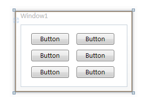
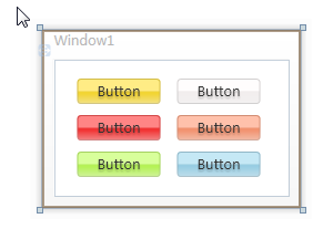
首先打开 Microsoft Visual Studio 2008 ,新建一个WPF项目,在上面随便放几个按钮:
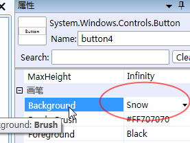
然后给各个按钮设置不同的背景颜色:
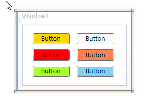
设置好之后就是这样啦:
然后我们就开始在 App.xaml 文件中定义按钮样式了:
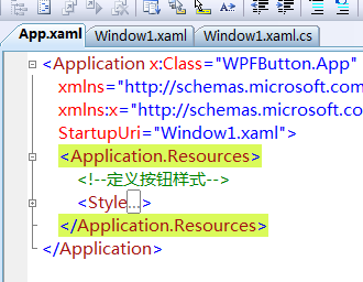
定义的样式代码如下:
Code<Application x:Class="WPFButton.App" xmlns="http://schemas.microsoft.com/winfx/2006/xaml/presentation" xmlns:x="http://schemas.microsoft.com/winfx/2006/xaml" StartupUri="Window1.xaml"> <Application.Resources> <!--定义按钮样式--> <Style TargetType="Button"> <Setter Property="Foreground" Value="Black"/> <!--修改模板属性--> <Setter Property="Template"> <Setter.Value> <!--控件模板--> <ControlTemplate TargetType="Button"> <!--背景色--> <Border x:Name="back" Opacity="0.8" CornerRadius="3"> <Border.BitmapEffect> <OuterGlowBitmapEffect Opacity="0.7" GlowSize="0" GlowColor="{Binding RelativeSource={RelativeSource TemplatedParent}, Path=(Button.Background).(SolidColorBrush.Color)}" /> </Border.BitmapEffect> <Border.Background> <LinearGradientBrush StartPoint="0,0" EndPoint="0,1.5"> <GradientBrush.GradientStops> <GradientStopCollection> <GradientStop Color="{Binding RelativeSource={RelativeSource TemplatedParent}, Path=(Button.Background).(SolidColorBrush.Color)}" Offset="0"/> <GradientStop Color="{Binding RelativeSource={RelativeSource TemplatedParent}, Path=(Button.Background).(SolidColorBrush.Color)}" Offset="0.4"/> <GradientStop Color="#FFF" Offset="1"/> </GradientStopCollection> </GradientBrush.GradientStops> </LinearGradientBrush> </Border.Background> <!--前景色及边框--> <Border x:Name="fore" BorderThickness="1" CornerRadius="3" BorderBrush="#5555"> <Border.Background> <LinearGradientBrush StartPoint="0,0" EndPoint="0,1"> <GradientBrush.GradientStops> <GradientStopCollection> <GradientStop Color="#6FFF" Offset="0.5"/> <GradientStop Color="#1111" Offset="0.51"/> </GradientStopCollection> </GradientBrush.GradientStops> </LinearGradientBrush> </Border.Background> <!--按钮内容--> <ContentPresenter x:Name="content" HorizontalAlignment="Center" VerticalAlignment="Center" Content="{TemplateBinding Content}"> <ContentPresenter.BitmapEffect> <DropShadowBitmapEffect Color="#000" Direction="-90" ShadowDepth="2" Softness="0.1" Opacity="0.3" /> </ContentPresenter.BitmapEffect> </ContentPresenter> </Border> </Border> <!--触发器--> <ControlTemplate.Triggers> <!--鼠标移入移出--> <Trigger Property="IsMouseOver" Value="True"> <Trigger.EnterActions> <BeginStoryboard> <Storyboard> <DoubleAnimation To="6" Duration="0:0:0.2" Storyboard.TargetName="back" Storyboard.TargetProperty="(Border.BitmapEffect).(OuterGlowBitmapEffect.GlowSize)" /> <ColorAnimation To="#AFFF" BeginTime="0:0:0.2" Duration="0:0:0.2" Storyboard.TargetName="fore" Storyboard.TargetProperty="(Border.Background).(LinearGradientBrush.GradientStops)[0].(GradientStop.Color)" /> <ColorAnimation To="#3FFF" BeginTime="0:0:0.2" Duration="0:0:0.2" Storyboard.TargetName="fore" Storyboard.TargetProperty="(Border.Background).(LinearGradientBrush.GradientStops)[1].(GradientStop.Color)" /> </Storyboard> </BeginStoryboard> </Trigger.EnterActions> <Trigger.ExitActions> <BeginStoryboard> <Storyboard> <DoubleAnimation Duration="0:0:0.2" Storyboard.TargetName="back" Storyboard.TargetProperty="(Border.BitmapEffect).(OuterGlowBitmapEffect.GlowSize)" /> <ColorAnimation Duration="0:0:0.2" Storyboard.TargetName="fore" Storyboard.TargetProperty="(Border.Background).(LinearGradientBrush.GradientStops)[0].(GradientStop.Color)" /> <ColorAnimation Duration="0:0:0.2" Storyboard.TargetName="fore" Storyboard.TargetProperty="(Border.Background).(LinearGradientBrush.GradientStops)[1].(GradientStop.Color)" /> </Storyboard> </BeginStoryboard> </Trigger.ExitActions> </Trigger> <!--按钮按下弹起--> <Trigger Property="IsPressed" Value="True"> <Trigger.EnterActions> <BeginStoryboard> <Storyboard> <DoubleAnimation To="3" Duration="0:0:0.1" Storyboard.TargetName="back" Storyboard.TargetProperty="(Border.BitmapEffect).(OuterGlowBitmapEffect.GlowSize)" /> <ColorAnimation To="#3AAA" Duration="0:0:0.1" Storyboard.TargetName="fore" Storyboard.TargetProperty="(Border.Background).(LinearGradientBrush.GradientStops)[0].(GradientStop.Color)" /> <ColorAnimation To="#2111" Duration="0:0:0.1" Storyboard.TargetName="fore" Storyboard.TargetProperty="(Border.Background).(LinearGradientBrush.GradientStops)[1].(GradientStop.Color)" /> </Storyboard> </BeginStoryboard> </Trigger.EnterActions> <Trigger.ExitActions> <BeginStoryboard> <Storyboard> <DoubleAnimation Duration="0:0:0.1" Storyboard.TargetName="back" Storyboard.TargetProperty="(Border.BitmapEffect).(OuterGlowBitmapEffect.GlowSize)" /> <ColorAnimation Duration="0:0:0.1" Storyboard.TargetName="fore" Storyboard.TargetProperty="(Border.Background).(LinearGradientBrush.GradientStops)[0].(GradientStop.Color)" /> <ColorAnimation Duration="0:0:0.1" Storyboard.TargetName="fore" Storyboard.TargetProperty="(Border.Background).(LinearGradientBrush.GradientStops)[1].(GradientStop.Color)" /> </Storyboard> </BeginStoryboard> </Trigger.ExitActions> </Trigger> <!--按钮失效--> <Trigger Property="IsEnabled" Value="False"> <Setter Property="Foreground" Value="#B444"/> <Trigger.EnterActions> <BeginStoryboard> <Storyboard> <DoubleAnimation To="0" Duration="0:0:0.3" Storyboard.TargetName="back" Storyboard.TargetProperty="(Border.BitmapEffect).(OuterGlowBitmapEffect.GlowSize)" /> <DoubleAnimation To="1" Duration="0:0:0.1" Storyboard.TargetName="content" Storyboard.TargetProperty="(ContentPresenter.BitmapEffect).(DropShadowBitmapEffect.Opacity)" /> <DoubleAnimation To="-135" Duration="0:0:0.1" Storyboard.TargetName="content" Storyboard.TargetProperty="(ContentPresenter.BitmapEffect).(DropShadowBitmapEffect.Direction)" /> <ColorAnimation To="#FFF" Duration="0:0:0.3" Storyboard.TargetName="content" Storyboard.TargetProperty="(ContentPresenter.BitmapEffect).(DropShadowBitmapEffect.Color)" /> <ColorAnimation To="#D555" Duration="0:0:0.3" Storyboard.TargetName="fore" Storyboard.TargetProperty="(Border.BorderBrush).(SolidColorBrush.Color)" /> <ColorAnimation To="#CEEE" Duration="0:0:0.3" Storyboard.TargetName="fore" Storyboard.TargetProperty="(Border.Background).(LinearGradientBrush.GradientStops)[0].(GradientStop.Color)" /> <ColorAnimation To="#CDDD" Duration="0:0:0.3" Storyboard.TargetName="fore" Storyboard.TargetProperty="(Border.Background).(LinearGradientBrush.GradientStops)[1].(GradientStop.Color)" /> </Storyboard> </BeginStoryboard> </Trigger.EnterActions> <Trigger.ExitActions> <BeginStoryboard> <Storyboard> <DoubleAnimation Duration="0:0:0.1" Storyboard.TargetName="back" Storyboard.TargetProperty="(Border.BitmapEffect).(OuterGlowBitmapEffect.GlowSize)" /> <DoubleAnimation Duration="0:0:0.1" Storyboard.TargetName="content" Storyboard.TargetProperty="(ContentPresenter.BitmapEffect).(DropShadowBitmapEffect.Opacity)" /> <DoubleAnimation Duration="0:0:0.1" Storyboard.TargetName="content" Storyboard.TargetProperty="(ContentPresenter.BitmapEffect).(DropShadowBitmapEffect.Direction)" /> <ColorAnimation Duration="0:0:0.1" Storyboard.TargetName="content" Storyboard.TargetProperty="(ContentPresenter.BitmapEffect).(DropShadowBitmapEffect.Color)" /> <ColorAnimation Duration="0:0:0.1" Storyboard.TargetName="fore" Storyboard.TargetProperty="(Border.BorderBrush).(SolidColorBrush.Color)" /> <ColorAnimation Duration="0:0:0.1" Storyboard.TargetName="fore" Storyboard.TargetProperty="(Border.Background).(LinearGradientBrush.GradientStops)[0].(GradientStop.Color)" /> <ColorAnimation Duration="0:0:0.1" Storyboard.TargetName="fore" Storyboard.TargetProperty="(Border.Background).(LinearGradientBrush.GradientStops)[1].(GradientStop.Color)" /> </Storyboard> </BeginStoryboard> </Trigger.ExitActions> </Trigger> </ControlTemplate.Triggers> </ControlTemplate> </Setter.Value> </Setter> </Style> </Application.Resources></Application>
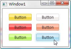
看了先不要头大,我们先看看最终效果,然后回过头来再解释代码:
这是常规样式
这个是鼠标移到上面时的样式

这个是鼠标点击时的样式
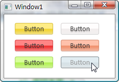
还有就是按钮失效时的样式
效果还算不错吧,下面来讲解代码喽,头晕的同学可以现在就收拾东西回家了哈。
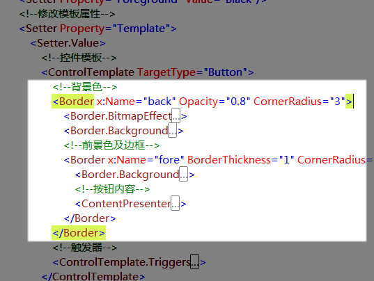
我们先来看这个命名为“back”的 Border 元素,它用它的 Background 属性充当了整个按钮的背景色。
<Border.Background> <LinearGradientBrush StartPoint="0,0" EndPoint="0,1.5"> <GradientBrush.GradientStops> <GradientStopCollection> <GradientStop Color="{Binding RelativeSource={RelativeSource TemplatedParent}, Path=(Button.Background).(SolidColorBrush.Color)}" Offset="0"/> <GradientStop Color="{Binding RelativeSource={RelativeSource TemplatedParent}, Path=(Button.Background).(SolidColorBrush.Color)}" Offset="0.4"/> <GradientStop Color="#FFF" Offset="1"/> </GradientStopCollection> </GradientBrush.GradientStops> </LinearGradientBrush> </Border.Background>
其背景所用的是一个渐变笔刷,起始值和中间值都是引用的按钮本身的背景色,就是我们之前设置过的颜色啦,终止值是白色,这样通过位置调整,我们可以在按钮最下部产生一些向白色的过度色彩效果。
<Border.BitmapEffect> <OuterGlowBitmapEffect Opacity="0.7" GlowSize="0" GlowColor="{Binding RelativeSource={RelativeSource TemplatedParent}, Path=(Button.Background).(SolidColorBrush.Color)}" /> </Border.BitmapEffect>
它的 BitmapEffect 属性我们设置了一个大小为 0 的外发光效果,平常是看不见这效果的,在这里预先设置好,是为了在鼠标移入、按下时实现动画使用。
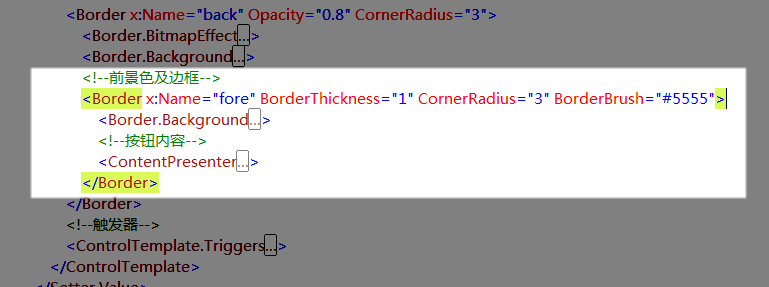
再来看看这个命名为“fore”的 Border 元素,它实现的是按钮的边框和高亮反光效果,我为它设置了一个半透明的黑色1像素边框,使得这个边框的色彩可以和背景色混合起来。
<Border.Background> <LinearGradientBrush StartPoint="0,0" EndPoint="0,1"> <GradientBrush.GradientStops> <GradientStopCollection> <GradientStop Color="#6FFF" Offset="0.5"/> <GradientStop Color="#1111" Offset="0.51"/> </GradientStopCollection> </GradientBrush.GradientStops> </LinearGradientBrush> </Border.Background>
它的背景同样采用的渐变笔刷,起始值和终止值的位置几乎贴在一起,从而形成比较鲜明的反光度对比。
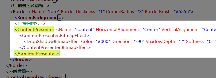
ContentPresenter 元素用于呈现按钮原本的内容,对于按钮来说就是按钮上的文字了,当然也可能会存在图片或其它东西。
<ContentPresenter.BitmapEffect> <DropShadowBitmapEffect Color="#000" Direction="-90" ShadowDepth="2" Softness="0.1" Opacity="0.3" /> </ContentPresenter.BitmapEffect>
我为之加了一个不太明显的阴影滤镜以增强显示效果。
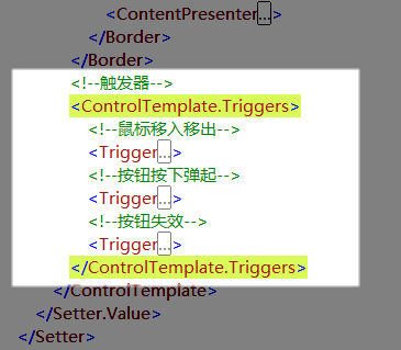
剩下的就是些可爱又该死的 Trigger ,我们通过这些触发器来改变按钮在不同状态时的外观。
<!--鼠标移入移出--> <Trigger Property="IsMouseOver" Value="True"> <Trigger.EnterActions> <BeginStoryboard> <Storyboard> <DoubleAnimation To="6" Duration="0:0:0.2" Storyboard.TargetName="back" Storyboard.TargetProperty="(Border.BitmapEffect).(OuterGlowBitmapEffect.GlowSize)" /> <ColorAnimation To="#AFFF" BeginTime="0:0:0.2" Duration="0:0:0.2" Storyboard.TargetName="fore" Storyboard.TargetProperty="(Border.Background).(LinearGradientBrush.GradientStops)[0].(GradientStop.Color)" /> <ColorAnimation To="#3FFF" BeginTime="0:0:0.2" Duration="0:0:0.2" Storyboard.TargetName="fore" Storyboard.TargetProperty="(Border.Background).(LinearGradientBrush.GradientStops)[1].(GradientStop.Color)" /> </Storyboard> </BeginStoryboard> </Trigger.EnterActions> <Trigger.ExitActions> <BeginStoryboard> <Storyboard> <DoubleAnimation Duration="0:0:0.2" Storyboard.TargetName="back" Storyboard.TargetProperty="(Border.BitmapEffect).(OuterGlowBitmapEffect.GlowSize)" /> <ColorAnimation Duration="0:0:0.2" Storyboard.TargetName="fore" Storyboard.TargetProperty="(Border.Background).(LinearGradientBrush.GradientStops)[0].(GradientStop.Color)" /> <ColorAnimation Duration="0:0:0.2" Storyboard.TargetName="fore" Storyboard.TargetProperty="(Border.Background).(LinearGradientBrush.GradientStops)[1].(GradientStop.Color)" /> </Storyboard> </BeginStoryboard> </Trigger.ExitActions> </Trigger>
在鼠标移入按钮时,我依次创建了改变外发光效果大小、改变上部反光区域颜色、改变下部反光区域颜色的动画,这里的要点就在于“Storyboard.TargetProperty="(Border.Background).(LinearGradientBrush.GradientStops)[1].(GradientStop.Color)"”属性设置语句,琢磨一下你就能看出这是对属性路径的描述,只不过它们写起来和看起来都很让人生气。
<!--按钮按下弹起--> <Trigger Property="IsPressed" Value="True"> <Trigger.EnterActions> <BeginStoryboard> <Storyboard> <DoubleAnimation To="3" Duration="0:0:0.1" Storyboard.TargetName="back" Storyboard.TargetProperty="(Border.BitmapEffect).(OuterGlowBitmapEffect.GlowSize)" /> <ColorAnimation To="#3AAA" Duration="0:0:0.1" Storyboard.TargetName="fore" Storyboard.TargetProperty="(Border.Background).(LinearGradientBrush.GradientStops)[0].(GradientStop.Color)" /> <ColorAnimation To="#2111" Duration="0:0:0.1" Storyboard.TargetName="fore" Storyboard.TargetProperty="(Border.Background).(LinearGradientBrush.GradientStops)[1].(GradientStop.Color)" /> </Storyboard> </BeginStoryboard> </Trigger.EnterActions> <Trigger.ExitActions> <BeginStoryboard> <Storyboard> <DoubleAnimation Duration="0:0:0.1" Storyboard.TargetName="back" Storyboard.TargetProperty="(Border.BitmapEffect).(OuterGlowBitmapEffect.GlowSize)" /> <ColorAnimation Duration="0:0:0.1" Storyboard.TargetName="fore" Storyboard.TargetProperty="(Border.Background).(LinearGradientBrush.GradientStops)[0].(GradientStop.Color)" /> <ColorAnimation Duration="0:0:0.1" Storyboard.TargetName="fore" Storyboard.TargetProperty="(Border.Background).(LinearGradientBrush.GradientStops)[1].(GradientStop.Color)" /> </Storyboard> </BeginStoryboard> </Trigger.ExitActions> </Trigger>
按下和弹起按钮时,我们做了相似的动画改变,与前面相比只是数值略微不同。
<!--按钮失效--> <Trigger Property="IsEnabled" Value="False"> <Setter Property="Foreground" Value="#B444"/> <Trigger.EnterActions> <BeginStoryboard> <Storyboard> <DoubleAnimation To="0" Duration="0:0:0.3" Storyboard.TargetName="back" Storyboard.TargetProperty="(Border.BitmapEffect).(OuterGlowBitmapEffect.GlowSize)" /> <DoubleAnimation To="1" Duration="0:0:0.1" Storyboard.TargetName="content" Storyboard.TargetProperty="(ContentPresenter.BitmapEffect).(DropShadowBitmapEffect.Opacity)" /> <DoubleAnimation To="-135" Duration="0:0:0.1" Storyboard.TargetName="content" Storyboard.TargetProperty="(ContentPresenter.BitmapEffect).(DropShadowBitmapEffect.Direction)" /> <ColorAnimation To="#FFF" Duration="0:0:0.3" Storyboard.TargetName="content" Storyboard.TargetProperty="(ContentPresenter.BitmapEffect).(DropShadowBitmapEffect.Color)" /> <ColorAnimation To="#D555" Duration="0:0:0.3" Storyboard.TargetName="fore" Storyboard.TargetProperty="(Border.BorderBrush).(SolidColorBrush.Color)" /> <ColorAnimation To="#CEEE" Duration="0:0:0.3" Storyboard.TargetName="fore" Storyboard.TargetProperty="(Border.Background).(LinearGradientBrush.GradientStops)[0].(GradientStop.Color)" /> <ColorAnimation To="#CDDD" Duration="0:0:0.3" Storyboard.TargetName="fore" Storyboard.TargetProperty="(Border.Background).(LinearGradientBrush.GradientStops)[1].(GradientStop.Color)" /> </Storyboard> </BeginStoryboard> </Trigger.EnterActions> <Trigger.ExitActions> <BeginStoryboard> <Storyboard> <DoubleAnimation Duration="0:0:0.1" Storyboard.TargetName="back" Storyboard.TargetProperty="(Border.BitmapEffect).(OuterGlowBitmapEffect.GlowSize)" /> <DoubleAnimation Duration="0:0:0.1" Storyboard.TargetName="content" Storyboard.TargetProperty="(ContentPresenter.BitmapEffect).(DropShadowBitmapEffect.Opacity)" /> <DoubleAnimation Duration="0:0:0.1" Storyboard.TargetName="content" Storyboard.TargetProperty="(ContentPresenter.BitmapEffect).(DropShadowBitmapEffect.Direction)" /> <ColorAnimation Duration="0:0:0.1" Storyboard.TargetName="content" Storyboard.TargetProperty="(ContentPresenter.BitmapEffect).(DropShadowBitmapEffect.Color)" /> <ColorAnimation Duration="0:0:0.1" Storyboard.TargetName="fore" Storyboard.TargetProperty="(Border.BorderBrush).(SolidColorBrush.Color)" /> <ColorAnimation Duration="0:0:0.1" Storyboard.TargetName="fore" Storyboard.TargetProperty="(Border.Background).(LinearGradientBrush.GradientStops)[0].(GradientStop.Color)" /> <ColorAnimation Duration="0:0:0.1" Storyboard.TargetName="fore" Storyboard.TargetProperty="(Border.Background).(LinearGradientBrush.GradientStops)[1].(GradientStop.Color)" /> </Storyboard> </BeginStoryboard> </Trigger.ExitActions> </Trigger>
当按钮失效时,我要改变很多东西,首先将文字颜色设为灰色,然后依次创建了改变外发光效果大小、改变内容阴影效果不透明度、改变内容阴影效果角度、改变内容阴影效果颜色、改变按钮边框颜色、改变上部反光区域颜色、改变下部反光区域颜色的动画。
这里将先前对内容应用的阴影效果彻底改变,使之产生凹陷的效果。
好了,到这里就下课啦,文章有点冗长了,但应该对新手很有帮助,老鸟估计现在已经梦游仙境了吧。
WPF界面设计技巧(2)—自定义漂亮的按钮样式的更多相关文章
- WPF界面设计技巧(5)—自定义列表项呈现内容
原文:WPF界面设计技巧(5)-自定义列表项呈现内容 接续上次的程序,稍微改动一下原有样式,并添加一个数据模板,我们就可以达成下面这样的显示功能: 鼠标悬停于文件列表项上,会在工具提示中显示图像缩略图 ...
- WPF界面设计技巧(4)—自定义列表项样式
原文:WPF界面设计技巧(4)-自定义列表项样式 有前面修改按钮样式的基础,我们可以尝试来定制一个即好看又好用的 ListBox ,今天先来讲“好看”部分. 打开 Microsoft Visual S ...
- WPF界面设计技巧(3)—实现不规则动画按钮
原文:WPF界面设计技巧(3)-实现不规则动画按钮 发布了定义WPF按钮的教程后,有朋友问能否实现不规则形状的按钮,今天我们就来讲一下不规则按钮的制作. 不规则按钮的做法实际上和先前我们做不规则窗体的 ...
- WPF界面设计技巧(11)-认知流文档 & 小议WPF的野心
原文:WPF界面设计技巧(11)-认知流文档 & 小议WPF的野心 流文档是WPF中的一种独特的文档承载格式,它的书写和呈现方式都很像HTML,它也几乎具备了HTML的绝大多数优势,并提供了更 ...
- WPF界面设计技巧(10)-样式的继承
原文:WPF界面设计技巧(10)-样式的继承 PS:现在我的MailMail完工了,进入内测阶段了,终于可以腾出手来写写教程了哈,关于MailMail的介绍及内测程序索取:http://www.cnb ...
- WPF界面设计技巧(9)—使用UI自动化布局
原文:WPF界面设计技巧(9)-使用UI自动化布局 最近一直没时间更新这系列文章,因为我一直在埋头编写我的第一个WPF应用程序:MailMail 今天开始编写附属的加密/解密工具,对UI自动化布局有些 ...
- WPF界面设计技巧(8)—自制山寨版CheckListBox
原文:WPF界面设计技巧(8)-自制山寨版CheckListBox 近年来IT市场山寨横行啊,我们今天也来发扬一下山寨精神,搞个自制的CheckListBox出来. 喏,CheckListBox 就是 ...
- WPF界面设计技巧(7)—模拟电梯升降的缓动动画
原文:WPF界面设计技巧(7)-模拟电梯升降的缓动动画 如同Flash一样,WPF的亮点之一也在于其擅于表现平滑的动画效果,但以移动动画来说,仅凭简单的起始位置.目标位置,所产生的动画仍会非常生硬,这 ...
- WPF界面设计技巧(6)—玩玩数字墨水手绘涂鸦
原文:WPF界面设计技巧(6)-玩玩数字墨水手绘涂鸦 想让你的程序支持鼠标及手写笔涂鸦吗?只要敲入“<InkCanvas/>”这几个字符,你就会领悟什么叫“很好很强大”,今天我们来做一个手 ...
随机推荐
- ASP.NET - cookie
下面是写cookie HttpCookie cookie = new HttpCookie("Info");//定义cookie对象以及名为Info的项 DateTime dt ...
- 【app】遍历目录所有文件
遍历目录所有文件 原创,转载时请注明,谢谢.邮箱:tangzhongp@163.com 博客园地址:http://www.cnblogs.com/embedded-tzp Csdn博客地址:htt ...
- 也谈C#之Json,从Json字符串到类代码
原文:也谈C#之Json,从Json字符串到类代码 阅读目录 json转类对象 逆思考 从json字符串自动生成C#类 json转类对象 自从.net 4.0开始,微软提供了一整套的针对json进 ...
- Spring MVC RedirectAttributes的用法解决办法
Spring MVC RedirectAttributes的用法很久没发过技术贴了,今天对于一个问题纠结了2小时,遂放弃研究用另一种方法解决,奈何心中一直存在纠结,发帖求解 我先解释下什么是Redir ...
- Spring Boot——开发新一代Spring应用
Spring官方网站本身使用Spring框架开发,随着功能以及业务逻辑的日益复杂,应用伴随着大量的XML配置文件以及复杂的Bean依赖关系.随着Spring 3.0的发布,Spring IO团队逐渐开 ...
- OpenStreetMap初探(一)——了解OpenStreetMap
1. 開始关注OpenStreetMap始于此博文:<微软对抗谷歌的秘密武器:开源地图OpenStreetMap> http://news.csdn.net/a/20120328/313 ...
- 配置BeanUtils包,同时也是对导入第三包的步骤说明
BeanUtils是由Apache公司开发的针对操作JavaBean的工具包. 对于JavaBean,简单的来说,就是要有一个空参的构造器和对属性的getXXX方法和setXXX方法. 在由JDK提供 ...
- 对数的操作 开始我的JAVA历程
package Text; public class Sumn { public static void main (String args[]){ System.out.println(" ...
- [读书笔记]黑客与画家[Hackers.and.Painters]
(书生注:这本书写的不错.针对程序员,可以带来不同角度的想法,有助于反思自己的程序员工作.我甚至从中发现了自己爱用铅笔的原因... 尤其是其中关于黑客的定义,包括黑客认为的乐趣和目的,让人更深层次思 ...
- 怎么提高ArcGIS for Desktop10.x的性能
Esri新公布了一篇提高ArcGIS for Desktop10.x的性能的文章.大家能够关注一下 http://support.esri.com/en/knowledgebase/techartic ...