
数据可视化实例(十一): 矩阵图(matplotlib,pandas)
矩阵图
https://datawhalechina.github.io/pms50/#/chapter9/chapter9
导入所需要的库
import numpy as np              # 导入numpy库

import pandas as pd             # 导入pandas库

import matplotlib as mpl        # 导入matplotlib库

import matplotlib.pyplot as plt

import seaborn as sns           # 导入seaborn库

%matplotlib inline              # 在jupyter notebook显示图像
设定图像各种属性
large = 22; med = 16; small = 12

params = {'axes.titlesize': large,    # 设置子图上的标题字体

            'legend.fontsize': med,     # 设置图例的字体

            'figure.figsize': (16, 10), # 设置图像的画布

           'axes.labelsize': med,      # 设置标签的字体

            'xtick.labelsize': med,     # 设置x轴上的标尺的字体

            'ytick.labelsize': med,     # 设置整个画布的标题字体

          'figure.titlesize': large}

#plt.rcParams.update(params)           # 更新默认属性

plt.style.use('seaborn-whitegrid')    # 设定整体风格

sns.set_style("white")                # 设定整体背景风格
程序代码
# step1:导入数据
df = sns.load_dataset('iris')
# step2: 绘制矩阵图
    # 画布

plt.figure(figsize = (12, 10),    # 画布尺寸_(12, 10)

           dpi = 80)             # 分辨率_80

    # 矩阵图

sns.pairplot(df,                                     # 使用的数据

            kind = 'scatter',                        # 绘制图像的类型_scatter

            hue = 'species',                         # 类别的列,让不同类别具有不谈的颜色

            plot_kws = dict(s = 50,                  # 点的尺寸

                           edgecolor = 'white',      # 边缘颜色

                           linewidth = 2.5))         # 线宽

# step1:导入数据
df = sns.load_dataset('iris')
# step2: 绘制矩阵图
    # 画布

plt.figure(figsize = (12, 10),    # 画布尺寸_(12, 10)

           dpi = 80)             # 分辨率_80

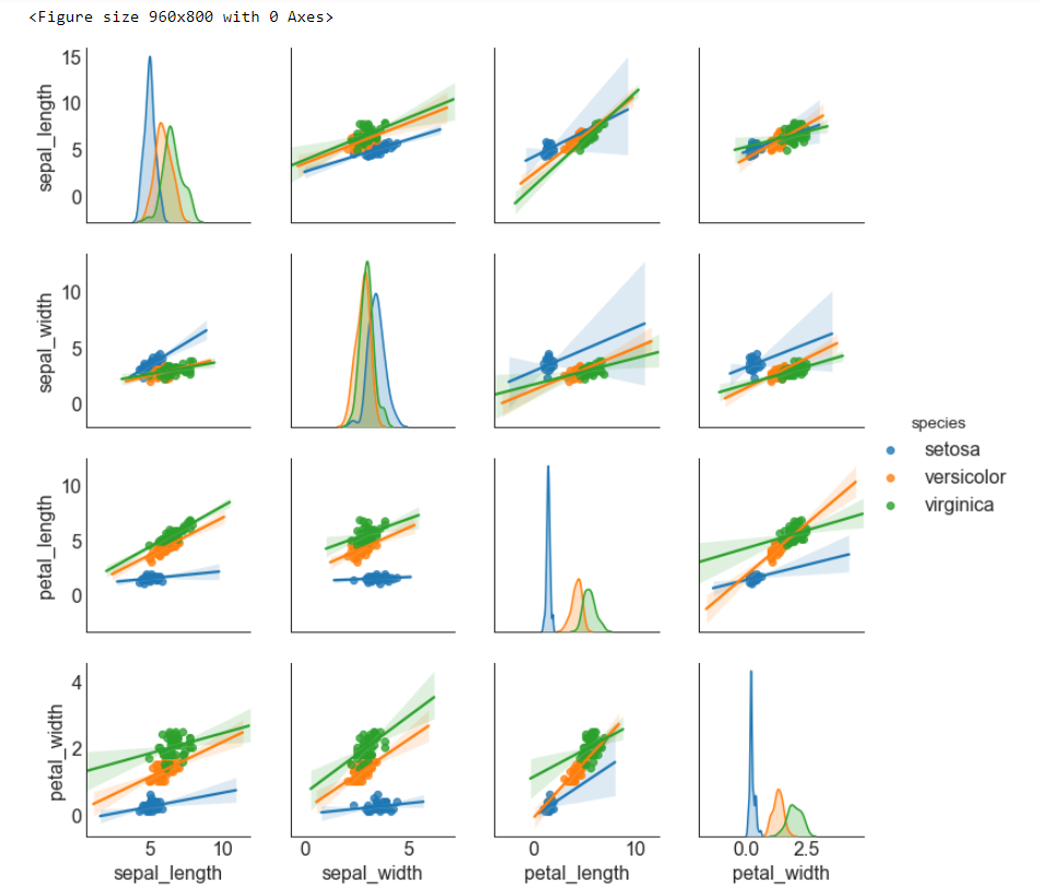
    # 矩阵图(带有拟合线的散点图)

sns.pairplot(df,                                     # 使用的数据

            kind = 'reg',                            # 绘制图像的类型_reg

            hue = 'species')                         # 类别的列,让不同类别具有不谈的颜色
博文总结
seaborn.pairplot
seaborn.pairplot(data, hue=None, hue_order=None,
 palette=None, vars=None, x_vars=None, y_vars=None, kind='scatter',
diag_kind='auto', markers=None, height=2.5, aspect=1,
dropna=True, plot_kws=None, diag_kws=None, grid_kws=None, size=None)
Plot pairwise relationships in a dataset.
By default, this function will create a grid of Axes such that each variable in data will by shared in the y-axis across a single row and in the x-axis across a single column.
The diagonal Axes are treated differently, drawing a plot to show the univariate distribution of the data for the variable in that column.
It is also possible to show a subset of variables or plot different variables on the rows and columns.
This is a high-level interface for PairGrid that is intended to make it easy to draw a few common styles. You should use PairGriddirectly if you need more flexibility.
参数:data:DataFrame
Tidy (long-form) dataframe where each column is a variable and each row is an observation.
hue:string (variable name), optional
Variable in
datato map plot aspects to different colors.
hue_order:list of strings
Order for the levels of the hue variable in the palette
palette:dict or seaborn color palette
Set of colors for mapping the
huevariable. If a dict, keys should be values in thehuevariable.
vars:list of variable names, optional
Variables within
datato use, otherwise use every column with a numeric datatype.
{x, y}_vars:lists of variable names, optional
Variables within
datato use separately for the rows and columns of the figure; i.e. to make a non-square plot.
kind:{‘scatter’, ‘reg’}, optional
Kind of plot for the non-identity relationships.
diag_kind:{‘auto’, ‘hist’, ‘kde’}, optional
Kind of plot for the diagonal subplots. The default depends on whether
"hue"is used or not.
markers:single matplotlib marker code or list, optional
Either the marker to use for all datapoints or a list of markers with a length the same as the number of levels in the hue variable so that differently colored points will also have different scatterplot markers.
height:scalar, optional
Height (in inches) of each facet.
aspect:scalar, optional
Aspect * height gives the width (in inches) of each facet.
dropna:boolean, optional
Drop missing values from the data before plotting.
{plot, diag, grid}_kws:dicts, optional
Dictionaries of keyword arguments.
返回值:grid:PairGrid
Returns the underlying
PairGridinstance for further tweaking.
seaborn.load_dataset
seaborn.load_dataset(name, cache=True, data_home=None, **kws)
从在线库中获取数据集(需要联网)。
参数:name:字符串
数据集的名字 (<cite>name</cite>.csv on https://github.com/mwaskom/seaborn-data)。 您可以通过
get_dataset_names()获取可用的数据集。
cache:boolean, 可选
如果为True,则在本地缓存数据并在后续调用中使用缓存。
data_home:string, 可选
用于存储缓存数据的目录。 默认情况下使用 ~/seaborn-data/
kws:dict, 可选
传递给 pandas.read_csv
数据可视化实例(十一): 矩阵图(matplotlib,pandas)的更多相关文章
- 【Matplotlib】数据可视化实例分析
数据可视化实例分析 作者:白宁超 2017年7月19日09:09:07 摘要:数据可视化主要旨在借助于图形化手段,清晰有效地传达与沟通信息.但是,这并不就意味着数据可视化就一定因为要实现其功能用途而令 ...
- 数据可视化实例(十四):面积图 (matplotlib,pandas)
偏差 (Deviation) 面积图 (Area Chart) 通过对轴和线之间的区域进行着色,面积图不仅强调峰和谷,而且还强调高点和低点的持续时间. 高点持续时间越长,线下面积越大. https:/ ...
- 数据可视化实例(三): 散点图(pandas,matplotlib,numpy)
关联 (Correlation) 关联图表用于可视化2个或更多变量之间的关系. 也就是说,一个变量如何相对于另一个变化. 散点图(Scatter plot) 散点图是用于研究两个变量之间关系的经典的和 ...
- seaborn线性关系数据可视化:时间线图|热图|结构化图表可视化
一.线性关系数据可视化lmplot( ) 表示对所统计的数据做散点图,并拟合一个一元线性回归关系. lmplot(x, y, data, hue=None, col=None, row=None, p ...
- seaborn分布数据可视化:直方图|密度图|散点图
系统自带的数据表格(存放在github上https://github.com/mwaskom/seaborn-data),使用时通过sns.load_dataset('表名称')即可,结果为一个Dat ...
- 数据可视化实例(十四):带标记的发散型棒棒糖图 (matplotlib,pandas)
偏差 (Deviation) 带标记的发散型棒棒糖图 (Diverging Lollipop Chart with Markers) 带标记的棒棒糖图通过强调您想要引起注意的任何重要数据点并在图表中适 ...
- 数据可视化实例(十七):包点图 (matplotlib,pandas)
排序 (Ranking) 包点图 (Dot Plot) 包点图表传达了项目的排名顺序,并且由于它沿水平轴对齐,因此您可以更容易地看到点彼此之间的距离. https://datawhalechina.g ...
- 数据可视化实例(九): 边缘箱形图(matplotlib,pandas)
https://datawhalechina.github.io/pms50/#/chapter7/chapter7 边缘箱形图 (Marginal Boxplot) 边缘箱图与边缘直方图具有相似的用 ...
- 数据可视化实例(七): 计数图(matplotlib,pandas)
https://datawhalechina.github.io/pms50/#/chapter5/chapter5 计数图 (Counts Plot) 避免点重叠问题的另一个选择是增加点的大小,这取 ...
随机推荐
- group by <grouping sets(...) ><cube(...)>
GROUP BY GROUPING SETS() 后面将还会写学习 with cube, with rollup,以及将它们转换为标准的GROUP BY的子句GROUP SET(), CU ...
- 2020年最新78道JVM面试题总结(含答案解析和思维导图)
前言 关于JVM系列面试知识点总结了一个思维导图,分享给大家 1.java中会存在内存泄漏吗,请简单描述. 会.自己实现堆载的数据结构时有可能会出现内存泄露. 2.64 位 JVM 中,int 的长度 ...
- Nginx安装配置介绍(二)
一:Nginx安装(Windows) 官网地址:https://nginx.org/en/download.html 解压完成后,文件目录如下: 启动Nginx: 直接双击目录下的nginx.exe, ...
- Java深拷贝和浅拷贝的区别
浅拷贝 被复制的对象的所有的变量都与原对象有相同的值,而所有的引用对象仍然指向原来的对象.换言之,浅拷贝 不复制引用对象. 1 class Experience { 2 private String ...
- c语音学习笔记
1.学习教程参考了杨光福 android jni Android视频<JNI> http://edu.csdn.net/course/detail/3235/54186?auto_star ...
- AbstractQueuedSynchronizer和ReentranLock基本原理
先把我主要学习参考的文章放上来先,这篇文章讲的挺好的,分析比较到位,最好是先看完这篇文章,在接下去看我写的.不然你会一脸懵逼,不过等你看完这篇文章,可能我的文章对你也用途不大了 深入分析Abstrac ...
- 入门大数据---Sqoop简介与安装
一.Sqoop 简介 Sqoop 是一个常用的数据迁移工具,主要用于在不同存储系统之间实现数据的导入与导出: 导入数据:从 MySQL,Oracle 等关系型数据库中导入数据到 HDFS.Hive.H ...
- 入门大数据---Anaconda安装
1. 什么是Anaconda? Anaconda是一个开源的Python发行版本,python是一个编译器,如果不使用Anaconda那么安装起来会比较痛苦,各个库之间的依赖性就很难连接的很好.Ana ...
- Redis高级特性
redis的事务(transaction) 转载:https://blog.csdn.net/fmwind/article/details/78065236 redis中的事务是一组命令的集合.事务同 ...
- caffe的python接口学习(3)训练模型training
如果不进行可视化,只想得到一个最终的训练model, 那么代码非常简单,如下 : import caffe caffe.set_device(0) caffe.set_mode_gpu() solve ...