python 生成图表
python写入excel(xlswriter)--生成图表
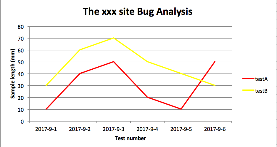
折线图
# -*- coding:utf-8 -*-

import xlsxwriter

# 创建一个excel

workbook = xlsxwriter.Workbook("chart_line.xlsx")

# 创建一个sheet

worksheet = workbook.add_worksheet()

# worksheet = workbook.add_worksheet("bug_analysis")

# 自定义样式,加粗

bold = workbook.add_format({'bold': 1})

# --------1、准备数据并写入excel---------------

# 向excel中写入数据,建立图标时要用到

headings = ['Number', 'testA', 'testB']

data = [

    ['2017-9-1', '2017-9-2', '2017-9-3', '2017-9-4', '2017-9-5', '2017-9-6'],

    [10, 40, 50, 20, 10, 50],

    [30, 60, 70, 50, 40, 30],

]

# 写入表头

worksheet.write_row('A1', headings, bold)

# 写入数据

worksheet.write_column('A2', data[0])

worksheet.write_column('B2', data[1])

worksheet.write_column('C2', data[2])

# --------2、生成图表并插入到excel---------------

# 创建一个柱状图(line chart)

chart_col = workbook.add_chart({'type': 'line'})

# 配置第一个系列数据

chart_col.add_series({

    # 这里的sheet1是默认的值,因为我们在新建sheet时没有指定sheet名

    # 如果我们新建sheet时设置了sheet名,这里就要设置成相应的值

    'name': '=Sheet1!$B$1',

    'categories': '=Sheet1!$A$2:$A$7',

    'values':   '=Sheet1!$B$2:$B$7',

    'line': {'color': 'red'},

})

# 配置第二个系列数据

chart_col.add_series({

    'name': '=Sheet1!$C$1',

    'categories':  '=Sheet1!$A$2:$A$7',

    'values':   '=Sheet1!$C$2:$C$7',

    'line': {'color': 'yellow'},

})

# 配置第二个系列数据(用了另一种语法)

# chart_col.add_series({

#     'name': ['Sheet1', 0, 2],

#     'categories': ['Sheet1', 1, 0, 6, 0],

#     'values': ['Sheet1', 1, 2, 6, 2],

#     'line': {'color': 'yellow'},

# })

# 设置图表的title 和 x,y轴信息

chart_col.set_title({'name': 'The xxx site Bug Analysis'})

chart_col.set_x_axis({'name': 'Test number'})

chart_col.set_y_axis({'name':  'Sample length (mm)'})

# 设置图表的风格

chart_col.set_style(1)

# 把图表插入到worksheet并设置偏移

worksheet.insert_chart('A10', chart_col, {'x_offset': 25, 'y_offset': 10})

workbook.close()
柱状图:
# -*- coding:utf-8 -*-

import xlsxwriter

# 创建一个excel

workbook = xlsxwriter.Workbook("chart_column.xlsx")

# 创建一个sheet

worksheet = workbook.add_worksheet()

# worksheet = workbook.add_worksheet("bug_analysis")

# 自定义样式,加粗

bold = workbook.add_format({'bold': 1})

# --------1、准备数据并写入excel---------------

# 向excel中写入数据,建立图标时要用到

headings = ['Number', 'testA', 'testB']

data = [

    ['2017-9-1', '2017-9-2', '2017-9-3', '2017-9-4', '2017-9-5', '2017-9-6'],

    [10, 40, 50, 20, 10, 50],

    [30, 60, 70, 50, 40, 30],

]

# 写入表头

worksheet.write_row('A1', headings, bold)

# 写入数据

worksheet.write_column('A2', data[0])

worksheet.write_column('B2', data[1])

worksheet.write_column('C2', data[2])

# --------2、生成图表并插入到excel---------------

# 创建一个柱状图(column chart)

chart_col = workbook.add_chart({'type': 'column'})

# 配置第一个系列数据

chart_col.add_series({

    # 这里的sheet1是默认的值,因为我们在新建sheet时没有指定sheet名

    # 如果我们新建sheet时设置了sheet名,这里就要设置成相应的值

    'name': '=Sheet1!$B$1',

    'categories': '=Sheet1!$A$2:$A$7',

    'values':   '=Sheet1!$B$2:$B$7',

    'line': {'color': 'red'},

})

# 配置第二个系列数据(用了另一种语法)

chart_col.add_series({

    'name': '=Sheet1!$C$1',

    'categories':  '=Sheet1!$A$2:$A$7',

    'values':   '=Sheet1!$C$2:$C$7',

    'line': {'color': 'yellow'},

})

# 配置第二个系列数据(用了另一种语法)

# chart_col.add_series({

#     'name': ['Sheet1', 0, 2],

#     'categories': ['Sheet1', 1, 0, 6, 0],

#     'values': ['Sheet1', 1, 2, 6, 2],

#     'line': {'color': 'yellow'},

# })

# 设置图表的title 和 x,y轴信息

chart_col.set_title({'name': 'The xxx site Bug Analysis'})

chart_col.set_x_axis({'name': 'Test number'})

chart_col.set_y_axis({'name':  'Sample length (mm)'})

# 设置图表的风格

chart_col.set_style(1)

# 把图表插入到worksheet以及偏移

worksheet.insert_chart('A10', chart_col, {'x_offset': 25, 'y_offset': 10})

workbook.close()
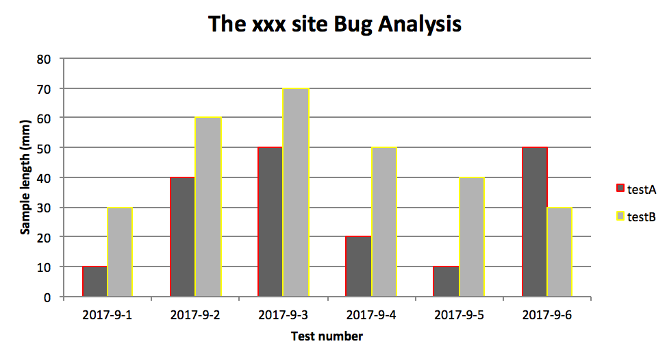
效果图
PS:
其实前面两个图只变动一点:把 line 个性为 column
chart_col = workbook.add_chart({'type': 'column'})
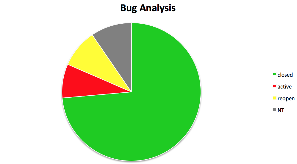
三、饼图:

# -*- coding:utf-8 -*-

import xlsxwriter

# 创建一个excel

workbook = xlsxwriter.Workbook("chart_pie.xlsx")

# 创建一个sheet

worksheet = workbook.add_worksheet()

# 自定义样式,加粗

bold = workbook.add_format({'bold': 1})

# --------1、准备数据并写入excel---------------

# 向excel中写入数据,建立图标时要用到

data = [

    ['closed', 'active', 'reopen', 'NT'],

    [1012, 109, 123, 131],

]

# 写入数据

worksheet.write_row('A1', data[0], bold)

worksheet.write_row('A2', data[1])

# --------2、生成图表并插入到excel---------------

# 创建一个柱状图(pie chart)

chart_col = workbook.add_chart({'type': 'pie'})

# 配置第一个系列数据

chart_col.add_series({

    'name': 'Bug Analysis',

    'categories': '=Sheet1!$A$1:$D$1',

    'values': '=Sheet1!$A$2:$D$2',

    'points': [

        {'fill': {'color': '#00CD00'}},

        {'fill': {'color': 'red'}},

        {'fill': {'color': 'yellow'}},

        {'fill': {'color': 'gray'}},

    ],

})

# 设置图表的title 和 x,y轴信息

chart_col.set_title({'name': 'Bug Analysis'})

# 设置图表的风格

chart_col.set_style(10)

# 把图表插入到worksheet以及偏移

worksheet.insert_chart('B10', chart_col, {'x_offset': 25, 'y_offset': 10})

workbook.close()
效果图:
参考资料:
http://xlsxwriter.readthedocs.io/chart_examples.html
http://xlsxwriter.readthedocs.io/chart.html
python 生成图表的更多相关文章
- python xlsxwriter库生成图表的应用
xlsxwriter可能用过的人并不是很多,不过使用后就会感觉,他的功能让你叹服,除了可以按要求生成你所需要的excel外 还可以加上很形象的各种图,比如柱状图.饼图.折线图等. 请看本人生成的: 这 ...
- 【python】使用plotly生成图表数据
安装 在 ubuntu 环境下,安装 plotly 很简单 python 版本2.7+ pip install plotly 绘图 在 plotly 网站注册后,可以直接将生成的图片保存到网站上,便于 ...
- python写入excel(xlswriter)--生成图表
一.折线图: # -*- coding:utf-8 -*- import xlsxwriter # 创建一个excel workbook = xlsxwriter.Workbook("cha ...
- python生成Excel图表(通过xlsxwriter)
前面介绍了pandas的简单用法,pandas的数据可以通过matlab第三方包将数据生成报表,但是我想将报表生成在Excel中,这时候就可以借助xlsxwriter第三方包来生成图标 缺点:xl ...
- JavaScript 解析 Django Python 生成的 datetime 数据 时区问题解决
JavaScript 解析 Django/Python 生成的 datetime 数据 当Web后台使用Django时,后台生成的时间数据类型就是Python类型的. 项目需要将几个时间存储到数据库中 ...
- 关于使用FusionCharts生成图表时出现invalid xml data错误提示的解决方法
FusionCharts的确功能是够强大的.收集的功能估计更强大.在初次使用时,对着手册,一步一步操作,就是生成图表工具不成功.一直报"Invalid xml data"错误.后面 ...
- Python 绘制图表之我见 ---一个java程序员的看法
---------------- 环境: win 10 . python3.5 https://github.com/Leechen2014/1400OS_01_Codes/blob/master/ ...
- [转] C#操作EXCEL,生成图表的全面应用
gailzhao 原文 关于C#操作EXCEL,生成图表的全面应用 近来我在开发一个运用C#生成EXCEL文档的程序,其中要根据数据生成相应的图表,该图表对颜色和格式都有严格的要求,在百度和谷歌中搜索 ...
- 【python】【转】Python生成随机数的方法
如果你对在Python生成随机数与random模块中最常用的几个函数的关系与不懂之处,下面的文章就是对Python生成随机数与random模块中最常用的几个函数的关系,希望你会有所收获,以下就是这篇文 ...
随机推荐
- GPUImage API文档之GLProgram类
GLProgram是GPUImage中代表openGL ES 中的program,具有glprogram功能. 属性 @property(readwrite, nonatomic) BOOL init ...
- Android Volley 库的使用
本文内容 什么是 Volley 库 Volley 能做什么 Volley 架构 环境 演示 Volley 库的使用 参考资料 Android 关于网络操作一般都会介绍 HttpClient 以及 Ht ...
- JQuery为textarea添加maxlength
<html> <head> <title>JQuery为textarea添加maxlength</title> <script type=&quo ...
- 使用Newtonsoft进行JSON序列化时将枚举序列化为字符串的方法
一.实体书写 将枚举类型的属性前面加上[JsonConverter(typeof(StringEnumConverter))]即可. 二.举例 [JsonConverter(typeof(String ...
- Android StageFrightMediaScanner源码解析
1. 简单介绍 Android中在StageFrightMediaScanner实现对多媒体文件的处理. 此外在StageFrightMediaScanner定义了支持的多媒体文件类型. 文件位置 f ...
- 从头认识Spring-1.14 SpEl表达式(1)-简单介绍与嵌入值
这一章节我们来讨论一下SpEl表达式的简单介绍与嵌入值. 1.SpEl表达式简单介绍 Spring Excpression Language (SpEL)语言支持在执行时操作和查询对象 事实上就是在执 ...
- [转]jquery设置select选中,赋值等操作
一.基础取值问题 例如<select class="selector"></select> 1.设置value为pxx的项选中 $(".selec ...
- JAVA内存模型及垃圾回收自我总结
本文为原创,根据<深入理解java虚拟机>和自己的一些理解进行整理,单纯和看其他人的博客感觉不如自己一点点的画和记录来的印象深刻. JAVA内存模型: 上图中:局部变量表所需的内存在编译期 ...
- 利用JQuery 来操作 ListBox和ListBox内移动
[导读]利用jquery 来操作 listbox和listbox内移动function listbox_move(listfrom,listto) { var size = $(" &quo ...
- JUC-线程池
一,问题 在没有使用线程池的时候,每次需要一个线程都得手动new Thread()方式创建线程,用完了再销毁. 我们使用线程的时候就去创建一个线程,这样实现起来非常简便,但是就会有一个问题: 如果并发 ...