《Python数据可视化之matplotlib实践》 源码 第三篇 演练 第九章
图 9.1
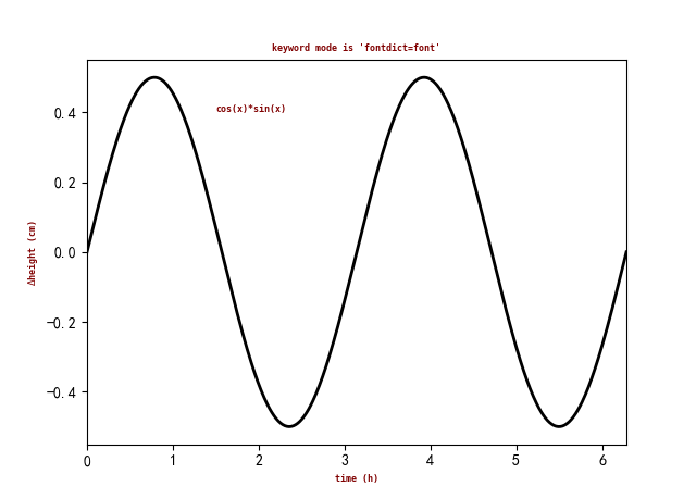


import matplotlib.pyplot as plt

import numpy as np

fig=plt.figure()

ax=fig.add_subplot(111)

font={"family":"monospace", "color":"maroon", "weight":"bold", "size":6}

x=np.linspace(0.0, 2*np.pi, 500)

y=np.cos(x)*np.sin(x)

ax.plot(x, y, color="k", ls="-", lw=2)

ax.set_title("keyword mode is 'fontdict=font'", fontdict=font)

ax.text(1.5, 0.4, "cos(x)*sin(x)", fontdict=font)

ax.set_xlabel("time (h)", **font)

ax.set_ylabel(r"$\Delta$height (cm)", **font)

ax.set_xlim(0, 2*np.pi)

plt.show()
=============================================
图 9.2
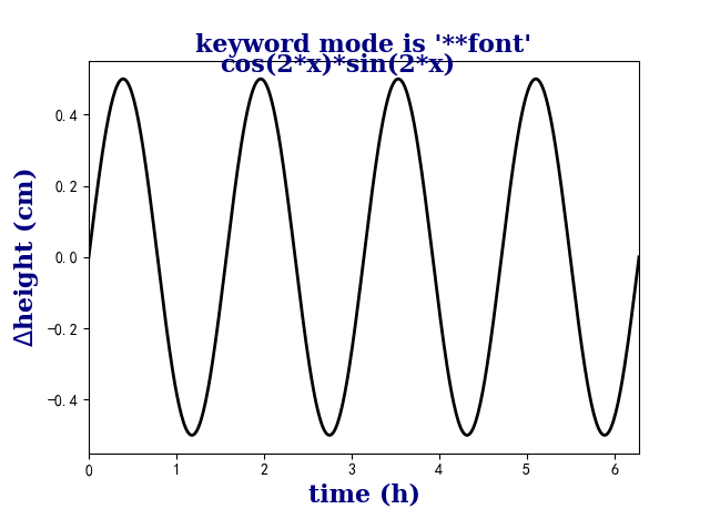
import matplotlib.pyplot as plt

import numpy as np

fig=plt.figure()

ax=fig.add_subplot(111)

font={"family":"serif", "color":"navy", "weight":"black", "size":16}

x=np.linspace(0.0, 2*np.pi, 500)

y=np.cos(2*x)*np.sin(2*x)

ax.plot(x, y, color="k", ls="-", lw=2)

ax.set_title("keyword mode is '**font'", **font)

ax.text(1.5, 0.52, "cos(2*x)*sin(2*x)", **font)

ax.set_xlabel("time (h)", **font)

ax.set_ylabel(r"$\Delta$height (cm)", **font)

ax.set_xlim(0, 2*np.pi)

plt.show()
=============================================
图 9.3

import matplotlib.pyplot as plt

import numpy as np

font=dict(family="serif", color="navy", weight="black", size=16)

color="skyblue"

linewidth=3

fig=plt.figure()

ax=fig.add_subplot(111)

linestyleList=["-", "--", "-.", ":"]

x=np.arange(1, 11, 1)

y=np.linspace(1, 1, 10)

ax.text(4, 4.0, "line styles", **font)

for i, ls in enumerate(linestyleList):

    ax.text(0, i+0.5, "'{}'".format(ls), **font)

    ax.plot(x, (i+0.5)*y, linestyle=ls, color=color, linewidth=linewidth)

ax.set_xlim(-1, 11)

ax.set_ylim(0, 4.5)

ax.margins(0.2)

ax.set_xticks([])

ax.set_yticks([])

plt.show()
=============================================
图 9.4
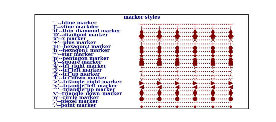
import matplotlib.pyplot as plt

import numpy as np

font_style=dict(family="serif", color="navy", weight="black", size=12)

line_marker_style=dict(linestyle=":", linewidth=2, color="maroon", markersize=10)

fig=plt.figure()

ax=fig.add_subplot(111)

msNameList=["'.'--point marker", "','--piexel marker", "'o'--circle marker",

            "'v'--triangle_down_marker", "'^'--triangle_up marker",

            "'<'--triangle_left marker", "'>'--triangle_right marker",

            "'1'--tri_down marker", "'2'--tri_up marker", "'3'--tri_left marker",

            "'4'--tri_right marker", "'s'--square marker", "'p'--pentagon marker",

            "'*'--star marker", "'h'--hexagon1 marker", "'H'--hexagon2 marker",

            "'+'--plus marker", "'x'--x marker", "'D'--diamond marker", "'d'--thin_diamond marker",

            "'|'--vline markder", "'_'--hline marker"]

markerstyleList=['.', ',', 'o', 'v', '^', '<', '>', '1', '2', '3', '4', 's', 'p', '*', 'h', 'H',

                 '+', 'x', 'D', 'd', '|', '_']

x=np.arange(5, 11, 1)

y=np.linspace(1, 1, 6)

ax.text(4, 23, "marker styles", **font_style)

for i, ms in enumerate(markerstyleList):

    ax.text(0, i+0.5, msNameList[i], **font_style)

    ax.plot(x, (i+0.5)*y, marker=ms, **line_marker_style)

ax.set_xlim(-1, 11)

ax.set_ylim(0, 24)

ax.margins(0.3)

ax.set_xticks([])

ax.set_yticks([])

plt.show()
=============================================
图 9.5

import matplotlib as mpl

import matplotlib.pyplot as plt

import numpy as np

mpl.rcParams["font.sans-serif"]=["SimHei"]

mpl.rcParams["axes.unicode_minus"]=False

x=np.arange(1, 13, 1)

y=np.array([12, 34, 22, 30, 18, 13, 15, 19, 24, 28, 23, 27])

fig, ax = plt.subplots(2, 2)

ax[0, 0].scatter(x, y*1.5, marker=r"$\clubsuit$", c="#fb8072", s=500)

ax[0, 0].locator_params(axis="x", tight=True, nbins=11)

ax[0, 0].set_xlim(0, 13)

ax[0, 0].set_xticks(x)

ax[0, 0].set_title('显示样式 “%s” 的散点图' % r"$\clubsuit$")

ax[0, 1].scatter(x, y-2, marker=r"$\heartsuit$", s=500)

ax[0, 1].locator_params(axis="x", tight=True, nbins=11)

ax[0, 1].set_xlim(0, 13)

ax[0, 1].set_xticks(x)

ax[0, 1].set_title('显示样式 “%s” 的散点图' % r"$\heartsuit$")

ax[1, 0].scatter(x, y+7, marker=r"$\diamondsuit$", c="#fb8072", s=500)

ax[1, 0].locator_params(axis="x", tight=True, nbins=11)

ax[1, 0].set_xlim(0, 13)

ax[1, 0].set_xticks(x)

ax[1, 0].set_title('显示样式 “%s” 的散点图' % r"$\diamondsuit$")

ax[1, 1].scatter(x, y-9, marker=r"$\spadesuit$", c="#8dd3c7", s=500)

ax[1, 1].locator_params(axis="x", tight=True, nbins=11)

ax[1, 1].set_xlim(0, 13)

ax[1, 1].set_xticks(x)

ax[1, 1].set_title('显示样式 “%s” 的散点图' % r"$\spadesuit$")

plt.suptitle("不同原始字符串作为标记类型的展示效果", fontsize=16, weight="black")

plt.show()
=============================================
图 9.6
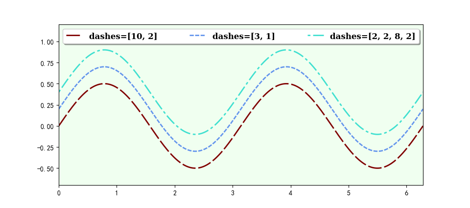
import matplotlib.pyplot as plt

import numpy as np

font_style=dict(family="serif", weight="black", size=12)

line_marker_style1=dict(linestyle="--", linewidth=2, color="maroon", markersize=10)

line_marker_style2=dict(linestyle="--", linewidth=2, color="cornflowerblue", markersize=10)

line_marker_style3=dict(linestyle="--", linewidth=2, color="turquoise", markersize=10)

fig=plt.figure()

ax=fig.add_subplot(111, facecolor="honeydew")

x=np.linspace(0, 2*np.pi, 500)

y=np.sin(x)*np.cos(x)

ax.plot(x, y, dashes=[10, 2], label="dashes=[10, 2]", **line_marker_style1)

ax.plot(x, y+0.2, dashes=[3, 1], label="dashes=[3, 1]", **line_marker_style2)

ax.plot(x, y+0.4, dashes=[2, 2, 8, 2], label="dashes=[2, 2, 8, 2]", **line_marker_style3)

ax.axis([0, 2*np.pi, -0.7, 1.2])

ax.legend(ncol=3, bbox_to_anchor=(0.00, 0.95, 1.0, 0.05), mode="expand",

          fancybox=True, shadow=True, prop=font_style)

plt.show()
=============================================
图 9.7
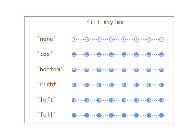
import matplotlib.pyplot as plt

import numpy as np

font_style=dict(family="sans-serif", color="saddlebrown", weight="semibold", size=16)

line_marker_style=dict(linestyle=":", linewidth=2, color="cornflowerblue",

                        markerfacecoloralt="lightgrey", marker="o", markersize=10)

fig=plt.figure()

ax=fig.add_subplot(111)

fillstyleList=["full", "left", "right", "bottom", "top", "none"]

x=np.arange(3, 11, 1)

y=np.linspace(1, 1, 8)

ax.text(4, 6.5, "fill styles", **font_style)

for i, fs in enumerate(fillstyleList):

    ax.text(0, i+0.4, "'{}'".format(fs), **font_style)

    ax.plot(x, (i+0.5)*y, fillstyle=fs, **line_marker_style)

ax.set_xlim(-1, 11)

ax.set_ylim(0, 7)

ax.margins(0, 3)

ax.set_xticks([])

ax.set_yticks([])

plt.show()
=============================================
《Python数据可视化之matplotlib实践》 源码 第三篇 演练 第九章的更多相关文章
- Python数据可视化——使用Matplotlib创建散点图
Python数据可视化——使用Matplotlib创建散点图 2017-12-27 作者:淡水化合物 Matplotlib简述: Matplotlib是一个用于创建出高质量图表的桌面绘图包(主要是2D ...
- python 数据可视化(matplotlib)
matpotlib 官网 :https://matplotlib.org/index.html matplotlib 可视化示例:https://matplotlib.org/gallery/inde ...
- Python数据可视化库-Matplotlib(一)
今天我们来学习一下python的数据可视化库,Matplotlib,是一个Python的2D绘图库 通过这个库,开发者可以仅需要几行代码,便可以生成绘图,直方图,功率图,条形图,错误图,散点图等等 废 ...
- Python数据可视化之Matplotlib实现各种图表
数据分析就是将数据以各种图表的形式展现给领导,供领导做决策用,因此熟练掌握饼图.柱状图.线图等图表制作是一个数据分析师必备的技能.Python有两个比较出色的图表制作框架,分别是Matplotlib和 ...
- 机器学习-数据可视化神器matplotlib学习之路(三)
之前学习了一些通用的画图方法和技巧,这次就学一下其它各种不同类型的图.好了先从散点图开始,上代码: from matplotlib import pyplot as plt import numpy ...
- Python数据可视化利器Matplotlib,绘图入门篇,Pyplot介绍
Pyplot matplotlib.pyplot是一个命令型函数集合,它可以让我们像使用MATLAB一样使用matplotlib.pyplot中的每一个函数都会对画布图像作出相应的改变,如创建画布.在 ...
- Python数据可视化库-Matplotlib(二)
我们接着上次的继续讲解,先讲一个概念,叫子图的概念. 我们先看一下这段代码 import matplotlib.pyplot as plt fig = plt.figure() ax1 = fig.a ...
- Python数据可视化之matplotlib
常用模块导入 import numpy as np import matplotlib import matplotlib.mlab as mlab import matplotlib.pyplot ...
- python数据可视化(matplotlib)
- python数据可视化-matplotlib入门(7)-从网络加载数据及数据可视化的小总结
除了从文件加载数据,另一个数据源是互联网,互联网每天产生各种不同的数据,可以用各种各样的方式从互联网加载数据. 一.了解 Web API Web 应用编程接口(API)自动请求网站的特定信息,再对这些 ...
随机推荐
- python 如何判断一组数呈上升还是下降趋势
1. python 判断一组数呈上升还是下降趋势的方法 要判断一组数(数列)是呈上升趋势.下降趋势还是无明显趋势,我们可以比较数列中相邻元素的差值.如果大部分差值都是正数,则数列呈上升趋势:如果大部分 ...
- 23201826-熊锋-第二次blog
一.前言 这三次pta作业第一次为答题判断程序-4,这是答题判断程序的第三次迭代,相较于答题判断三,新增了各种题型及其不同种类的答案,并且出现多选题,使得这次题目相当棘手,具有很大的挑战性.第二次为家 ...
- C#.NET 操作FTP
工具类: using System; using System.Collections.Generic; using System.IO; using System.Net; namespace Co ...
- Vue学习:4.v-model使用
第一节算是对v-model的粗略了解,仅仅是将input的输入与Vue 实例的数据之间双向绑定.这一节将更详细的了解v-model在不同表单元素中的使用. v-model实例:找对象 实现功能: 使用 ...
- SpringMVC 流程?
a.用户发送请求至前端控制器 DispatcherServlet. b.DispatcherServlet 收到请求调用 HandlerMapping 处理器映射器. c.处理器映射器找到具体的处理器 ...
- springboot之日志配置-logback
springboot之日志配置-logback 1.为什么使用logback logback是springboot默认集成的,是基于Sl4J的日志框架. logback的内核重写了,使得在某些关键路径 ...
- window10 yapi安装 swagger配置 及 Error: getaddrinfo ENOTFOUND yapi.demo.qunar.com解决
node下载https://nodejs.org/download/release/v12.18.3/mongodb下载https://www.mongodb.com/try/download/ent ...
- Unity 罗技G29接入
Unity 罗技G29接入 unity g29unity logictech g29g29 Unity 罗技G29接入 一. 使用Unity Standard Assets中的CrossPlatfor ...
- 如何使用csproj构建C#源代码组件NuGet包?
一般我们构建传统的NuGet包,都是打包和分发dll程序集文件. 至于打包和分发C#源代码文件的做法,比较少见. 那么这种打包源代码文件的做法,有什么优点和缺点呢? 优点: 方便阅读源代码. 方便断点 ...
- JSONPATH-阿里和jayway的实现测试
业务业务的需要,所以想找一个从对象中获取属性的工具. 搜了搜发现由阿里和jayway的实现,又花费了一些时间了解和练习,总结了一些要点: 阿里的可能快一些,但考虑到完备性,也许选择jayway更好一些 ...