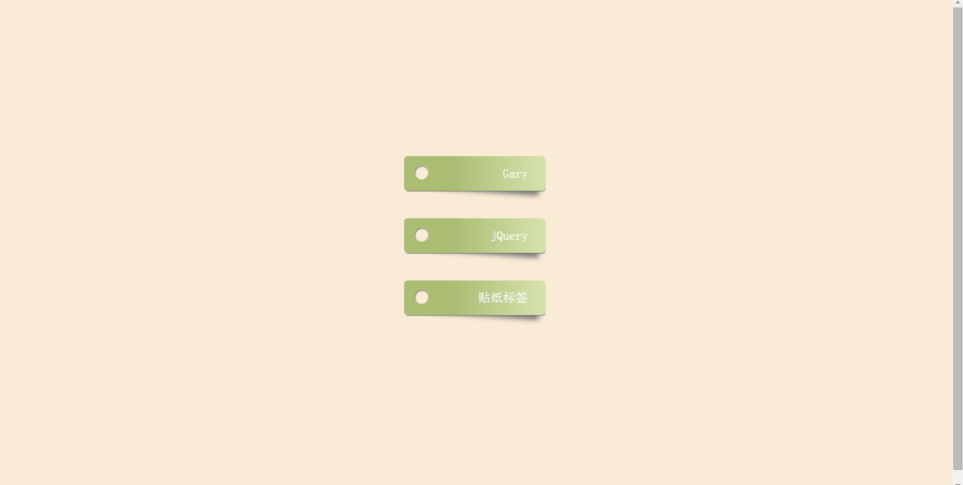
JS框架_(JQuery.js)带阴影贴纸标签按钮
百度云盘 传送门 密码:azo6
纯CSS带阴影贴纸标签按钮效果:
<!doctype html>

<html>

<head>

<meta charset="utf-8">

<title>CSS3带阴影贴纸标签按钮样式</title>

<style>

html {

  box-sizing: border-box;

  font: 18px PT Mono;

  background: antiquewhite;

}

*,

*::before,

*::after {

  box-sizing: inherit;

}

body {

  display: flex;

  align-items: center;

  justify-content: center;

  flex-direction: column;

  height: 100vh;

}

.box {

  width: 15%;

  min-width: 150px;

  display: block;

  height: 50px;

  position: relative;

  border-radius: 5px;

  background: linear-gradient(to right, #abbd73 35%, #d6e2ad 100%);

  margin-bottom: 40px;

  padding: 15px 25px 0 40px;

  color: darkslategray;

  box-shadow: 1px 2px 1px -1px #777;

  transition: background 200ms ease-in-out;

  text-align:right;

}

.box a{color:#fff;text-decoration:none;}

.shadow {

  position: relative;

}

.shadow:before {

  z-index: -1;

  position: absolute;

  content: "";

  bottom: 13px;

  right: 7px;

  width: 75%;

  top: 0;

  box-shadow: 0 15px 10px #777;

  -webkit-transform: rotate(4deg);

          transform: rotate(4deg);

  transition: all 150ms ease-in-out;

}

.box:hover {

  background: linear-gradient(to right, #abbd73 0%, #abbd73 100%);

}

.shadow:hover::before {

  -webkit-transform: rotate(0deg);

          transform: rotate(0deg);

  bottom: 20px;

  z-index: -10;

}

.circle {

  position: absolute;

  top: 14px;

  left: 15px;

  border-radius: 50%;

  box-shadow: inset 1px 1px 1px 0px rgba(0, 0, 0, 0.5), inset 0 0 0 25px antiquewhite;

  width: 20px;

  height: 20px;

  display: inline-block;

  text-align:right;

  padding:0 20px 0 0;

}

</style>

</head>

<body>

<div class="box shadow">

    <a href="#">Gary</a>

  <div class="circle"></div>

</div>

<div class="box shadow">

    <a href="#">jQuery</a>

  <div class="circle"></div>

</div>

<div class="box shadow">

    <a href="#">贴纸标签</a>

  <div class="circle"></div>

</div>

</div>

</body>

</html>
index.html
实现过程:
一、设置CSS样式
justify-content 用于设置或检索弹性盒子元素在主轴(横轴)方向上的对齐方式。

flex-start    默认值。项目位于容器的开头

flex-end    项目位于容器的结尾

center    项目位于容器的中心

space-between    项目位于各行之间留有空白的容器内

space-around    项目位于各行之前、之间、之后都留有空白的容器内
justify-content: center;
1、绘制标签盒子
.box {

  width: 15%;

  min-width: 150px;

  display: block;

  height: 50px;

  position: relative;

  border-radius: 5px;

  background: linear-gradient(to right, #abbd73 35%, #d6e2ad 100%);

  margin-bottom: 40px;

  padding: 15px 25px 0 40px;

  color: darkslategray;

  box-shadow: 1px 2px 1px -1px #777;

  transition: background 200ms ease-in-out;

  text-align:right;

}
min-width :设置元素的最小宽度。
border-radius:向 div 元素添加圆角边框
background: linear-gradient(direction, color-stop1, color-stop2, ...) 百度经验
linear-gradient(线性渐变)
radial-gradient(径向渐变)
direction:渐变方法
color-stop1, color-stop2:要呈现平稳过渡的颜色
margin-bottom :设置元素的下外边距
color: darkslategray;深石板灰......(英语差)
transition:鼠标碰到时触发过度动画 传送门
2、绘制盒子阴影
.shadow:before {

  z-index: -1;

  position: absolute;

  content: "";

  bottom: 13px;

  right: 7px;

  width: 75%;

  top: 0;

  box-shadow: 0 15px 10px #777;

  -webkit-transform: rotate(4deg);

          transform: rotate(4deg);

  transition: all 150ms ease-in-out;

}
z-index :设置元素的堆叠顺序。拥有更高堆叠顺序的元素总是会处于堆叠顺序较低的元素的前面
使得阴影位于标签按钮下方
bottom :规定盒子的底部边缘与阴影之间的偏移(调大了会有点丑∑(= = !))
transform: rotate(4deg)定义 2D 旋转4度
3、绘制标签圆角
.circle {

  position: absolute;

  top: 14px;

  left: 15px;

  border-radius: 50%;

  box-shadow: inset 1px 1px 1px 0px rgba(0, 0, 0, 0.5), inset 0 0 0 25px antiquewhite;

  width: 20px;

  height: 20px;

  display: inline-block;

  text-align:right;

  padding:0 20px 0 0;

}
border-radius:向标签添加圆角边框
antiquewhite颜色:古董白(石材百科说是中国产花岗岩!!!)上一张图
二、在Body中给“标签”添加CSS样式
<body>

<div class="box shadow">

    <a href="#">Gary</a>

<div class="circle"></div>

</div>

<div class="box shadow">

    <a href="#">jQuery</a>

  <div class="circle"></div>

</div>

<div class="box shadow">

    <a href="#">贴纸标签</a>

  <div class="circle"></div>

</div>

</div>

</body>
JS框架_(JQuery.js)带阴影贴纸标签按钮的更多相关文章
- JS框架_(JQuery.js)绚丽的3D星空动画
百度云盘: 传送门 密码:8ft8 绚丽的3D星空动画效果(纯CSS) (3D星空动画可以用作网页背景,Gary为文本文字) <!doctype html> <html lang=& ...
- JS框架_(JQuery.js)Tooltip弹出式按钮插件
百度云盘 传送门 密码:7eh5 弹出式按钮效果 <!DOCTYPE html> <html > <head> <meta charset="UTF ...
- JS框架_(JQuery.js)圆形多选菜单选项
百度云盘 传送门 密码:zb1c 圆形多选菜单选项效果: <!DOCTYPE html> <html lang="en" > <head> &l ...
- JS框架_(JQuery.js)夜晚天空满天星星闪烁动画
百度云盘 传送门 密码:xftr 满天星星闪烁动画效果: (可用星空动画来作为页面背景,白色文字改为文章或者其他的O(∩_∩)O) <!doctype html> <html> ...
- JS框架_(JQuery.js)文章全屏动画切换
百度云盘 传送门 密码:anap 文章全屏动画切换效果 <!doctype html> <html lang="zh"> <head> < ...
- JS框架_(JQuery.js)动画效果鼠标跟随
百度云盘 传送门 密码 :4n9u 火狐浏览器上纯CSS_动画效果鼠标跟随效果: (作者:lily_lcj 传送门) <!DOCTYPE html PUBLIC "-//W3C//DT ...
- JS框架_(JQuery.js)点赞按钮动画
百度云盘 传送门 密码: 0ihy 点赞按钮动画效果: (点击一次随机生成一颗小爱心,作为点赞动画~) <!doctype html> <html lang="en&quo ...
- JS框架_(JQuery.js)图片相册掀开切换效果
百度云盘 传送门 密码:y0dk 图片掀开切换效果: <!DOCTYPE html PUBLIC "-//W3C//DTD XHTML 1.0 Transitional//EN&quo ...
- JS框架_(JQuery.js)上传进度条
百度云盘 传送门 密码: 1pou 纯CSS上传进度条效果: <!DOCTYPE html PUBLIC "-//W3C//DTD XHTML 1.0 Transitional//EN ...
随机推荐
- c++学习笔记之类和对象(一、类定义)
类和对象是 C++ 的重要特性,它们使得 C++ 成为面向对象的编程语言. 类是创建对象的模板,一个类可以创建多个对象,每个对象都是类类型的一个变量:创建对象的过程也叫类的实例化.每个对象都是类的一个 ...
- git使用技巧集合(持续更新中)
git使用技巧集合(持续更新中) 在团队协作中,git.svn等工具是非常重要的,在此只记录一些git使用过程中遇到的问题以及解决方法,并且会持续更新. 1.git commit之后,还没push,如 ...
- 2019年8月23日 星期五(workerman和swoole的区别)
两个框架我都有用过,workerman用得更多些,这2个框架都很出名,它们的出现大大的提高了php的应用范围及知名度 workerman和swoole都是php socket 服务器框架,都支持长连接 ...
- GitHub从小白到熟悉<二>
创建 仓库
- solr学习笔记-入门
solr学习笔记 1.安装前准备 solr依赖java 8 运行环境,所以我们先安装java.如果没有java环境无法启动solr服务,并且会看到如下提示: [root@localhost solr- ...
- Adam作者大革新, 联合Hinton等人推出全新优化方法Lookahead
Adam作者大革新, 联合Hinton等人推出全新优化方法Lookahead 参与:思源.路.泽南 快来试试 Lookahead 最优化方法啊,调参少.收敛好.速度还快,大牛用了都说好. 最优化方 ...
- redis 学习(8)-- redis 客户端 -- Jedis
redis 客户端 -- Jedis 1. Jedis 直连 本质是 TCP 连接. 执行流程 创建Jedis对象 通过Jedis执行命令 返回Jedis执行结果 关闭Jedis连接 demo 要使用 ...
- [转] JAVA分为三个体系,JavaSE,JavaEE,JavaME(J2ME)的区别以及各个版
Java SE(JavaPlatform,Standard Edition).Java SE 以前称为 J2SE.它允许开发和部署在桌面.服务器.嵌入式环境和实时环境中使用的 Java 应用程 ...
- 使用QEMU模拟树莓派
QEMU上的树莓派 我们开始设置一个Lab VM.我们将使用Ubuntu并在其中模拟我们所需的ARM版本. 首先,获取最新的Ubuntu版本并在VM中运行它: https://www.ubuntu.c ...
- concurrent.futures:线程池,让你更加高效、并发的处理任务
并发任务池 concurrent.futures模块提供了使用工作线程或进程池运行任务的接口. 线程池和进程池的API是一致的,所以应用只需要做最小的修改就可以在线程和进程之间进行切换 这个模块提供了 ...