New UWP Community Toolkit - Carousel
概述
New UWP Community Toolkit V2.2.0 的版本发布日志中提到了 Carousel 的调整,本篇我们结合代码详细讲解 Carousel 的实现。
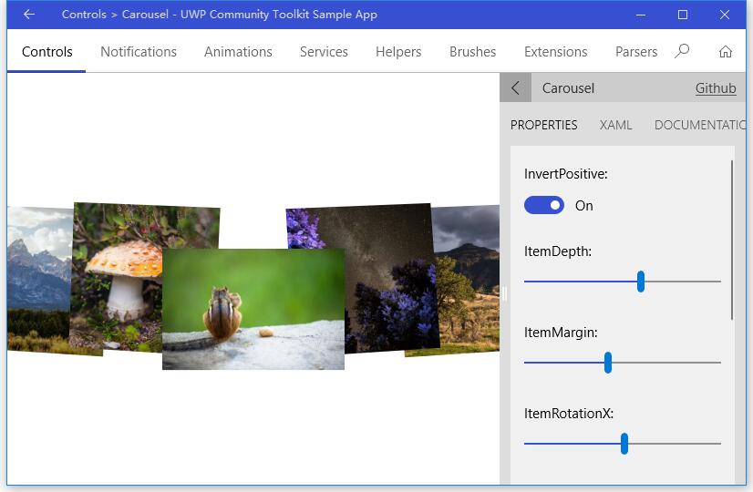
Carousel 是一种传送带形态的控件,在图片展示类的应用中有非常多的应用,它拥有很好的流畅度,可以做很多的自定义,并集成了鼠标,触摸板,键盘等的操作。我们来看一下官方的介绍和官网示例中的展示:
The
Carouselcontrol provides a new control, inherited from theItemsControl, representing a nice and smooth carousel.
This control lets you specify a lot of properties for a flexible layouting.
TheCarouselcontrol works fine with mouse, touch, mouse and keyboard as well.
Doc: https://docs.microsoft.com/zh-cn/windows/uwpcommunitytoolkit/controls/carousel
Namespace: Microsoft.Toolkit.Uwp.UI.Controls; Nuget: Microsoft.Toolkit.Uwp.UI.Controls;
开发过程
代码分析
先来看看 Carousel 的类结构组成:
- Carousel.cs - Carousel 控件类,继承自 ItemsControl
- Carousel.xaml - Carousel 的样式文件,包含了 Carousel,CarouselItem,CarouselPanel 的样式
- CarouselItem.cs - CarouselItem 是 Carousel 控件的列表中的选择器 ItemTemplate
- CarouselPanel.cs - CarouselPanel 是 Carousel 控件的 ItemPanelTemplate

下面来看一下几个主要类中的主要代码实现,因为篇幅关系,我们只摘录部分关键代码实现:
1. Carousel.cs
在具体分析代码前,我们先看看 Carousel 类的组成:
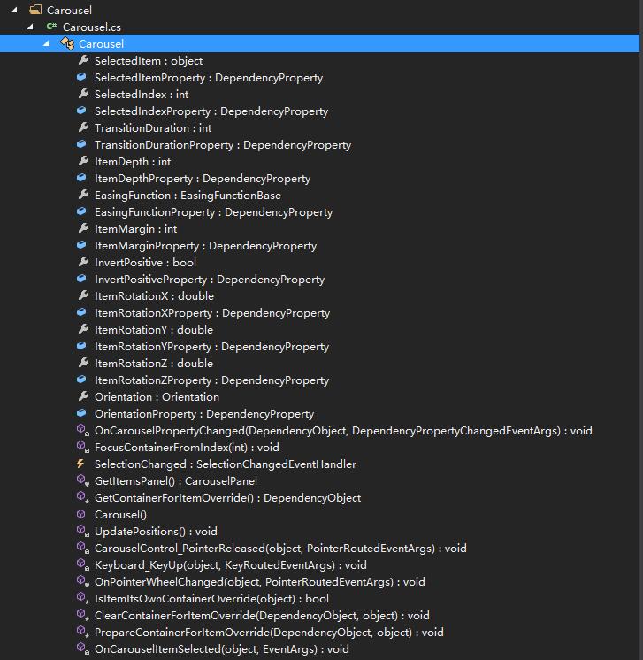
可以看到,作为一个集合类控件,Carousel 也注册了 SelectedItem 和 SelectedIndex 依赖属性,并且因为控件可以控制元素的深度,旋转角度,动画时长和类型,列表方向等,注册了 TransitionDuration,ItemDepth,EasingFunction,ItemMargin,ItemRotationX,Orientation 等依赖属性。而部分依赖属性的 PropertyChanged 事件由 OnCarouselPropertyChanged(d, e) 来实现;
下面来看一下 Carousel 类的构造方法:
构造方法中,首先设置了样式,Tab 导航模式;定义了鼠标滚轮,鼠标点击和键盘事件,并注册了数据源变化事件来得到正确的 SelectedItem 和 SelectedIndex。
public Carousel()
{
    // Set style
    DefaultStyleKey = typeof(Carousel);
    SetValue(AutomationProperties.NameProperty, "Carousel");
    IsHitTestVisible = true;

    IsTabStop = false;
    TabNavigation = KeyboardNavigationMode.Once;

    // Events registered
    PointerWheelChanged += OnPointerWheelChanged;
    PointerReleased += CarouselControl_PointerReleased;
    KeyDown += Keyboard_KeyUp;

    // Register ItemSource changed to get correct SelectedItem and SelectedIndex
    RegisterPropertyChangedCallback(ItemsSourceProperty, (d, dp) => { ... });
}
在键盘按键抬起的事件处理中,分别对应 Down,Up,Right 和 Left 做了处理,我们只截取了 Down 的处理过程;可以看到,如果列表方向为纵向,则 Down 按键会触发 SelectedIndex++,也就是当前选择项下移一位;对应其他三个按键也是类似的操作;OnPointerWheelChanged 的实现方式类似,这里不赘述;
private void Keyboard_KeyUp(object sender, KeyRoutedEventArgs e)
{
    switch (e.Key)
    {
        case Windows.System.VirtualKey.Down:
        case Windows.System.VirtualKey.GamepadDPadDown:
        case Windows.System.VirtualKey.GamepadLeftThumbstickDown:
            if (Orientation == Orientation.Vertical)
            {
                )
                {
                    SelectedIndex++;
                }
                else if (e.OriginalKey != Windows.System.VirtualKey.Down)
                {
                    FocusManager.TryMoveFocus(FocusNavigationDirection.Down);
                }

                e.Handled = true;
            }

            break;
        ...
    }
}
接着看一下 PrepareContainerForItemOverride(element, item) 方法,它为 Item 设置了初始的 3D 旋转的中心点,Item 变换的中心点;并根据当前选择项确定 Item 是否被选中;
protected override void PrepareContainerForItemOverride(DependencyObject element, object item)
{
    base.PrepareContainerForItemOverride(element, item);

    var carouselItem = (CarouselItem)element;
    carouselItem.Selected += OnCarouselItemSelected;

    carouselItem.RenderTransformOrigin = new Point(0.5, 0.5);

    carouselItem.IsTabStop = Items.IndexOf(item) == SelectedIndex;
    carouselItem.UseSystemFocusVisuals = true;

    PlaneProjection planeProjection = new PlaneProjection();
    planeProjection.CenterOfRotationX = 0.5;
    planeProjection.CenterOfRotationY = 0.5;
    planeProjection.CenterOfRotationZ = 0.5;

    var compositeTransform = new CompositeTransform();
    compositeTransform.CenterX = 0.5;
    compositeTransform.CenterY = 0.5;
    compositeTransform.CenterZ = 0.5;

    carouselItem.Projection = planeProjection;
    carouselItem.RenderTransform = compositeTransform;

    if (item == SelectedItem)
    {
        carouselItem.IsSelected = true;
    }
}
2. Carousel.xaml
如上面类结构介绍时所说,Carousel.xaml 是 Carousel 控件的样式文件;下面代码中我把非关键部分用 ‘...’ 代替了,可以看到,主要是两个部分的样式:CarouselItem 和 Carousel,CarouselPanel 作为 Carousel 的 ItemsPanelTemplate;Carousel 控件的 easing mode 是 'EaseOut'。
<ResourceDictionary xmlns="http://schemas.microsoft.com/winfx/2006/xaml/presentation"
                    xmlns:x="http://schemas.microsoft.com/winfx/2006/xaml"
                    xmlns:local="using:Microsoft.Toolkit.Uwp.UI.Controls">

    <Style TargetType="local:CarouselItem">
        <Setter Property="Template">
            <Setter.Value>
                <ControlTemplate TargetType="local:CarouselItem">
                    <Grid BorderBrush="{TemplateBinding BorderBrush}" BorderThickness="{TemplateBinding BorderThickness}" Background="{TemplateBinding Background}">
                        <VisualStateManager.VisualStateGroups>
                            ...
                        </VisualStateManager.VisualStateGroups>
                        <ContentPresenter .../>
                    </Grid>
                </ControlTemplate>
            </Setter.Value>
        </Setter>
    </Style>

    <Style TargetType="local:Carousel">
        <Setter Property="ItemsPanel">
            <Setter.Value>
                <ItemsPanelTemplate>
                    <local:CarouselPanel />
                </ItemsPanelTemplate>
            </Setter.Value>
        </Setter>
        <Setter Property="EasingFunction">
            <Setter.Value>
                <ExponentialEase EasingMode="EaseOut" />
            </Setter.Value>
        </Setter>
        <Setter Property="Template">
            <Setter.Value>
                <ControlTemplate TargetType="local:Carousel">
                    <Grid>
                        ...
                    </Grid>
                </ControlTemplate>
            </Setter.Value>
        </Setter>
    </Style>

</ResourceDictionary>
3. CarouselItem.cs
在前面 Carousel.xaml 中我们看到了 CarouselItem 的样式,有针对 VisualStateManager 的样式状态,而 CarouselItem 类则定义了这些状态变化事件对应的处理方法。分别有 OnIsSelectedChanged,OnPointerEntered,OnPointerExited 和 OnPointerPressed,在触发这些状态时,CarouselItem 会对应切换到那个状态时的样式。
public CarouselItem()
{
    // Set style
    DefaultStyleKey = typeof(CarouselItem);
    RegisterPropertyChangedCallback(SelectorItem.IsSelectedProperty, OnIsSelectedChanged);
}

protected override void OnPointerEntered(PointerRoutedEventArgs e) {...}

protected override void OnPointerExited(PointerRoutedEventArgs e) {...}

protected override void OnPointerPressed(PointerRoutedEventArgs e) {...}

internal event EventHandler Selected;

private void OnIsSelectedChanged(DependencyObject sender, DependencyProperty dp)
{
    var item = (CarouselItem)sender;

    if (item.IsSelected)
    {
        Selected?.Invoke(this, EventArgs.Empty);
        VisualStateManager.GoToState(item, SelectedState, true);
    }
    else
    {
        VisualStateManager.GoToState(item, NormalState, true);
    }
}
4. CarouselPanel.cs
同样在具体分析代码前,我们先看看 CarouselPanel 类的组成:
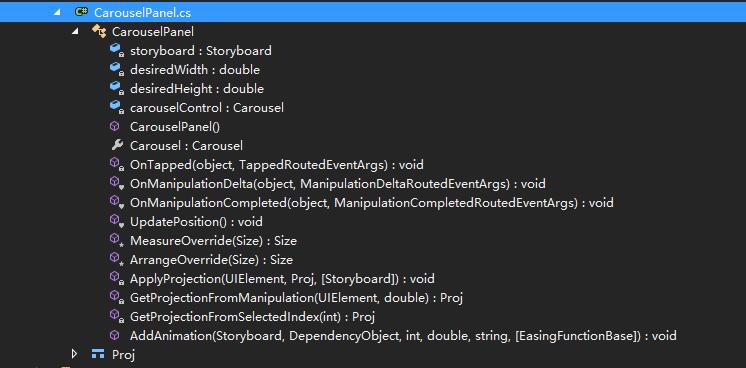
CarouselPanel 类继承自 Panel 类,可以看到它接收的事件响应,有 OnTapped,OnManipulationDelta 和 OnManipulationCompleted,分别对应点按,触摸移动和移动结束的处理。其中:
- OnTapped 的处理主要是根据当前控件的可视化范围和尺寸,判断点击的点对应哪个元素被选中;
- OnManipulationDelta 则是根据触控操作的方向和量度等,决定 Item 的动画幅度,动画速度和每个元素变换状态,以及选中元素的变化;
- OnManipulationCompleted 则是在触控结束后,确定结束动画,以及结束时应该选中那个元素;
- UpdatePosition() 方法则是在 OnManipulationDelta 方法触发到 first 或 last 元素时,需要重新设置动画;
- GetProjectionFromManipulation(sender, e) 则是在 OnManipulationDelta 方法中,根据当前触控的手势,决定当前 Item 的 Projection;
- GetProjectionFromSelectedIndex(i) 是根据当前选中的索引,来取得 Item 的 Projection;
- ApplyProjection(element, proj, storyboard) 是应用获取到的 Projection,包括旋转,变换等动画;
而因为 CarouselPanel 类继承自 Panel 类,所以它也重写了 MeasureOverride(availableSize) 和 ArrangeOverride(finalSize) 方法:
MeasureOverride(availableSize) 方法的实现中,主要是根据宽度和高度是否设置为无限值,如果是,且方向和元素排列顺序一致,则尺寸为当前方向三个元素的宽度,然后把计算后的尺寸传出去;
protected override Size MeasureOverride(Size availableSize)
{
    var containerWidth = 0d;
    var containerHeight = 0d;

    foreach (FrameworkElement container in Children)
    {
        container.Measure(availableSize);
        // get containerWidth and containerHeight for max
    }

    var width = 0d;
    var height = 0d;

    // It's a Auto size, so we define the size should be 3 items
    if (double.IsInfinity(availableSize.Width))
    {
        width = Carousel.Orientation == Orientation.Horizontal ? containerWidth * (Children.Count >  ?  : Children.Count) : containerWidth;
    }
    else
    {
        width = availableSize.Width;
    }

    // It's a Auto size, so we define the size should be 3 items
    if (double.IsInfinity(availableSize.Height))
    {
        height = Carousel.Orientation == Orientation.Vertical ? containerHeight * (Children.Count >  ?  : Children.Count) : containerHeight;
    }
    else
    {
        height = availableSize.Height;
    }

    Clip = , , width, height) };

    return new Size(width, height);
}
ArrangeOverride(finalSize) 方法则是排列元素的处理,因为 Carousel 控件有动画处理,所以在排列时需要考虑到元素排列的动画,以及 Zindex;
protected override Size ArrangeOverride(Size finalSize)
{
    ;
    ;

    Clip = , , finalSize.Width, finalSize.Height) };

    ; i < Children.Count; i++)
    {
        FrameworkElement container = Children[i] as FrameworkElement;
        ...
        // get the good center and top position
        // Get rect position
        // Placing the rect in the center of screen
        ...
        // Get the initial projection (without move)
        var proj = GetProjectionFromSelectedIndex(i);

        // apply the projection to the current object
        ApplyProjection(container, proj);

        // calculate zindex and opacity
        ) - deltaFromSelectedIndex;
        Canvas.SetZIndex(container, zindex);
    }

    return finalSize;
}
调用示例
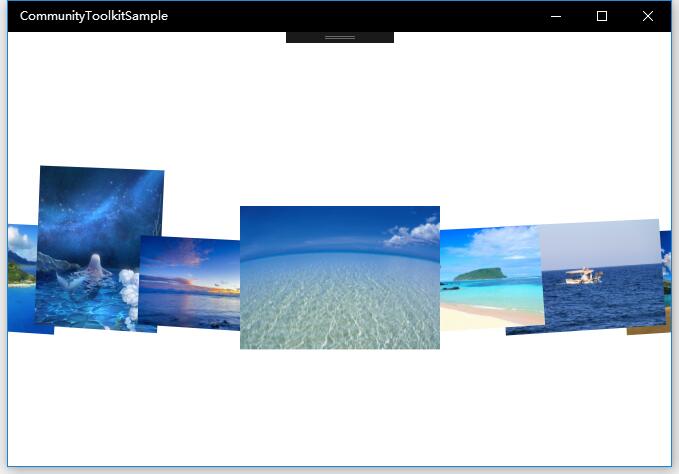
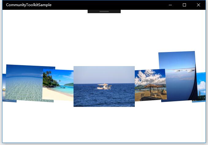
示例中我们实现了横向的 Carousel 控件,作为一个图片列表,可以看到当前选中的 Item 的 ZIndex 是最高的,向两侧依次降低,而在滑动过程中,伴随着 3D 和变换的动画,ZIndex 也会一起变化,而滑动结束时,选中项重新计算,每一项的 Project 也会重新计算。
<Grid>
    <Border Margin="0">
        <controls:Carousel x:Name="CarouselControl"
            InvertPositive="True"
            ItemDepth="238"
            ItemMargin="-79"
            ItemRotationX="4"
            ItemRotationY="9"
            ItemRotationZ ="-3"
            Orientation="Horizontal"
            SelectedIndex="5">
            <controls:Carousel.EasingFunction>
                <CubicEase EasingMode="EaseOut" />
            </controls:Carousel.EasingFunction>
            <controls:Carousel.ItemTemplate>
                <DataTemplate>
                    <Image Width="200"
                        Height="200"
                        VerticalAlignment="Bottom"
                        Source="{Binding Thumbnail}"
                        Stretch="Uniform" />
                </DataTemplate>
            </controls:Carousel.ItemTemplate>
        </controls:Carousel>
    </Border>
</Grid>
总结
到这里我们就把 UWP Community Toolkit 中的 Carousel 控件的源代码实现过程和简单的调用示例讲解完成了,希望能对大家更好的理解和使用这个控件有所帮助,让你的图片列表控件更加炫酷灵动。欢迎大家多多交流,谢谢!
最后,再跟大家安利一下 UWPCommunityToolkit 的官方微博:https://weibo.com/u/6506046490, 大家可以通过微博关注最新动态。
衷心感谢 UWPCommunityToolkit 的作者们杰出的工作,Thank you so much, UWPCommunityToolkit authors!!!
New UWP Community Toolkit - Carousel的更多相关文章
- New UWP Community Toolkit
概述 UWP Community Toolkit 是一个 UWP App 自定义控件.应用服务和帮助方法的集合,能够很大程度的简化和指引开发者的开发工作,相信广大 UWPer 并不陌生. 下面是截取自 ...
- New UWP Community Toolkit - XAML Brushes
概述 上一篇 New UWP Community Toolkit 文章中,我们对 V2.2.0 版本的重要更新做了简单回顾.接下来会针对每个重要更新,结合 SDK 源代码和调用代码详细讲解. 本篇我们 ...
- New UWP Community Toolkit - Markdown
概述 前面 New UWP Community Toolkit 文章中,我们对 V2.2.0 版本的重要更新做了简单回顾,其中简单介绍了 MarkdownTextBlock 和 MarkdownDoc ...
- New UWP Community Toolkit - Staggered panel
概述 前面 New UWP Community Toolkit 文章中,我们对 2.2.0 版本的重要更新做了简单回顾,其中简单介绍了 Staggered panel,本篇我们结合代码详细讲解 St ...
- New UWP Community Toolkit - RadialProgressBar
概述 UWP Community Toolkit 中有一个圆形的进度条控件 - RadialProgressBar,本篇我们结合代码详细讲解 RadialProgressBar 的实现. Radi ...
- New UWP Community Toolkit - RadialGauge
概述 New UWP Community Toolkit V2.2.0 的版本发布日志中提到了 RadialGauge 的调整,本篇我们结合代码详细讲解 RadialGauge 的实现. Radi ...
- New UWP Community Toolkit - RangeSelector
概述 前面 New UWP Community Toolkit 文章中,我们对 V2.2.0 版本的重要更新做了简单回顾,其中简单介绍了 RangeSelector,本篇我们结合代码详细讲解一下 Ra ...
- New UWP Community Toolkit - ImageEx
概述 UWP Community Toolkit 中有一个图片的扩展控件 - ImageEx,本篇我们结合代码详细讲解 ImageEx 的实现. ImageEx 是一个图片的扩展控件,包括 Ima ...
- New UWP Community Toolkit - AdaptiveGridView
概述 UWP Community Toolkit 中有一个自适应的 GridView 控件 - AdaptiveGridView,本篇我们结合代码详细讲解 AdaptiveGridView 的实现 ...
随机推荐
- [RPC Fault faultString="Cannot invoke method 'saveOrUpdate'." faultCode="Server.ResourceUnavailable"
1.错误描述 [RPC Fault faultString="Cannot invoke method 'saveOrUpdate'." faultCode="Serve ...
- freemarker基本数据类型(十一)
freemarker基本数据类型 1.基本数据类型 (1)字符串 (2)数字 (3)布尔值 (4)日期 2.展示示例 <html> <head> <meta http-e ...
- 阿里云ECS+CentOS 7.0+Docker+Redmine环境搭建
前言 搭建Redmine环境可以选择使用分别安装Ruby+Rails+Redmine+MySQL的方式, 但是过程中需要解决各种扰人的依赖问题.Docker为我们提供的Plan B,方便,快捷. 安装 ...
- C# 高效字符串连接 StringBuilder介绍
在介绍StringBuilder之前,必须要先了解string的特性. string在.NET中属于基本数据类型,也是基本数据类型中唯一的引用类型.字符串可以声明为常量,但它却放在了堆中. 一:不可改 ...
- 【BZOJ4407】于神之怒加强版(莫比乌斯反演)
[BZOJ4407]于神之怒加强版(莫比乌斯反演) 题面 BZOJ 求: \[\sum_{i=1}^n\sum_{j=1}^mgcd(i,j)^k\] 题解 根据惯用套路 把公约数提出来 \[\sum ...
- 【NOIP2015】斗地主(搜索,贪心)
题面戳我 题解 我原来也觉得是一道不可做的难题.. 其实,,,很简单的啦... 对于当前状态 我们出牌的方式大致分为两类 一类是不用考虑点数的,包括单张,对子,三带一等 另一类就是需要考虑点数的,包括 ...
- 对网易云音乐参数(params,encSecKey)的分析
我们如果对网易云音乐进行爬虫的话,我们会发现,提交的参数是(params,encSecKey),然而这两个参数是一串很长的东西 我们要对网易云进行爬虫,那么就一定要将这两个参数弄明白,然后才可以进行爬 ...
- shell 脚本下执行Mongodb命令
最近项目中搭建了两台mongodb的服务器,由于服务器只有两台的情况下,目前只是搭建了主从模式架构(官方目前并不推荐主从模式),缺点就是故障转移不变等等原因,而是推荐副本集模式(这里就不多说了)... ...
- 微信小程序天坑--图片汉字命名
图片用汉字命名的,在开发者工具中是显示的,但是,在真机的微信中,是不会显示的. 大写的尴尬,微信小程序开发者工具对于做微信的UI来说,就是一个天坑,在电脑上漂漂亮亮的,到手机上各种意想不到的情况.
- 2018第一波iOS经典笔试题(现场实拍)
序言 作为一个开发者,眼里不仅仅只存在于那一行又一行的代码,更还有那诗和远方. 注明:面试是对自我审视的一种过程,面试题和iOS程序员本身技术水平没任何关联,无论你能否全部答出,都不要对自己产生任何正 ...