python 生成图表
python写入excel(xlswriter)--生成图表
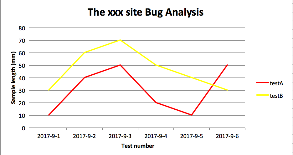
折线图
# -*- coding:utf-8 -*-

import xlsxwriter

# 创建一个excel

workbook = xlsxwriter.Workbook("chart_line.xlsx")

# 创建一个sheet

worksheet = workbook.add_worksheet()

# worksheet = workbook.add_worksheet("bug_analysis")

# 自定义样式,加粗

bold = workbook.add_format({'bold': 1})

# --------1、准备数据并写入excel---------------

# 向excel中写入数据,建立图标时要用到

headings = ['Number', 'testA', 'testB']

data = [

    ['2017-9-1', '2017-9-2', '2017-9-3', '2017-9-4', '2017-9-5', '2017-9-6'],

    [10, 40, 50, 20, 10, 50],

    [30, 60, 70, 50, 40, 30],

]

# 写入表头

worksheet.write_row('A1', headings, bold)

# 写入数据

worksheet.write_column('A2', data[0])

worksheet.write_column('B2', data[1])

worksheet.write_column('C2', data[2])

# --------2、生成图表并插入到excel---------------

# 创建一个柱状图(line chart)

chart_col = workbook.add_chart({'type': 'line'})

# 配置第一个系列数据

chart_col.add_series({

    # 这里的sheet1是默认的值,因为我们在新建sheet时没有指定sheet名

    # 如果我们新建sheet时设置了sheet名,这里就要设置成相应的值

    'name': '=Sheet1!$B$1',

    'categories': '=Sheet1!$A$2:$A$7',

    'values':   '=Sheet1!$B$2:$B$7',

    'line': {'color': 'red'},

})

# 配置第二个系列数据

chart_col.add_series({

    'name': '=Sheet1!$C$1',

    'categories':  '=Sheet1!$A$2:$A$7',

    'values':   '=Sheet1!$C$2:$C$7',

    'line': {'color': 'yellow'},

})

# 配置第二个系列数据(用了另一种语法)

# chart_col.add_series({

#     'name': ['Sheet1', 0, 2],

#     'categories': ['Sheet1', 1, 0, 6, 0],

#     'values': ['Sheet1', 1, 2, 6, 2],

#     'line': {'color': 'yellow'},

# })

# 设置图表的title 和 x,y轴信息

chart_col.set_title({'name': 'The xxx site Bug Analysis'})

chart_col.set_x_axis({'name': 'Test number'})

chart_col.set_y_axis({'name':  'Sample length (mm)'})

# 设置图表的风格

chart_col.set_style(1)

# 把图表插入到worksheet并设置偏移

worksheet.insert_chart('A10', chart_col, {'x_offset': 25, 'y_offset': 10})

workbook.close()
柱状图:
# -*- coding:utf-8 -*-

import xlsxwriter

# 创建一个excel

workbook = xlsxwriter.Workbook("chart_column.xlsx")

# 创建一个sheet

worksheet = workbook.add_worksheet()

# worksheet = workbook.add_worksheet("bug_analysis")

# 自定义样式,加粗

bold = workbook.add_format({'bold': 1})

# --------1、准备数据并写入excel---------------

# 向excel中写入数据,建立图标时要用到

headings = ['Number', 'testA', 'testB']

data = [

    ['2017-9-1', '2017-9-2', '2017-9-3', '2017-9-4', '2017-9-5', '2017-9-6'],

    [10, 40, 50, 20, 10, 50],

    [30, 60, 70, 50, 40, 30],

]

# 写入表头

worksheet.write_row('A1', headings, bold)

# 写入数据

worksheet.write_column('A2', data[0])

worksheet.write_column('B2', data[1])

worksheet.write_column('C2', data[2])

# --------2、生成图表并插入到excel---------------

# 创建一个柱状图(column chart)

chart_col = workbook.add_chart({'type': 'column'})

# 配置第一个系列数据

chart_col.add_series({

    # 这里的sheet1是默认的值,因为我们在新建sheet时没有指定sheet名

    # 如果我们新建sheet时设置了sheet名,这里就要设置成相应的值

    'name': '=Sheet1!$B$1',

    'categories': '=Sheet1!$A$2:$A$7',

    'values':   '=Sheet1!$B$2:$B$7',

    'line': {'color': 'red'},

})

# 配置第二个系列数据(用了另一种语法)

chart_col.add_series({

    'name': '=Sheet1!$C$1',

    'categories':  '=Sheet1!$A$2:$A$7',

    'values':   '=Sheet1!$C$2:$C$7',

    'line': {'color': 'yellow'},

})

# 配置第二个系列数据(用了另一种语法)

# chart_col.add_series({

#     'name': ['Sheet1', 0, 2],

#     'categories': ['Sheet1', 1, 0, 6, 0],

#     'values': ['Sheet1', 1, 2, 6, 2],

#     'line': {'color': 'yellow'},

# })

# 设置图表的title 和 x,y轴信息

chart_col.set_title({'name': 'The xxx site Bug Analysis'})

chart_col.set_x_axis({'name': 'Test number'})

chart_col.set_y_axis({'name':  'Sample length (mm)'})

# 设置图表的风格

chart_col.set_style(1)

# 把图表插入到worksheet以及偏移

worksheet.insert_chart('A10', chart_col, {'x_offset': 25, 'y_offset': 10})

workbook.close()
效果图
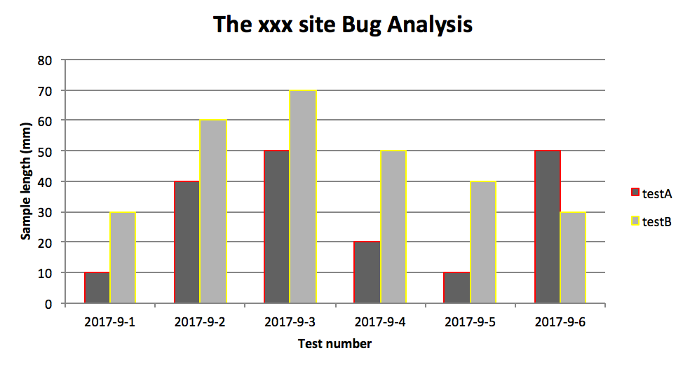
PS:
其实前面两个图只变动一点:把 line 个性为 column
chart_col = workbook.add_chart({'type': 'column'})
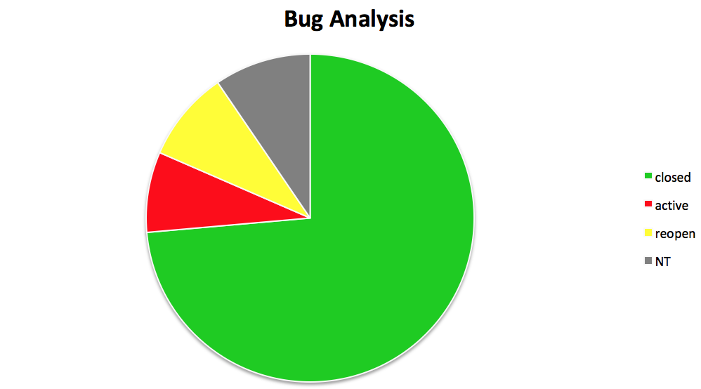
三、饼图:

# -*- coding:utf-8 -*-

import xlsxwriter

# 创建一个excel

workbook = xlsxwriter.Workbook("chart_pie.xlsx")

# 创建一个sheet

worksheet = workbook.add_worksheet()

# 自定义样式,加粗

bold = workbook.add_format({'bold': 1})

# --------1、准备数据并写入excel---------------

# 向excel中写入数据,建立图标时要用到

data = [

    ['closed', 'active', 'reopen', 'NT'],

    [1012, 109, 123, 131],

]

# 写入数据

worksheet.write_row('A1', data[0], bold)

worksheet.write_row('A2', data[1])

# --------2、生成图表并插入到excel---------------

# 创建一个柱状图(pie chart)

chart_col = workbook.add_chart({'type': 'pie'})

# 配置第一个系列数据

chart_col.add_series({

    'name': 'Bug Analysis',

    'categories': '=Sheet1!$A$1:$D$1',

    'values': '=Sheet1!$A$2:$D$2',

    'points': [

        {'fill': {'color': '#00CD00'}},

        {'fill': {'color': 'red'}},

        {'fill': {'color': 'yellow'}},

        {'fill': {'color': 'gray'}},

    ],

})

# 设置图表的title 和 x,y轴信息

chart_col.set_title({'name': 'Bug Analysis'})

# 设置图表的风格

chart_col.set_style(10)

# 把图表插入到worksheet以及偏移

worksheet.insert_chart('B10', chart_col, {'x_offset': 25, 'y_offset': 10})

workbook.close()
效果图:
参考资料:
http://xlsxwriter.readthedocs.io/chart_examples.html
http://xlsxwriter.readthedocs.io/chart.html
python 生成图表的更多相关文章
- python xlsxwriter库生成图表的应用
xlsxwriter可能用过的人并不是很多,不过使用后就会感觉,他的功能让你叹服,除了可以按要求生成你所需要的excel外 还可以加上很形象的各种图,比如柱状图.饼图.折线图等. 请看本人生成的: 这 ...
- 【python】使用plotly生成图表数据
安装 在 ubuntu 环境下,安装 plotly 很简单 python 版本2.7+ pip install plotly 绘图 在 plotly 网站注册后,可以直接将生成的图片保存到网站上,便于 ...
- python写入excel(xlswriter)--生成图表
一.折线图: # -*- coding:utf-8 -*- import xlsxwriter # 创建一个excel workbook = xlsxwriter.Workbook("cha ...
- python生成Excel图表(通过xlsxwriter)
前面介绍了pandas的简单用法,pandas的数据可以通过matlab第三方包将数据生成报表,但是我想将报表生成在Excel中,这时候就可以借助xlsxwriter第三方包来生成图标 缺点:xl ...
- JavaScript 解析 Django Python 生成的 datetime 数据 时区问题解决
JavaScript 解析 Django/Python 生成的 datetime 数据 当Web后台使用Django时,后台生成的时间数据类型就是Python类型的. 项目需要将几个时间存储到数据库中 ...
- 关于使用FusionCharts生成图表时出现invalid xml data错误提示的解决方法
FusionCharts的确功能是够强大的.收集的功能估计更强大.在初次使用时,对着手册,一步一步操作,就是生成图表工具不成功.一直报"Invalid xml data"错误.后面 ...
- Python 绘制图表之我见 ---一个java程序员的看法
---------------- 环境: win 10 . python3.5 https://github.com/Leechen2014/1400OS_01_Codes/blob/master/ ...
- [转] C#操作EXCEL,生成图表的全面应用
gailzhao 原文 关于C#操作EXCEL,生成图表的全面应用 近来我在开发一个运用C#生成EXCEL文档的程序,其中要根据数据生成相应的图表,该图表对颜色和格式都有严格的要求,在百度和谷歌中搜索 ...
- 【python】【转】Python生成随机数的方法
如果你对在Python生成随机数与random模块中最常用的几个函数的关系与不懂之处,下面的文章就是对Python生成随机数与random模块中最常用的几个函数的关系,希望你会有所收获,以下就是这篇文 ...
随机推荐
- JavaScript判断变量是否为数组的方法(Array)
废话不多说直接上一个代码: 1.这里是通用的检测方法 /* * 判断是否是数组 */ function isArray(obj){ return Object.prototype.toString.c ...
- Xcode missing file or .png is missing from working copy
当不小心在工程文件中删掉文件时.有可能会提示 .xxx is missing from working copy 有可能是SVN引起的.删掉这个文件就好了 如果是单个文件.进入Terminal 相 ...
- flume-elasticsearch-sink indexName
- JdbcTemplate应用学习
一.Spring对不同的持久化支持: Spring为各种支持的持久化技术,都提供了简单操作的模板和回调 ORM持久化技术 模板类 JDBC org.springframework.jdbc.core. ...
- 8、java5线程池之动态缓存线程池newCachedThreadPool
JDK文档描述 创建一个可根据需要创建新线程的线程池,但是在以前构造的线程可用时将重用它们.对于执行很多短期异步任务的程序而言,这些线程池通常可提高程序性能.调用 execute 将重用以前构造的线程 ...
- python之获取微信access_token
# -*- coding: cp936 -*- #python 27 #xiaodeng #获取微信access_token #办法一:将该url直接填写到浏览器地址中可以获得access_token ...
- mingw 构建 mysql-connector-c-6.1.9记录
1.准备工作 首先需要下载mysql-connector-c-6.1.9的源码,然后解压. 然后需要准备编译环境,这里我使用的是msys2(下载地址http://repo.msys2.org/dist ...
- mysql导入source注意点
mysql的导入导出要注意字符集,防止查询乱码! 导入前设置字符集 set names utf8; //导入指定编码source /xxx.sqlcommit;
- 转:D3DXVec3TransformNormal() 与 3DXVec3TransformCoord() 的区别
DirectX中有两个很相似的函数,输入与输出的参数格式完全一样,都是输入一个三维向量(D3DXVECTOR3)和一个矩阵(D3DXMATRIX),输出变换之后的向量(D3DXVECTOR3). 函数 ...
- 上海期货交易所CTP行情和交易接入
发布时间:2018-09-25 技术:C++11,动态库的制作 概述 CTP的接入Demo 详细 代码下载:http://www.demodashi.com/demo/14125.html 本 ...