张高兴的 UWP 开发笔记:汉堡菜单进阶
不同于Windows 8应用,Windows 10引入了“汉堡菜单”这一导航模式。说具体点,就拿官方的天气应用来说,左上角三条横杠的图标外加一个SplitView控件组成的这一导航模式就叫“汉堡菜单”。
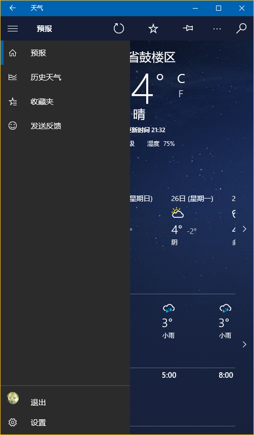
本文讨论的是如何实现官方的这一样式(点击后左侧出现一个填充矩形),普通实现网上到处都是,有需要的朋友自己百度下吧。
下面将介绍两种不同的实现方法,第一种最简单的方法是直接使用 Template 10 模板,第二种就是纯手写了。
若有什么不正确的地方望指正,大家共同讨论。
1. Template 10 模板
使用 Template 10 模板可以快速建立出应用的框架,简单快捷。(帮助文档 https://github.com/Windows-XAML/Template10/wiki )
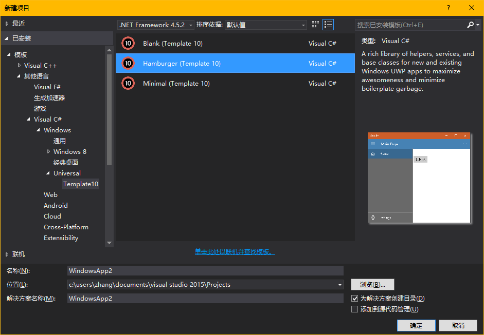
要使用 Template 10 首先点击 Visual Studio “工具”菜单中的“扩展与更新”,搜索并安装 Template 10(简化搜索可以直接输入t10)

安装完成需要重启,重启后按下图找到项目模板新建即可,使用很简单,帮助文档连接也在上方给出。
2. 手写
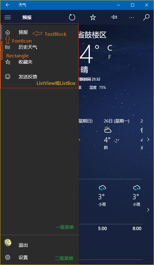
先分析一下界面的构成,暂时不看标题栏,由一个设置了 Canvas.ZIndex 的 Button 和一个 SplitView 构成。SplitView.Pane 中又包含了两个ListView(一级菜单和二级菜单)。ListView 里的每个 Item 又由 Rectangle,FontIcon,TextBlock 组成。见下图
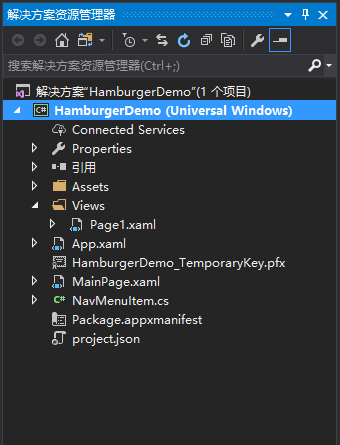
构成清晰之后实现的思路大概也就清晰了。下面给一个简单的Demo,解决方案结构如下。(GitHub https://github.com/ZhangGaoxing/uwp-demo/tree/master/HamburgerDemo)
先创建一个NavMenuItem类
using System;

using System.ComponentModel;

using Windows.UI.Xaml;

using Windows.UI.Xaml.Media;

namespace HamburgerDemo

{

    class NavMenuItem : INotifyPropertyChanged

    {

        // 记录图标字体

        public FontFamily FontFamily { get; set; }

        // 图标的C#转义代码

        public string Icon { get; set; }

        // 标题

        public string Label { get; set; }

        // 导航页

        public Type DestPage { get; set; }

        // 用于左侧矩形的显示

        private Visibility selected = Visibility.Collapsed;

        public Visibility Selected

        {

            get { return selected; }

            set

            {

                selected = value;

                this.OnPropertyChanged("Selected");

            }

        }

        // 双向绑定,用于更新矩形是否显示

        public event PropertyChangedEventHandler PropertyChanged;

        public void OnPropertyChanged(string propertyName)

        {

            PropertyChanged?.Invoke(this, new PropertyChangedEventArgs(propertyName));

        }

    }

}
主页面框架代码
<Page
x:Class="HamburgerDemo.MainPage"
xmlns="http://schemas.microsoft.com/winfx/2006/xaml/presentation"
xmlns:x="http://schemas.microsoft.com/winfx/2006/xaml"
xmlns:local="using:HamburgerDemo"
xmlns:d="http://schemas.microsoft.com/expression/blend/2008"
xmlns:mc="http://schemas.openxmlformats.org/markup-compatibility/2006"
mc:Ignorable="d"> <Page.Resources>
<!--菜单的数据模板-->
<DataTemplate x:Key="DataTemplate">
<Grid>
<Grid.ColumnDefinitions>
<ColumnDefinition Width="48" />
<ColumnDefinition Width="*" />
</Grid.ColumnDefinitions> <Rectangle Fill="{ThemeResource SystemControlBackgroundAccentBrush}"
Visibility="{Binding Selected, Mode=TwoWay}"
HorizontalAlignment="Left" Width="5" Height="48" /> <FontIcon FontFamily="{Binding FontFamily}" Glyph="{Binding Icon}" Foreground="White"
VerticalAlignment="Center"
Margin="-2,0,0,0" Width="48" Height="48" /> <TextBlock Grid.Column="1"
Text="{Binding Label}" Foreground="White"
Margin="12,0,0,0" VerticalAlignment="Center" />
</Grid>
</DataTemplate>
<!--ListViewItem样式定制-->
<Style x:Key="NavMenuItemContainerStyle" TargetType="ListViewItem">
<Setter Property="MinWidth" Value="{StaticResource SplitViewCompactPaneThemeLength}"/>
<Setter Property="Height" Value="48"/>
<Setter Property="Padding" Value="0"/>
<Setter Property="UseSystemFocusVisuals" Value="True" />
<Setter Property="Template">
<Setter.Value>
<ControlTemplate TargetType="ListViewItem">
<ListViewItemPresenter ContentTransitions="{TemplateBinding ContentTransitions}"
Control.IsTemplateFocusTarget="True"
SelectionCheckMarkVisualEnabled="False"
PointerOverBackground="{ThemeResource SystemControlHighlightListLowBrush}"
PointerOverForeground="{ThemeResource ListViewItemForegroundPointerOver}"
SelectedBackground="Transparent"
SelectedForeground="{ThemeResource SystemControlForegroundAccentBrush}"
SelectedPointerOverBackground="{ThemeResource SystemControlHighlightListLowBrush}"
PressedBackground="{ThemeResource SystemControlHighlightListMediumBrush}"
SelectedPressedBackground="{ThemeResource SystemControlHighlightListMediumBrush}"
DisabledOpacity="{ThemeResource ListViewItemDisabledThemeOpacity}"
HorizontalContentAlignment="{TemplateBinding HorizontalContentAlignment}"
VerticalContentAlignment="{TemplateBinding VerticalContentAlignment}"
ContentMargin="{TemplateBinding Padding}"/>
</ControlTemplate>
</Setter.Value>
</Setter>
</Style>
</Page.Resources> <Grid Background="{ThemeResource ApplicationPageBackgroundThemeBrush}">
<!--汉堡菜单开关-->
<Button Name="PaneOpenButton"
FontFamily="Segoe MDL2 Assets" Content="" Foreground="White"
Background="{Binding BackgroundColor}"
Width="48" Height="48"
VerticalAlignment="Top" Canvas.ZIndex="100" /> <SplitView Name="RootSplitView"
DisplayMode="CompactOverlay"
CompactPaneLength="48" OpenPaneLength="256"
IsPaneOpen="True"> <SplitView.Pane>
<Grid Background="#CC000000">
<Grid.RowDefinitions>
<!--空出Button的高度-->
<RowDefinition Height="48" />
<RowDefinition Height="*" />
<RowDefinition Height="Auto" />
</Grid.RowDefinitions>
<!--一级菜单-->
<ListView Name="NavMenuPrimaryListView"
Grid.Row="1" VerticalAlignment="Top"
SelectionMode="None" IsItemClickEnabled="True"
ItemTemplate="{StaticResource DataTemplate}"
ItemContainerStyle="{StaticResource NavMenuItemContainerStyle}"/>
<!--二级菜单-->
<ListView Name="NavMenuSecondaryListView"
Grid.Row="2" VerticalAlignment="Bottom"
SelectionMode="None" IsItemClickEnabled="True"
ItemTemplate="{StaticResource DataTemplate}"
ItemContainerStyle="{StaticResource NavMenuItemContainerStyle}"
BorderBrush="{ThemeResource SystemControlBackgroundAccentBrush}" BorderThickness="0,1,0,0" />
</Grid>
</SplitView.Pane> <SplitView.Content>
<Frame Name="RootFrame" />
</SplitView.Content> </SplitView> </Grid>
</Page>
主页面的后台代码
using HamburgerDemo.Views;

using System.Collections.Generic;

using Windows.UI.Xaml;

using Windows.UI.Xaml.Controls;

using Windows.UI.Xaml.Media;

namespace HamburgerDemo

{

    public sealed partial class MainPage : Page

    {

        // 为不同的菜单创建不同的List类型

        private List<NavMenuItem> navMenuPrimaryItem = new List<NavMenuItem>(

            new[]

            {

                new NavMenuItem()

                {

                    FontFamily = new FontFamily("Segoe MDL2 Assets"),

                    Icon = "\xE10F",

                    Label = "页面1",

                    Selected = Visibility.Visible,

                    DestPage = typeof(Page1)

                },

                new NavMenuItem()

                {

                    FontFamily = new FontFamily("Segoe MDL2 Assets"),

                    Icon = "\xE11A",

                    Label = "页面2",

                    Selected = Visibility.Collapsed,

                    DestPage = typeof(Page1)

                },

                new NavMenuItem()

                {

                    FontFamily = new FontFamily("Segoe MDL2 Assets"),

                    Icon = "\xE121",

                    Label = "页面3",

                    Selected = Visibility.Collapsed,

                    DestPage = typeof(Page1)

                },

                new NavMenuItem()

                {

                    FontFamily = new FontFamily("Segoe MDL2 Assets"),

                    Icon = "\xE122",

                    Label = "页面4",

                    Selected = Visibility.Collapsed,

                    DestPage = typeof(Page1)

                }

            });

        private List<NavMenuItem> navMenuSecondaryItem = new List<NavMenuItem>(

            new[]

            {

                new NavMenuItem()

                {

                    FontFamily = new FontFamily("Segoe MDL2 Assets"),

                    Icon = "\xE713",

                    Label = "设置",

                    Selected = Visibility.Collapsed,

                    DestPage = typeof(Page1)

                }

            });

        public MainPage()

        {

            this.InitializeComponent();

            // 绑定导航菜单

            NavMenuPrimaryListView.ItemsSource = navMenuPrimaryItem;

            NavMenuSecondaryListView.ItemsSource = navMenuSecondaryItem;

            // SplitView 开关

            PaneOpenButton.Click += (sender, args) =>

            {

                RootSplitView.IsPaneOpen = !RootSplitView.IsPaneOpen;

            };

            // 导航事件

            NavMenuPrimaryListView.ItemClick += NavMenuListView_ItemClick;

            NavMenuSecondaryListView.ItemClick += NavMenuListView_ItemClick;

            // 默认页

            RootFrame.SourcePageType = typeof(Page1);

        }

        private void NavMenuListView_ItemClick(object sender, ItemClickEventArgs e)

        {

            // 遍历,将选中Rectangle隐藏

            foreach (var np in navMenuPrimaryItem)

            {

                np.Selected = Visibility.Collapsed;

            }

            foreach (var ns in navMenuSecondaryItem)

            {

                ns.Selected = Visibility.Collapsed;

            }

            NavMenuItem item = e.ClickedItem as NavMenuItem;

            // Rectangle显示并导航

            item.Selected = Visibility.Visible;

            if (item.DestPage != null)

            {

                RootFrame.Navigate(item.DestPage);

            }

            RootSplitView.IsPaneOpen = false;

        }

    }

}
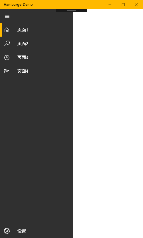
运行效果图如下
张高兴的 UWP 开发笔记:汉堡菜单进阶的更多相关文章
- 张高兴的 UWP 开发笔记:用 Thumb 控件仿制一个可拖动 Button
在 WPF 上可用的控件拖动方法在 UWP 上大多没用,那干脆用 Thumb 仿制一个吧. 关于 Thumb 控件的教程也不多,毕竟在 WPF 控件拖动有很多种方法, Thumb 就显得很鸡肋了.下面 ...
- 张高兴的 UWP 开发笔记:横向 ListView
ListView 默认的排列方向是纵向 ( Orientation="Vertical" ) ,但如果我们需要横向显示的 ListView 怎么办? Blend for Visua ...
- 张高兴的 UWP 开发笔记:应用内启动应用 (UWP Launch UWP)
需求:在 A 应用内启动 B 应用,如果 B 应用未安装则跳转应用商店搜索. 启动方式使用 Uri 启动,本文使用尽可能简单,并且能拿来直接用的代码.不涉及启动后的应用数据交互,如需深入了解,请戳 M ...
- 张高兴的 UWP 开发笔记:手机状态栏 StatusBar
UWP 有关应用标题栏 TitleBar 的文章比较多,但介绍 StatusBar 的却没几篇,在这里随便写写.状态栏 StatusBar 用法比较简单,花点心思稍微设计一下,对应用会是个很好的点缀. ...
- 张高兴的 UWP 开发笔记:定制 ContentDialog 样式
我需要一个背景透明的 ContentDialog,像下图一样.如何定制?写了一个简单的示例(https://github.com/ZhangGaoxing/uwp-demo/tree/master/C ...
- 张高兴的 Xamarin.Forms 开发笔记:为 Android 与 iOS 引入 UWP 风格的汉堡菜单 ( MasterDetailPage )
所谓 UWP 样式的汉堡菜单,我曾在"张高兴的 UWP 开发笔记:汉堡菜单进阶"里说过,也就是使用 Segoe MDL2 Assets 字体作为左侧 Icon,并且左侧使用填充颜色 ...
- UWP开发笔记——嵌套式页面的实现
绪论 UWP开发中,Page是最常用的Control之一,通常情况下,在开发的application中,每一个页面就是一个Page.有时候,为了开发整合度更高,UI表现更为一致的UI,开发者需要把UI ...
- 安卓开发笔记——Menu菜单组件(选项菜单,上下文菜单,子菜单)
菜单是用户界面中最常见的元素之一,使用非常频繁,在Android中,菜单被分为如下三种,选项菜单(OptionsMenu).上下文菜单(ContextMenu)和子菜单(SubMenu). 菜单的实现 ...
- uwp汉堡菜单的实现
---恢复内容开始--- 现在uwp上面的汉堡菜单(就是那个三道杠,点击之后会出现菜单)使用的越来越普遍,比如微软自己家的Cortana.现在我使用的实现方法是使用SplitView实现.首先Spli ...
随机推荐
- 深入理解BFC
定义 在解释BFC之前,先说一下文档流.我们常说的文档流其实分为定位流.浮动流和普通流三种.而普通流其实就是指BFC中的FC.FC是formatting context的首字母缩写,直译过来是格式化上 ...
- virtualbox linux虚拟机相关
linux虚拟机设置为静态IP 在virtualbox中安装好linux虚拟机后,如果采用的是NAT方式的话,linux虚拟机默认采用dhcp方式自动上网,而且用的是NetworkManager服务而 ...
- MySQL设置字段的默认值为当前系统时间
问题产生: 当我们在对某个字段进行设置时间默认值,该默认值必须是的当前记录的插入时间,那么就将当前系统时间作为该记录创建的时间. 应用场景: 1.在数据表中,要记录每条数据是什么时候创建的,应该由数据 ...
- Velocity笔记--使用Velocity获取动态Web项目名的问题
以前使用jsp开发的时候,可以通过request很轻松的获取到根项目名,现在换到使用velocity渲染视图,因为已经不依赖servlet,request等一些类的环境,而Web项目的根项目名又不是写 ...
- 十分钟玩转 jQuery、实例大全
一.简介 定义 jQuery创始人是美国John Resig,是优秀的Javascript框架: jQuery是一个轻量级.快速简洁的javaScript库.源码戳这 jQuery对象 jQuery产 ...
- MSYS2环境下编译X265
HEVC(High Efficiency Video Coding),是一种新的视频压缩标准.可以替代H.264/ AVC编码,使得保持相同质量的情况下,体积减少40%左右.目前有多种实现版本,x26 ...
- iOS之延时执行(睡眠)的几种方法
1. 最直接的方法: [self performSelector:@selector(deleyMethod) withObject:nil afterDelay:1.0]; 此方式要求必须在主线程中 ...
- jQuery中取消后续执行内容
<html xmlns="http://www.w3.org/1999/xhtml"><head> <title></title&g ...
- Asp.NET + SQLServer 部署注意事项
1. 内存设置最大值(如果不设置, 会造成内存占用太大,带来性能问题) IIS 设置最大内存 sqlserver 设置最大内存
- Tomcat 部署我的第一个程序
idea 生成war包.先双击clean,再双击package.生成成功之后就会产生war包. 第二步:将生成好的war文件复制到tomcat文件夹下. 第三步:配置tomcat的server.xml ...