吴裕雄--天生自然 PYTHON数据分析:医疗数据分析

import numpy as np # linear algebra

import pandas as pd # data processing, CSV file I/O (e.g. pd.read_csv)

# plotly

import chart_studio.plotly as py

from plotly.offline import init_notebook_mode, iplot

init_notebook_mode(connected=True)

import plotly.graph_objs as go

import seaborn as sns

# word cloud library

from wordcloud import WordCloud

# matplotlib

import matplotlib.pyplot as plt

# Input data files are available in the "../input/" directory.

# For example, running this (by clicking run or pressing Shift+Enter) will list the files in the input directory
dataframe = pd.read_csv("F:\\kaggleDataSet\\healthcare-data\\test_2v.csv")
import chart_studio.plotly as py
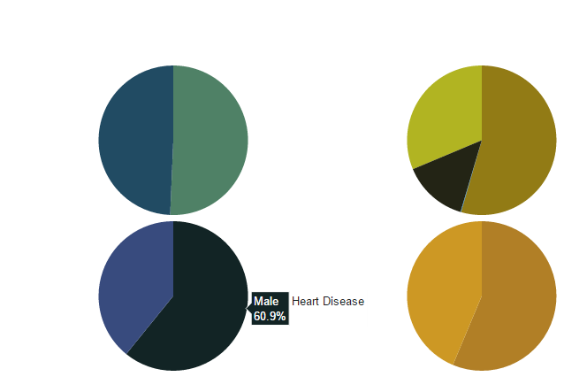
from plotly.graph_objs import * df_heart_disease = dataframe[dataframe.heart_disease== 1]
labels = df_heart_disease.gender
pie1_list=df_heart_disease.heart_disease df_hypertension= dataframe[dataframe.hypertension == 1]
labels1 = df_hypertension.gender
pie1_list1=df_hypertension.hypertension labels2 = dataframe.Residence_type
pie1_list2 = dataframe.heart_disease labels3 = dataframe.work_type
pie1_list3 = dataframe.heart_disease fig = {
'data': [
{
'labels': labels,
'values': pie1_list,
'type': 'pie',
'name': 'Heart Disease',
'marker': {'colors': ['rgb(56, 75, 126)',
'rgb(18, 36, 37)',
'rgb(34, 53, 101)',
'rgb(36, 55, 57)',
'rgb(6, 4, 4)']},
'domain': {'x': [0, .48],
'y': [0, .49]},
'hoverinfo':'label+percent+name',
'textinfo':'none'
},
{
'labels': labels1,
'values': pie1_list1,
'marker': {'colors': ['rgb(177, 127, 38)',
'rgb(205, 152, 36)',
'rgb(99, 79, 37)',
'rgb(129, 180, 179)',
'rgb(124, 103, 37)']},
'type': 'pie',
'name': 'Hypertension',
'domain': {'x': [.52, 1],
'y': [0, .49]},
'hoverinfo':'label+percent+name',
'textinfo':'none' },
{
'labels': labels2,
'values': pie1_list2,
'marker': {'colors': ['rgb(33, 75, 99)',
'rgb(79, 129, 102)',
'rgb(151, 179, 100)',
'rgb(175, 49, 35)',
'rgb(36, 73, 147)']},
'type': 'pie',
'name': 'Residence Type',
'domain': {'x': [0, .48],
'y': [.51, 1]},
'hoverinfo':'label+percent+name',
'textinfo':'none'
},
{
'labels': labels3,
'values': pie1_list3,
'marker': {'colors': ['rgb(146, 123, 21)',
'rgb(177, 180, 34)',
'rgb(206, 206, 40)',
'rgb(175, 51, 21)',
'rgb(35, 36, 21)']},
'type': 'pie',
'name':'Work Type',
'domain': {'x': [.52, 1],
'y': [.51, 1]},
'hoverinfo':'label+percent+name',
'textinfo':'none'
} ],
'layout': {'title': '',
'showlegend': False}
} iplot(fig)
import chart_studio.plotly as py

import plotly.graph_objs as go

# Create random data with numpy

import numpy as np

df_250 = dataframe.iloc[:250,:]

random_x = df_250.index

random_y0 =  df_250.avg_glucose_level

random_y1 =  df_250.bmi

random_y2 =  df_250.age

# Create traces

trace0 = go.Scatter(

    x = random_x,

    y = random_y0,

    mode = 'markers',

    name = 'Avg. Glucose Level'

)

trace1 = go.Scatter(

    x = random_x,

    y = random_y1,

    mode = 'lines+markers',

    name = 'BMI'

)

trace2 = go.Scatter(

    x = random_x,

    y = random_y2,

    mode = 'lines',

    name = 'Age'

)

data = [trace0, trace1, trace2]

iplot(data, filename='scatter-mode')

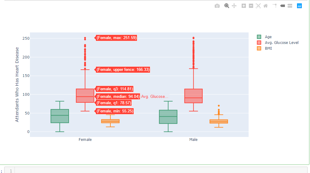
import chart_studio.plotly as py

import plotly.graph_objs as go

df_heart_disease = dataframe[dataframe.heart_disease==1]

labels = df_heart_disease.gender

x = labels

trace0 = go.Box(

    y=dataframe.age,

    x=x,

    name='Age',

    marker=dict(

        color='#3D9970'

    )

)

trace1 = go.Box(

    y=dataframe.avg_glucose_level,

    x=x,

    name='Avg. Glucose Level',

    marker=dict(

        color='#FF4136'

    )

)

trace2 = go.Box(

    y=dataframe.bmi,

    x=x,

    name='BMI',

    marker=dict(

        color='#FF851B'

    )

)

data = [trace0, trace1, trace2]

layout = go.Layout(

    yaxis=dict(

        title='Attendants Who Has Heart Disease',

        zeroline=False

    ),

    boxmode='group'

)

fig = go.Figure(data=data, layout=layout)

iplot(fig)
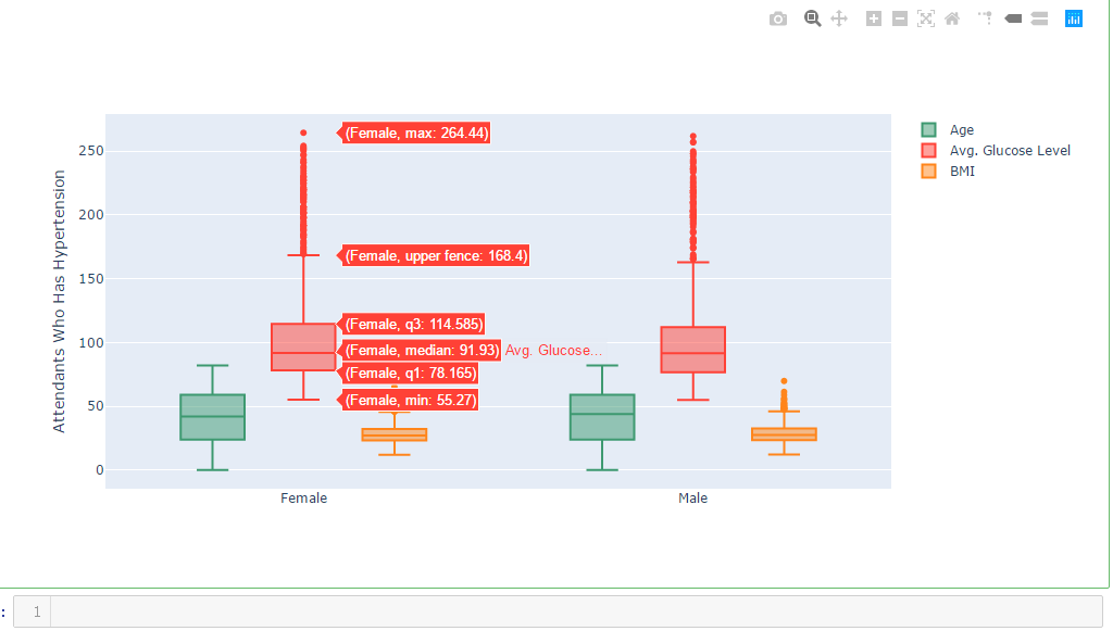
import chart_studio.plotly as py

import plotly.graph_objs as go

df_hypertension= dataframe[dataframe.hypertension == 1]

labels1 = df_hypertension.gender

x = labels1

trace0 = go.Box(

    y=dataframe.age,

    x=x,

    name='Age',

    marker=dict(

        color='#3D9970'

    )

)

trace1 = go.Box(

    y=dataframe.avg_glucose_level,

    x=x,

    name='Avg. Glucose Level',

    marker=dict(

        color='#FF4136'

    )

)

trace2 = go.Box(

    y=dataframe.bmi,

    x=x,

    name='BMI',

    marker=dict(

        color='#FF851B'

    )

)

data = [trace0, trace1, trace2]

layout = go.Layout(

    yaxis=dict(

        title='Attendants Who Has Hypertension',

        zeroline=False

    ),

    boxmode='group'

)

fig = go.Figure(data=data, layout=layout)

iplot(fig)
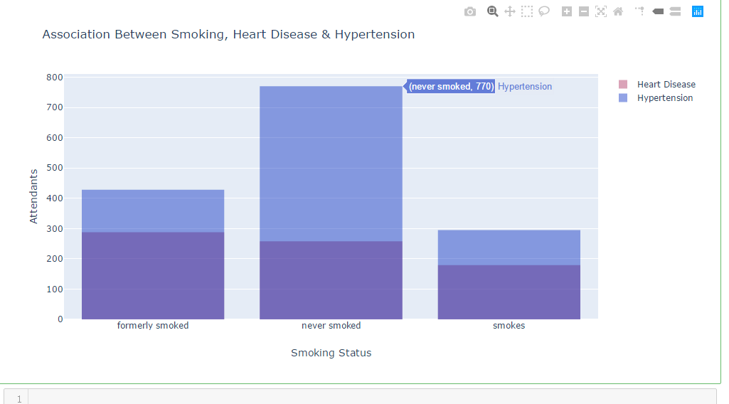
df_heart_disease_1 = dataframe.smoking_status [dataframe.heart_disease == 1  ]

df_hypertension_1  = dataframe.smoking_status [dataframe.hypertension  == 1   ]

trace1 = go.Histogram(

    x=df_heart_disease_1,

    opacity=0.75,

    name = "Heart Disease",

    marker=dict(color='rgba(171, 50, 96, 0.6)'))

trace2 = go.Histogram(

    x=df_hypertension_1,

    opacity=0.75,

    name = "Hypertension",

    marker=dict(color='rgba(12, 50, 196, 0.6)'))

data = [trace1, trace2]

layout = go.Layout(barmode='overlay',

                   title=' Association Between Smoking, Heart Disease & Hypertension',

                   xaxis=dict(title='Smoking Status'),

                   yaxis=dict( title='Attendants'),

)

fig = go.Figure(data=data, layout=layout)

iplot(fig)
df_heart_disease_1 = dataframe.work_type [dataframe.heart_disease    == 1  ]

df_hypertension_1 = dataframe.work_type [dataframe.hypertension    == 1   ]

trace1 = go.Histogram(

    x=df_heart_disease_1,

    opacity=0.75,

    name = "Heart Disease",

    marker=dict(color='rgba(171, 50, 96, 0.6)'))

trace2 = go.Histogram(

    x=df_hypertension_1,

    opacity=0.75,

    name = "Hypertension",

    marker=dict(color='rgba(12, 50, 196, 0.6)'))

data = [trace1, trace2]

layout = go.Layout(barmode='overlay',

                   title=' Association Between Work Type, Heart Disease & Hypertension',

                   xaxis=dict(title=''),

                   yaxis=dict( title='Attendants'),

)

fig = go.Figure(data=data, layout=layout)

iplot(fig)

吴裕雄--天生自然 PYTHON数据分析:医疗数据分析的更多相关文章
- 吴裕雄--天生自然 PYTHON数据分析:糖尿病视网膜病变数据分析(完整版)
# This Python 3 environment comes with many helpful analytics libraries installed # It is defined by ...
- 吴裕雄--天生自然 PYTHON数据分析:所有美国股票和etf的历史日价格和成交量分析
# This Python 3 environment comes with many helpful analytics libraries installed # It is defined by ...
- 吴裕雄--天生自然 python数据分析:健康指标聚集分析(健康分析)
# This Python 3 environment comes with many helpful analytics libraries installed # It is defined by ...
- 吴裕雄--天生自然 python数据分析:葡萄酒分析
# import pandas import pandas as pd # creating a DataFrame pd.DataFrame({'Yes': [50, 31], 'No': [101 ...
- 吴裕雄--天生自然 PYTHON数据分析:人类发展报告——HDI, GDI,健康,全球人口数据数据分析
import pandas as pd # Data analysis import numpy as np #Data analysis import seaborn as sns # Data v ...
- 吴裕雄--天生自然 python数据分析:医疗费数据分析
import numpy as np import pandas as pd import os import matplotlib.pyplot as pl import seaborn as sn ...
- 吴裕雄--天生自然 PYTHON语言数据分析:ESA的火星快车操作数据集分析
import os import numpy as np import pandas as pd from datetime import datetime import matplotlib imp ...
- 吴裕雄--天生自然 python语言数据分析:开普勒系外行星搜索结果分析
import pandas as pd pd.DataFrame({'Yes': [50, 21], 'No': [131, 2]}) pd.DataFrame({'Bob': ['I liked i ...
- 吴裕雄--天生自然 PYTHON数据分析:基于Keras的CNN分析太空深处寻找系外行星数据
#We import libraries for linear algebra, graphs, and evaluation of results import numpy as np import ...
随机推荐
- HTML引入文件/虚拟目录/绝对路径与相对路径
此篇引见 相对路径和绝对路径的区别 1.绝对路径 使用方法:而绝对路径可以使用“\”或“/”字符作为目录的分隔字符 绝对路径是指文件在硬盘上真正存在的路径.例如 <body backround= ...
- keras字符编码
https://www.jianshu.com/p/258a21ae0390https://blog.csdn.net/apengpengpeng/article/details/80866034#- ...
- C语言 指针在函数传参中的使用
int add(int a, int b) //函数传参的时候使用了int整型数据,本身是数值类型.实际调用该函数时,实参将自己拷贝一份,并将拷贝传递给形参进行运算.实参自己实际是不参与运算的.所 ...
- centos 从头部署java环境
1.首先安装lrzsz 上传下载服务 yum install -y lrzsz 2.然后检查是否已经安装java rpm -qa|grep java 如果已经安装卸载后再重新安装 3.将下载好的jdk ...
- Django框架的安装与使用
Django框架的安装与使用 在使用Django框架开发web应用程序时,开发阶段同样依赖wsgiref模块来实现Server的功能,我们使用Django框架是为了快速地开发application, ...
- DRF框架之ModelSerializer序列化器
ModelSerializer是Serializer的子类,序列化和反序列化跟Serializer一样. ModelSerializer与常规的Serializer相同,但提供了: 基于模型类自动生成 ...
- Docker添加root用户
0 环境 系统环境:centos7 服务器:阿里云 1 正文 1 进入rabbitmq容器中 docker exec -i -t 563 bin/bash 2 添加用户(用户名和密码) rabbitm ...
- shell脚本中的条件测试if中的-z到-d的意思
文件表达式 if [ -f file ] 如果文件存在if [ -d ... ] 如果目录存在if [ -s file ] 如果文件存在且非空 if [ -r file ] ...
- (vshadow)Volume Shadow在渗透测试中的利用
本文根据嘶吼学习总结出文中几种方式Vshadow包含在window SDK中,由微软签名. Vshadow包括执行脚本和调用支持卷影快照管理的命令的功能,这些功能可能会被滥用于特权级的防御规避,权限持 ...
- Win10卸载python总是提示error2503失败各种解决办法
最近win10的电脑装了python的3.4,然后想卸载,就总是提示error 2053,类似于这种: 下面是我的坎坷解决之路: 1.网上说,任务管理器 --> 详细信息 --> expl ...