
吴裕雄--天生自然 python数据分析:健康指标聚集分析(健康分析)
# This Python 3 environment comes with many helpful analytics libraries installed

# It is defined by the kaggle/python docker image: https://github.com/kaggle/docker-python

# For example, here's several helpful packages to load in

import numpy as np # linear algebra

import pandas as pd # data processing, CSV file I/O (e.g. pd.read_csv)

# Input data files are available in the "../input/" directory.

# For example, running this (by clicking run or pressing Shift+Enter) will list the files in the input directory
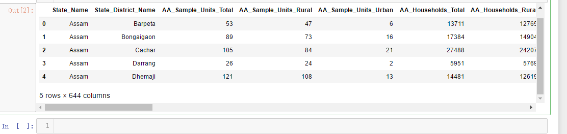
df=pd.read_csv('F:\\kaggleDataSet\\Key_indicator_districtwise\\Key_indicator_districtwise.csv')

df.head()
x=df['AA_Sample_Units_Total']

y=df['AA_Sample_Units_Rural']

z=df['AA_Population_Urban']

import matplotlib.pyplot as plt

import seaborn as sns

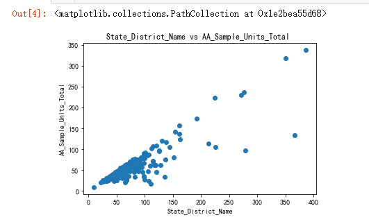
plt.title('State_District_Name vs AA_Sample_Units_Total ')

plt.xlabel('State_District_Name')

plt.ylabel('AA_Sample_Units_Total')

plt.scatter(x,y)
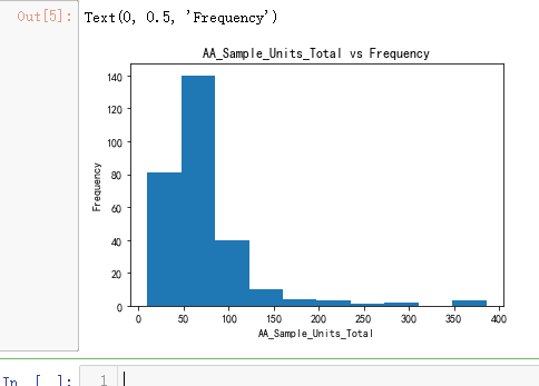
plt.hist(x)

plt.title('AA_Sample_Units_Total vs Frequency')

plt.xlabel('AA_Sample_Units_Total')

plt.ylabel('Frequency')
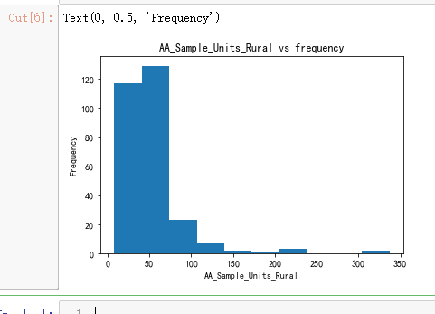
plt.hist(y)

plt.title('AA_Sample_Units_Rural vs frequency')

plt.xlabel('AA_Sample_Units_Rural')

plt.ylabel('Frequency')
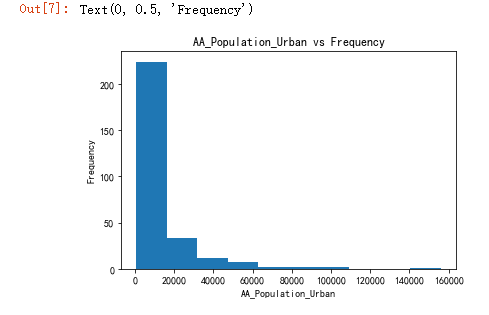
plt.hist(z)

plt.title('AA_Population_Urban vs Frequency')

plt.xlabel('AA_Population_Urban')

plt.ylabel('Frequency')
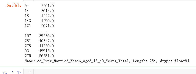
q=df['AA_Ever_Married_Women_Aged_15_49_Years_Total']

q

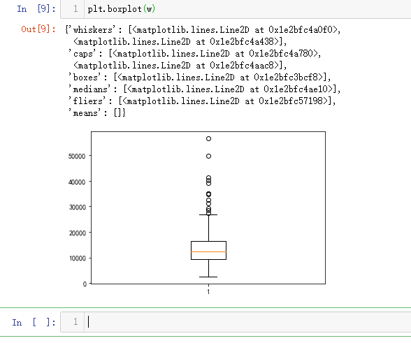
w=q.sort_values()

w
plt.boxplot(w)
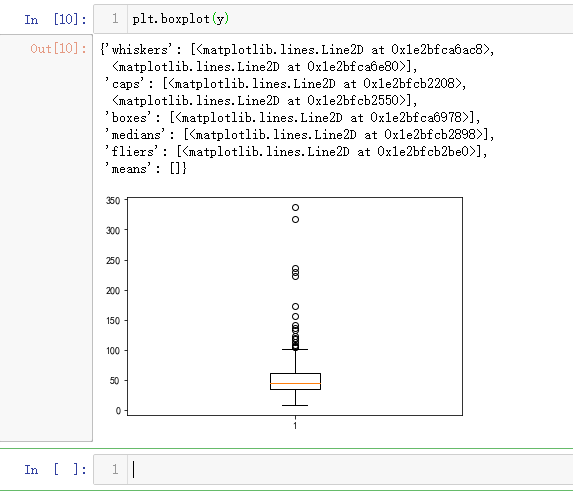
plt.boxplot(y)
import matplotlib.pyplot as plt

import numpy as np

from sklearn import datasets, linear_model, metrics

# load the boston dataset

boston = datasets.load_boston(return_X_y=False)

# defining feature matrix(X) and response vector(y)

X = boston.data

y = boston.target

# splitting X and y into training and testing sets

from sklearn.model_selection import train_test_split

X_train, X_test, y_train, y_test = train_test_split(X, y, test_size=0.4,

                                                    random_state=1)

# create linear regression object

reg = linear_model.LinearRegression()

# train the model using the training sets

reg.fit(X_train, y_train)

# regression coefficients

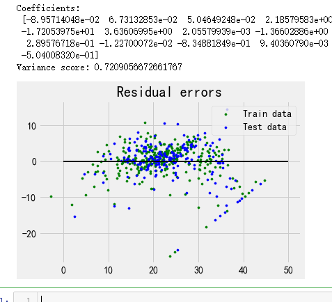
print('Coefficients: \n', reg.coef_)

# variance score: 1 means perfect prediction

print('Variance score: {}'.format(reg.score(X_test, y_test)))

# plot for residual error

## setting plot style

plt.style.use('fivethirtyeight')

## plotting residual errors in training data

plt.scatter(reg.predict(X_train), reg.predict(X_train) - y_train,

            color = "green", s = 10, label = 'Train data')

## plotting residual errors in test data

plt.scatter(reg.predict(X_test), reg.predict(X_test) - y_test,

            color = "blue", s = 10, label = 'Test data')

## plotting line for zero residual error

plt.hlines(y = 0, xmin = 0, xmax = 50, linewidth = 2)

## plotting legend

plt.legend(loc = 'upper right')

## plot title

plt.title("Residual errors")

## function to show plot

plt.show()
吴裕雄--天生自然 python数据分析:健康指标聚集分析(健康分析)的更多相关文章
- 吴裕雄--天生自然 PYTHON数据分析:基于Keras的CNN分析太空深处寻找系外行星数据
#We import libraries for linear algebra, graphs, and evaluation of results import numpy as np import ...
- 吴裕雄--天生自然 PYTHON数据分析:人类发展报告——HDI, GDI,健康,全球人口数据数据分析
import pandas as pd # Data analysis import numpy as np #Data analysis import seaborn as sns # Data v ...
- 吴裕雄--天生自然 PYTHON数据分析:糖尿病视网膜病变数据分析(完整版)
# This Python 3 environment comes with many helpful analytics libraries installed # It is defined by ...
- 吴裕雄--天生自然 PYTHON数据分析:所有美国股票和etf的历史日价格和成交量分析
# This Python 3 environment comes with many helpful analytics libraries installed # It is defined by ...
- 吴裕雄--天生自然 python数据分析:葡萄酒分析
# import pandas import pandas as pd # creating a DataFrame pd.DataFrame({'Yes': [50, 31], 'No': [101 ...
- 吴裕雄--天生自然 python数据分析:医疗费数据分析
import numpy as np import pandas as pd import os import matplotlib.pyplot as pl import seaborn as sn ...
- 吴裕雄--天生自然 python数据分析:基于Keras使用CNN神经网络处理手写数据集
import pandas as pd import numpy as np import matplotlib.pyplot as plt import matplotlib.image as mp ...
- 吴裕雄--天生自然 PYTHON数据分析:钦奈水资源管理分析
df = pd.read_csv("F:\\kaggleDataSet\\chennai-water\\chennai_reservoir_levels.csv") df[&quo ...
- 吴裕雄--天生自然 PYTHON数据分析:医疗数据分析
import numpy as np # linear algebra import pandas as pd # data processing, CSV file I/O (e.g. pd.rea ...
随机推荐
- js中call和apply的实现原理
js中call和apply的实现原理 实现call的思路: /* 还有就是call方法是放在Function().prototype上的也就是构造函数才有的call方法 (我门可 ...
- intellij idea安卓开发配置
1.java sdk 2.java ndk 3.gradle https://gradle.org/install/#manually 配置properties 删除根目录下android{} htt ...
- 关于redis的使用总结
简介 redis是一个开源的用c语言编写的数据库,但并不像常规的关系型数据库那样把数据存储在表中 , 而是像Java中的Map集合一样,存储的是一系列key=value键值对,redis属于NoSQL ...
- C盘满了解决办法之查看文件夹占用的统计界面
TreeSize Free软件,可以实时查看文件夹使用情况: 百度搜索: 下载安装完以后的显示界面如下:
- POJ 1O17 Packets [贪心]
Packets Description A factory produces products packed in square packets of the same height h and of ...
- 给select赋值之后,再点击选择下拉值时,显示一值不变的解决
在一个项目需求中,请求数据,得到的数据dataAll渲染到页面的select下拉表单中,当时是需要一进页面就要默认选中第一个选项,所以直接将dataAll的第一个索引值赋值给了表单的绑定值formVa ...
- CodeForces 993A Two Squares(数学 几何)
https://codeforces.com/problemset/problem/993/A 题意: 给你两个矩形,第一行是一个正面表示的矩形,第二个是一个旋转四十五度角的矩形,问这两个矩形是否相交 ...
- 解决LoadRunner服务器返回乱码
- << 和>> 的计算公式
在java中,一个数左移n位,就是将这个数乘以2的n次方,右移就是将这个数除以2的n次方. 如: 8>>2 = 2 (8/2^2) 15 << 3 = 120 (15*(2 ...
- iOS补位动画、沙漏效果、移动UITableViewCell、模拟贪吃蛇、拖拽进度等源码
iOS精选源码 JHAlertView - 一款黑白配色的HUD之沙漏效果 继承UIButton的自定义按钮SPButton 用递归算法实现iOS补位动画 iOS 长按移动UITableViewCel ...