New UWP Community Toolkit - DeveloperTools
概述
UWP Community Toolkit 中有一个开发者工具集 DeveloperTools,可以帮助开发者在开发过程中进行 UI 和功能的调试,本篇我们结合代码详细讲解 DeveloperTools 的实现。
DeveloperTools 中目前包括了两个工具:
- AlignmentGrid - 提供了 Grid 中的网格,开发者可以根据网格来检查控件对齐;除了开发过程中的辅助作用,开发者还可以使用它作为画板辅助线,日记应用的网格等 UI 显示;
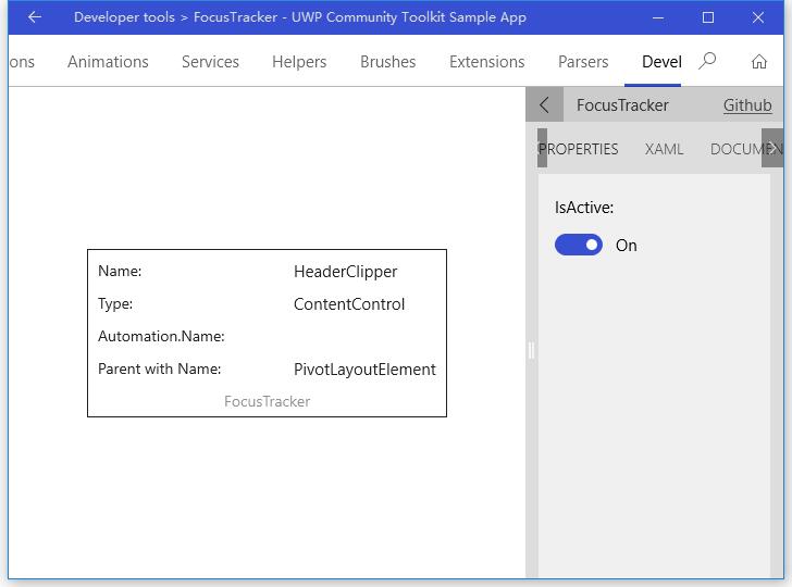
- FocusTracker - 可以显示当前聚焦的 XAML 元素信息,包括 name,type,AutomationProperties.Name 和 first parent name;
来看一下官方示例中的截图:

Source: https://github.com/Microsoft/UWPCommunityToolkit/tree/master/Microsoft.Toolkit.Uwp.DeveloperTools
Doc: https://docs.microsoft.com/zh-cn/windows/uwpcommunitytoolkit/developer-tools/alignmentgrid
https://docs.microsoft.com/zh-cn/windows/uwpcommunitytoolkit/developer-tools/focustracker
Namespace: Microsoft.Toolkit.Uwp.DeveloperTools; Nuget: Microsoft.Toolkit.Uwp.DeveloperTools;
开发过程
代码分析
1. AlignmentGrid
AlignmentGrid 类继承自 ContentControl,定义的依赖属性如下:
- LineBrush - 网格线的颜色画刷
- HorizontalStep - 网格横向的步长,默认为 20.0
- VerticalStep - 网格纵向的步长,默认为 20.0,横向和纵向步长可以不相等
以上三个属性变化时,会触发 OnPropertyChanged(d, e),和 AlignmentGrid_SizeChanged(s, e) 一样,主要处理逻辑在 Rebuild() 方法中,下面我们看看 Rebuild() 方法实现:
- 清空 containerCanvas,获取当前横向和纵向步长,如果 lineBrush 无效,则初始化为 ApplicationForegroundThemeBrush;
- 横向循环绘制矩形,循环步长是横向步长,总长度是控件实际宽度;绘制矩形宽度为 1,高度为控件实际高度,位置居左为当前总步长;
- 纵向循环绘制矩形,循环步长是纵向步长,总长度是控件实际高度;绘制矩形高度为 1,宽度为控件实际宽度,位置居上为当前总步长;
private void Rebuild()
{
    containerCanvas.Children.Clear();
    var horizontalStep = HorizontalStep;
    var verticalStep = VerticalStep;
    var brush = LineBrush ?? (Brush)Application.Current.Resources["ApplicationForegroundThemeBrush"];

    ; x < ActualWidth; x += horizontalStep)
    {
        var line = new Rectangle
        {
            Width = ,
            Height = ActualHeight,
            Fill = brush
        };
        Canvas.SetLeft(line, x);

        containerCanvas.Children.Add(line);
    }

    ; y < ActualHeight; y += verticalStep)
    {
        var line = new Rectangle
        {
            Width = ActualWidth,
            Height = ,
            Fill = brush
        };
        Canvas.SetTop(line, y);

        containerCanvas.Children.Add(line);
    }
}
2. FocusTracker
FocusTracker 包含了两个文件:
- FocusTracker.xaml - FocusTracker 的样式文件,主要定义了 FocusTracker 的显示信息,如上面控件介绍中所说的;
- FocusTracker.cs - 定义处理文件, 定义了 FocusTracker 的主要处理逻辑;
FocusTracker.cs
FocusTracker 类中定义了一个依赖属性 IsActive,属性变化时会触发 OnIsActiveChanged(d, e) 处理方法,IsActive == true 时,调用 Start() 方法;IsActive == false 时,调用 Stop() 方法;
我们看到,类中的主要处理是定义一个 DispatcherTimer,在 Start() 方法中实例化并启用它,Stop() 方法中停止它,并清空内容显示;
private void Start()
{
    if (updateTimer == null)
    {
        updateTimer = new DispatcherTimer();
        updateTimer.Tick += UpdateTimer_Tick;
    }

    updateTimer.Start();
}

private void Stop()
{
    updateTimer?.Stop();
    ClearContent();
}
来看一下 updateTimer 的 Tick 处理方法:
- 使用 FocusManager 获取当前获得焦点的元素,清空上一次获取焦点的控件内容信息;
- 分别获取 Name、Type、AutomationProperties.Name 和 First Parent 信息,这对于代码调试和自动化测试很有帮助;
private void UpdateTimer_Tick(object sender, object e)
{
    var focusedControl = FocusManager.GetFocusedElement() as FrameworkElement;

    if (focusedControl == null)
    {
        ClearContent();
        return;
    }

    if (controlName != null)
    {
        controlName.Text = focusedControl.Name;
    }

    if (controlType != null)
    {
        controlType.Text = focusedControl.GetType().Name;
    }

    if (controlAutomationName != null)
    {
        controlAutomationName.Text = AutomationProperties.GetName(focusedControl);
    }

    if (controlFirstParentWithName != null)
    {
        var parentWithName = FindVisualAscendantWithName(focusedControl);
        controlFirstParentWithName.Text = parentWithName?.Name ?? string.Empty;
    }
}
调用示例
1. AlignmentGrid
我们在 Grid 中放了一个 AlignmentGrid 控件,还有一个 TextBlock,做对比显示,效果如下图;
引申一下,我们可以修改 AlignmentGrid 绘制矩形的代码,AlignmentGrid 中定义了 AlignmentGrid 作为矩形的边框画刷,我们可以根据矩形的位置,绘制出左边到右边渐变的画刷,或者虚线的画刷;或者跨度更大一些,使用 ImageBrush 来作为父控件的九宫格显示等,相信大家会有更丰富的想象和应用场景;
<Grid>
    <tools:AlignmentGrid LineBrush="Gray" HorizontalStep="40" VerticalStep="30" Opacity="1.0"/>
    <TextBlock Text="Hello World" FontSize="40" HorizontalAlignment="Center" VerticalAlignment="Center"/>
</Grid>

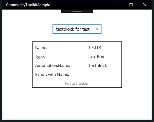
2. FocusTracker
我们使用 FocusTracker 来跟踪对 TextBox 的聚焦事件,XAML 中设置的属性和下面运行显示中的信息一致;
<Grid Background="{ThemeResource ApplicationPageBackgroundThemeBrush}">
    <tools:FocusTracker IsActive="True" VerticalAlignment="Center" HorizontalAlignment="Center"/>
    <TextBox x:Name="testTB" Text="textblock for test" AutomationProperties.Name="textblock"
                HorizontalAlignment="Center" VerticalAlignment="Top" Margin="0,50,0,0"/>
</Grid>
总结
到这里我们就把 UWP Community Toolkit 中的 DeveloperTools 的实现过程和简单的调用示例讲解完成了,希望这些工具对大家开发 UWP 应用有所帮助,如果大家有更好用的工具类,也欢迎大家给 UWPCommunityToolkit 做 PR,贡献自己的代码,欢迎大家多多交流,谢谢!
最后,再跟大家安利一下 UWPCommunityToolkit 的官方微博:https://weibo.com/u/6506046490, 大家可以通过微博关注最新动态。
衷心感谢 UWPCommunityToolkit 的作者们杰出的工作,Thank you so much, UWPCommunityToolkit authors!!!
New UWP Community Toolkit - DeveloperTools的更多相关文章
- New UWP Community Toolkit
概述 UWP Community Toolkit 是一个 UWP App 自定义控件.应用服务和帮助方法的集合,能够很大程度的简化和指引开发者的开发工作,相信广大 UWPer 并不陌生. 下面是截取自 ...
- New UWP Community Toolkit - XAML Brushes
概述 上一篇 New UWP Community Toolkit 文章中,我们对 V2.2.0 版本的重要更新做了简单回顾.接下来会针对每个重要更新,结合 SDK 源代码和调用代码详细讲解. 本篇我们 ...
- New UWP Community Toolkit - Markdown
概述 前面 New UWP Community Toolkit 文章中,我们对 V2.2.0 版本的重要更新做了简单回顾,其中简单介绍了 MarkdownTextBlock 和 MarkdownDoc ...
- New UWP Community Toolkit - Staggered panel
概述 前面 New UWP Community Toolkit 文章中,我们对 2.2.0 版本的重要更新做了简单回顾,其中简单介绍了 Staggered panel,本篇我们结合代码详细讲解 St ...
- New UWP Community Toolkit - Carousel
概述 New UWP Community Toolkit V2.2.0 的版本发布日志中提到了 Carousel 的调整,本篇我们结合代码详细讲解 Carousel 的实现. Carousel 是 ...
- New UWP Community Toolkit - RadialProgressBar
概述 UWP Community Toolkit 中有一个圆形的进度条控件 - RadialProgressBar,本篇我们结合代码详细讲解 RadialProgressBar 的实现. Radi ...
- New UWP Community Toolkit - RadialGauge
概述 New UWP Community Toolkit V2.2.0 的版本发布日志中提到了 RadialGauge 的调整,本篇我们结合代码详细讲解 RadialGauge 的实现. Radi ...
- New UWP Community Toolkit - RangeSelector
概述 前面 New UWP Community Toolkit 文章中,我们对 V2.2.0 版本的重要更新做了简单回顾,其中简单介绍了 RangeSelector,本篇我们结合代码详细讲解一下 Ra ...
- New UWP Community Toolkit - ImageEx
概述 UWP Community Toolkit 中有一个图片的扩展控件 - ImageEx,本篇我们结合代码详细讲解 ImageEx 的实现. ImageEx 是一个图片的扩展控件,包括 Ima ...
随机推荐
- JAVA反射中的getFields()方法和getDeclaredFields ()方法的区别
JAVA反射中的getFields()方法和getDeclaredFields ()方法的区别 关于获取类的字段有两种方式:getFields()和getDeclaredFields().我们先来 ...
- Oracle-数据类型为date 日期查询技巧
date类型是oracle中存储日期类的一种常用类型,其处理也是在数据库使用中比较多需要注意的地方.如我们可以使用to_char函数将其转化为任意时间格式的字符串,也可使用to_date函数转化相应的 ...
- java map遍历、排序,根据value获取key
Map 四种遍历: Map<String,String> map = new HashMap<String, String>(); map.put("one" ...
- Memcached修改默认端口
windows下修改memcached服务的端口号(默认端口:11211)如果不是作为服务启动memcached的话,memcached -p 端口号就可以了. 通过修改注册表可以简单实现 运行:re ...
- Qt下载地址
上Qt官网http://www.qt.io/download/想下载Qt,速度很慢,在这里记录下在Qt官网看到的镜像下载地址: 1. 所有Qt版本下载地址: http://download.qt.io ...
- 值得 .NET 开发者了解的15个特性
本文列举了 15 个值得了解的 C# 特性,旨在让 .NET 开发人员更好的使用 C# 语言进行开发工作. 1. ObsoleteAttribute ObsoleteAttribute 适用于除组件. ...
- C++模板类与Qt信号槽混用
一.正文 目前正在做一个视频处理相关的项目.项目的技术栈是这样的,UI层采用Qt来实现基本的数据展示和交互,底层音视频采用的是一套基于FFmpeg的视频处理框架.这是一套类似Microsoft Med ...
- spring Boot+spring Cloud实现微服务详细教程第二篇
上一篇文章已经说明了一下,关于spring boot创建maven项目的简单步骤,相信很多熟悉Maven+Eclipse作为开发常用工具的朋友们都一目了然,这篇文章主要讲解一下,构建spring bo ...
- 用Canvas写一个简单的游戏--别踩白块儿
第一次写博客也不知怎么写,反正就按照我自己的想法来吧!怎么说呢?还是不要扯那些多余的话了,直接上正题吧! 第一次用canvas写游戏,所以挑个简单实现点的来干:别踩白块儿,其他那些怎么操作的那些就不用 ...
- c++ --> extern "C" {}详解
extern "C" {}详解 extern "C"的真实目的是实现类C和C++的混合编程.在C++源文件中的语句前面加上extern "C" ...