吴裕雄--天生自然 PYTHON数据分析:人类发展报告——HDI, GDI,健康,全球人口数据数据分析

import pandas as pd  # Data analysis

import numpy as np #Data analysis

import seaborn as sns # Data visualization

import matplotlib.pyplot as plt # Data Visualization

import  matplotlib.gridspec as gridspec # subplots and grid

from wordcloud import WordCloud, STOPWORDS # Visualize text

import json

import folium # Map

import folium.plugins as plugins # Map

from mpl_toolkits.basemap import Basemap # Map

import warnings

warnings.filterwarnings('ignore')

import scipy.stats

import gc

# Plotting style and setting

plt.style.use('fivethirtyeight') #Plot style

#plt.style.use('bmh')

plt.rc('axes', labelsize=12) # plot setting

plt.rc('xtick', labelsize=12)

plt.rc('ytick', labelsize=12)

pd.options.display.max_rows = 100

% matplotlib inline
#path = 'file/' # local file loaction

path = 'F:\\kaggleDataSet\\human-development\\'

loan = pd.read_csv(path+'kiva_loans.csv')

mpi = pd.read_csv(path+'kiva_mpi_region_locations.csv')

#loan_theme = pd.read_csv(path+'loan_theme_ids.csv')

#loan_theme_region = pd.read_csv(path+'loan_themes_by_region.csv')

# MPI

#mpi_world = pd.read_csv('file/MPI_national.csv')

#mpi_subnational = pd.read_csv('file/MPI_subnational.csv')

#HDI

path = 'F:\\kaggleDataSet\\human-development\\'

hdi = pd.read_csv(path+'HDI.csv')

continent_hdi = pd.read_csv(path+'Continent_HDI.csv')

geo_world_data = json.load(open(path+'countries.geojson'))
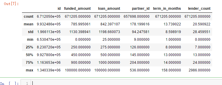
loan.head()

loan.describe()
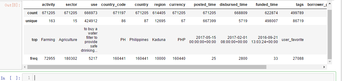
loan.describe(include=['O']) # Discribe categorical data
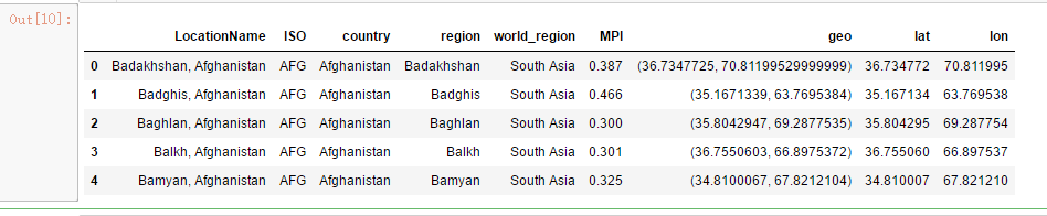
mpi.head()
mpi.describe(include=['O']) # Discribe categorical data

f,ax = plt.subplots(1,3,figsize=(16,6))

sns.distplot(loan['funded_amount'],ax=ax[0])

ax[0].set_title('Distribution of funded_amount')

ax[0].set_xlabel('Funded Amount')

ulimit = np.percentile(loan['funded_amount'],99)

llimit= np.percentile(loan['funded_amount'],1)

value = loan[(llimit<loan['funded_amount'])&(loan['funded_amount']<ulimit)]['funded_amount']

sns.distplot(value,color='r',ax=ax[1])

ax[1].set_title('Distribution of funded_amount by removing outliers');

ax[1].set_xlabel('Funded Amount')

ax[2].scatter(np.sort(loan['funded_amount'].values),range(loan.shape[0]),)

ax[2].set_title('Distribution of funded_amount');

ax[2].set_xlabel('Funded Amount')

ax[2].set_ylabel('Index')

plt.subplots_adjust(wspace=0.3)

f,ax = plt.subplots(1,3,figsize=(16,6))

sns.distplot(loan['loan_amount'],ax=ax[0])

ax[0].set_title('Distribution of Loan amount')

ax[0].set_xlabel('Loan Amount')

ulimit = np.percentile(loan['loan_amount'],99)

llimit= np.percentile(loan['loan_amount'],1)

value = loan[(llimit<loan['loan_amount'])&(loan['loan_amount']<ulimit)]['loan_amount']

sns.distplot(value,color='r',ax=ax[1])

ax[1].set_xlabel('Loan Amount')

ax[1].set_title('Distribution of Loan amount by removing outliers');

ax[2].scatter(np.sort(loan['loan_amount'].values),range(loan.shape[0]),)

ax[2].set_title('Distribution of Loan amount');

ax[2].set_xlabel('Loan Amount')

ax[2].set_ylabel('Index')

plt.subplots_adjust(wspace=0.3)

m = folium.Map(location=[0,0],zoom_start=2)

poo = loan.groupby(['country_code']).agg({'count','count'})['id'].reset_index()

m.choropleth(geo_data= geo_world_data,data = poo,

             columns=['country_code','count'],key_on='feature.properties.wb_a2',

             name='Listed Country',fill_opacity=1,fill_color='YlOrBr',

             highlight=True,legend_name='Count')

folium.LayerControl().add_to(m)

m

f,ax = plt.subplots(1,2,figsize=(16,8))

poo = loan['country'].value_counts()[:10]

sns.barplot(poo.values,poo.index, palette='Wistia', ax=ax[0])

ax[0].set_title('Distribution of Top listed Countries')

ax[0].set_xlabel('Count')

for i, v in enumerate(poo.values):

    ax[0].text(.6,i, round(v,2),fontsize=10,color='k')

poo = loan.groupby('country').mean()['loan_amount'].sort_values(ascending=False)[:10]

sns.barplot(poo.values, poo.index, palette='cool', ax=ax[1])

ax[1].set_title('Distribution of Top Average loan amount by country')

ax[1].set_ylabel('')

ax[1].set_xlabel('Average Loan Amount')

for i, v in enumerate(poo.values):

    ax[1].text(.6,i, round(v,2),fontsize=10,color='k')

plt.subplots_adjust(wspace=0.5);

plt.figure(figsize=(16,8))

poo = loan.groupby('country').mean()['loan_amount'].sort_values(ascending=False)

sns.boxplot(loan['country'], np.log(loan['loan_amount']), palette='spring',order=poo.index)

plt.xlabel('')

plt.ylabel('Loan amount ($log10$)')

plt.title('Boxplot of loan amount($log10$)')

plt.xticks(rotation=90);

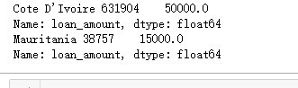
print("Cote D'Ivoire",loan[loan['country'] == "Cote D'Ivoire"]['loan_amount'])

print("Mauritania",loan[loan['country'] == "Mauritania"]['loan_amount'])
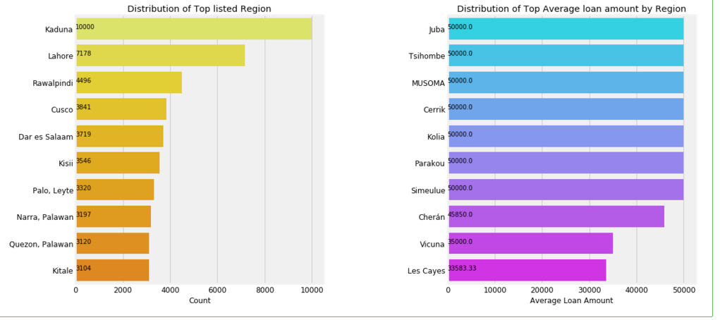
f,ax = plt.subplots(1,2,figsize=(16,8))

poo = loan['region'].value_counts()[:10]

sns.barplot(poo.values,poo.index, palette='Wistia', ax=ax[0])

ax[0].set_title('Distribution of Top listed Region')

ax[0].set_xlabel('Count')

for i, v in enumerate(poo.values):

    ax[0].text(.6,i, round(v,2),fontsize=10,color='k')

poo = loan.groupby('region').mean()['loan_amount'].sort_values(ascending=False)[:10]

sns.barplot(poo.values, poo.index, palette='cool', ax=ax[1])

ax[1].set_title('Distribution of Top Average loan amount by Region')

ax[1].set_ylabel('')

ax[1].set_xlabel('Average Loan Amount')

for i, v in enumerate(poo.values):

    ax[1].text(.6,i, round(v,2),fontsize=10,color='k')

plt.subplots_adjust(wspace=0.5);
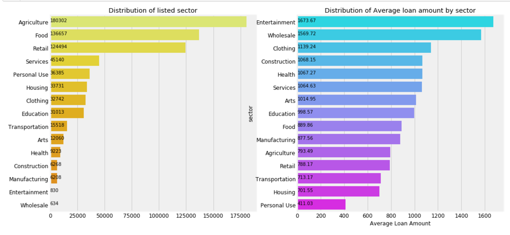
plt.figure( figsize =(16,8))

gridspec.GridSpec(2,2)

plt.subplot2grid((1,2),(0,0))

poo = loan['sector'].value_counts()

#plt.pie(poo.values, labels = poo.index, autopct='%1.1f%%',colors=sns.color_palette('Wistia'),startangle=60,)

sns.barplot(poo.values,poo.index,palette='Wistia')

for i, v in enumerate(poo.values):

    plt.text(.6,i, round(v,2),fontsize=10,color='k')

plt.title('Distribution of listed sector')

plt.subplot2grid((1,2),(0,1))

poo = loan.groupby('sector').mean()['loan_amount'].sort_values(ascending=False)

sns.barplot(poo.values,poo.index,palette='cool')

plt.title('Distribution of Average loan amount by sector')

plt.xlabel('Average Loan Amount')

for i, v in enumerate(poo.values):

    plt.text(.6,i, round(v,2),fontsize=10,color='k')
# Joy plot

tmp = loan[['loan_amount','sector']]

tmp['loan_amount'] = np.log(tmp['loan_amount'])

g = sns.FacetGrid(tmp,row='sector',hue='sector',aspect=15, size=0.6)

# Draw the densities in a few steps

g.map(sns.kdeplot, "loan_amount", clip_on=False, shade=True, alpha=1, lw=1.5, bw=.2)

g.map(sns.kdeplot, "loan_amount", clip_on=False, color="w", lw=2, bw=.2)

g.map(plt.axhline, y=0, lw=2, clip_on=False)

# Define and use a simple function to label the plot in axes coordinates

def label(x, color, label):

    ax = plt.gca()

    ax.text(0, .2, label, fontweight="bold", color=color, ha="left", va="center", transform=ax.transAxes)

g.map(label, "loan_amount")

# Set the subplots to overlap

g.fig.subplots_adjust(hspace=0)

# Remove axes details that don't play will with overlap

g.set_titles("")

g.set(yticks=[])

g.set(xlabel = 'loan amount (log)')

g.despine(bottom=True, left=True)

g.savefig('F:\\joy.png')

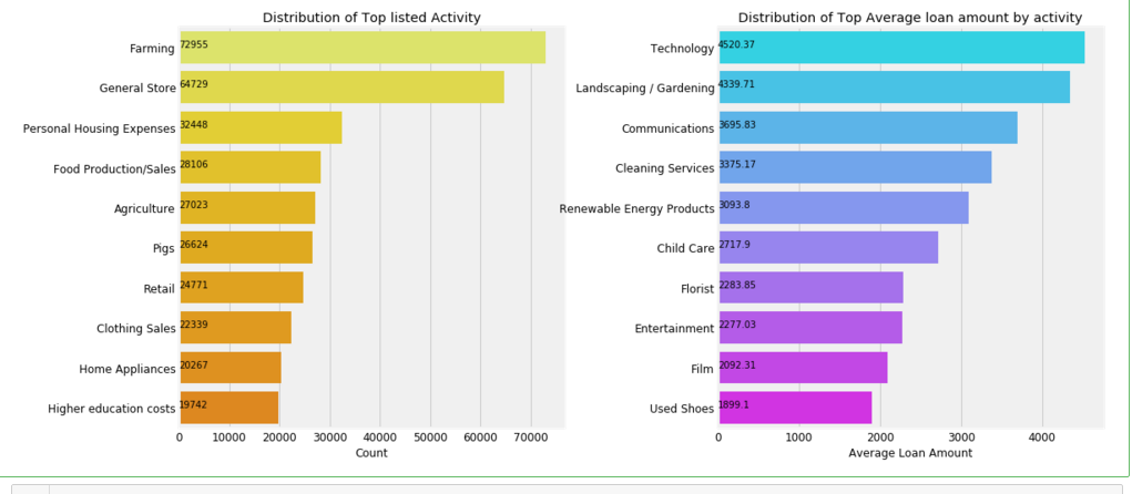
f,ax = plt.subplots(1,2,figsize=(16,8))

poo = loan['activity'].value_counts()[:10]

sns.barplot(poo.values,poo.index, palette='Wistia',ax= ax[0])

ax[0].set_title('Distribution of Top listed Activity')

ax[0].set_xlabel('Count')

for i, v in enumerate(poo.values):

    ax[0].text(.6,i, round(v,2),fontsize=10,color='k')

poo = loan.groupby('activity').mean()['loan_amount'].sort_values(ascending=False)[:10]

sns.barplot(poo.values, poo.index, palette='cool', ax=ax[1])

ax[1].set_title('Distribution of Top Average loan amount by activity')

ax[1].set_ylabel('')

ax[1].set_xlabel('Average Loan Amount')

for i, v in enumerate(poo.values):

    ax[1].text(1,i, round(v,2),fontsize=10,color='k')

plt.subplots_adjust(wspace=0.4)
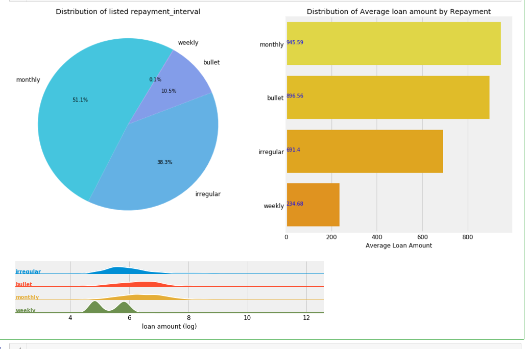
plt.figure(figsize =(16,8))

gridspec.GridSpec(2,2)

plt.subplot2grid((1,2),(0,0))

poo = loan['repayment_interval'].value_counts()

plt.pie(poo.values,labels= poo.index,autopct='%1.1f%%',startangle=60,colors=sns.color_palette('cool',desat=.7))

plt.title('Distribution of listed repayment_interval')

plt.subplot2grid((1,2),(0,1))

poo = loan.groupby('repayment_interval').mean()['loan_amount'].sort_values(ascending=False)

sns.barplot(poo.values,poo.index, palette='Wistia')

plt.title('Distribution of Average loan amount by Repayment')

plt.xlabel('Average Loan Amount')

plt.ylabel('')

for i, v in enumerate(poo.values):

    plt.text(1,i, round(v,2),fontsize=10,color='b')

# Joy plot

tmp = loan[['loan_amount','repayment_interval']]

tmp['loan_amount'] = np.log(tmp['loan_amount'])

g = sns.FacetGrid(tmp,row='repayment_interval',hue='repayment_interval',aspect=15, size=0.6)

# Draw the densities in a few steps

g.map(sns.kdeplot, "loan_amount", clip_on=False, shade=True, alpha=1, lw=1.5, bw=.2)

g.map(sns.kdeplot, "loan_amount", clip_on=False, color="w", lw=2, bw=.2)

g.map(plt.axhline, y=0, lw=2, clip_on=False)

# Define and use a simple function to label the plot in axes coordinates

def label(x, color, label):

    ax = plt.gca()

    ax.text(0, .2, label, fontweight="bold", color=color, ha="left", va="center", transform=ax.transAxes)

g.map(label, "loan_amount")

# Set the subplots to overlap

g.fig.subplots_adjust(hspace=0)

# Remove axes details that don't play will with overlap

g.set_titles("")

g.set(yticks=[])

g.set(xlabel = 'loan amount (log)')

g.despine(bottom=True, left=True)

plt.subplots_adjust(wspace=0.3);
f,ax = plt.subplots(2,2,figsize=(16,12))

axs = ax.ravel()

for i,c in enumerate(loan['repayment_interval'].unique()):

    k = loan[loan['repayment_interval'] == c]

    agg = k.groupby(['country']).mean()['loan_amount'].sort_values(ascending=False).dropna()[:10]

    if i<4:

        sns.barplot(x = agg.values,y = agg.index, ax= axs[i],palette=sns.color_palette('cool',n_colors=i+1))

        axs[i].set_title('Average loan amount for country by \n Repayment Interval: {}'.format(c))

        axs[i].set_ylabel('')

        axs[i].set_xlabel('Average Loan amount')

        for j, v in enumerate(agg.values):

            axs[i].text(1,j, round(v,2),fontsize=10,color='k')

plt.subplots_adjust(wspace=0.4,hspace=0.3)

plt.figure(figsize=(16,6))

poo = loan['term_in_months'].value_counts().iloc[:20]

sns.barplot(y = poo.values, x = poo.index, palette= 'cool',order=poo.index)

plt.xticks(rotation=90)

plt.xlabel('Month')

plt.ylabel('Count')

plt.title('Distribution of terms');

plt.figure(figsize=(16,6))

poo = loan['lender_count'].value_counts().iloc[:20]

sns.barplot(y = poo.values, x = poo.index, palette= 'Wistia',order=poo.index)

plt.xticks(rotation=90)

plt.xlabel('Lender Count')

plt.title('Distribution of Lender count ');

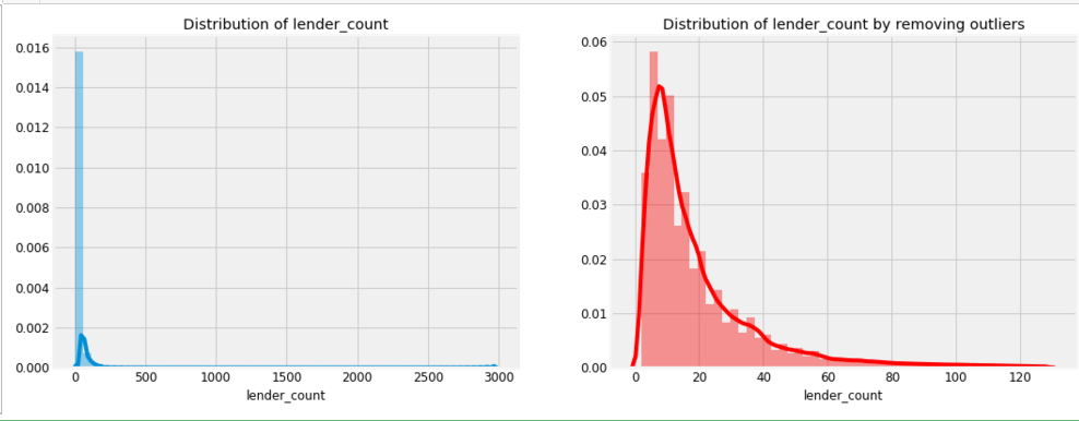
f,ax = plt.subplots(1,2,figsize=(16,6))

sns.distplot(loan['lender_count'],ax=ax[0])

ax[0].set_title('Distribution of lender_count')

ulimit = np.percentile(loan['lender_count'],99)

llimit= np.percentile(loan['lender_count'],1)

value = loan[(llimit<loan['lender_count'])&(loan['lender_count']<ulimit)]['lender_count']

sns.distplot(value,color='r',ax=ax[1])

ax[1].set_title('Distribution of lender_count by removing outliers');
#use

wc = (WordCloud(height= 1000,width=1600, stopwords=STOPWORDS,max_words=1000,background_color='white').generate(" ".join(loan['use'].astype(str))) )

plt.figure(figsize=(16,10))

plt.imshow(wc)

plt.axis('off')

#plt.savefig('use_cloud.png')

plt.title('Loan amount usage');

plt.figure(figsize=(16,10))

poo = loan['use'].value_counts()[:10]

sns.barplot(poo.values,poo.index, palette='Wistia')

plt.title('Distribution of listed Use of Loan amount')

plt.xlabel('Average Loan amount')

for i, v in enumerate(poo.values):

    plt.text(.6,i, round(v,2),fontsize=10,color='k')

    plt.rc('ytick', labelsize=20);

plt.rc('ytick', labelsize=10);

#tags

wc = (WordCloud(height= 1000,width=1600, stopwords=STOPWORDS,max_words=1000,background_color='white').generate(" ".join(loan['tags'].astype(str))) )

plt.figure(figsize=(16,10))

plt.imshow(wc)

plt.axis('off')

plt.title('Loan amount Tags');

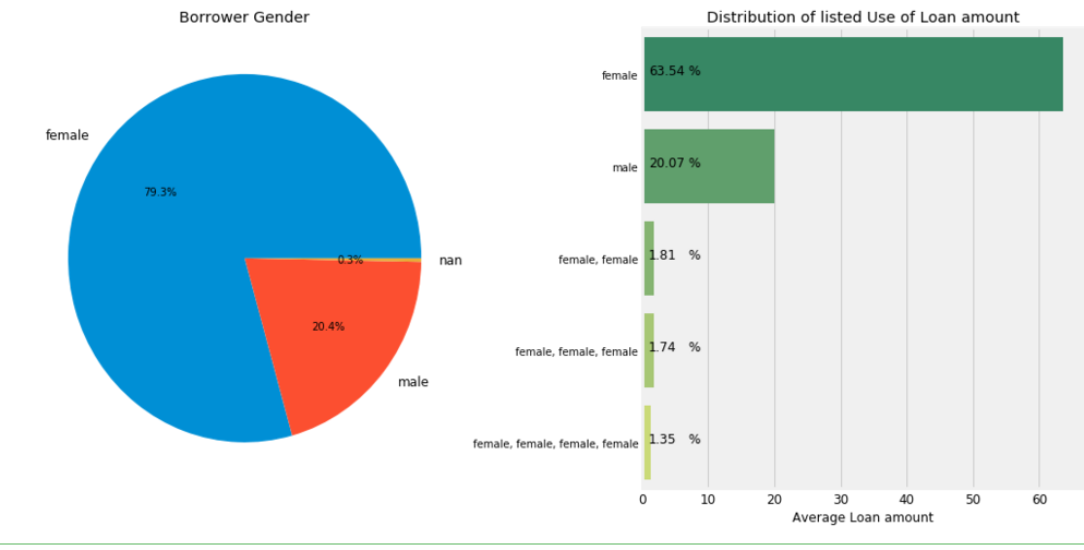
gender = ",".join(loan['borrower_genders'].astype(str).str.replace(' ',''))

cnt = pd.DataFrame(gender.strip().split(','),columns=['Gender'])

cnt = cnt['Gender'].value_counts()

f,ax = plt.subplots(1,2,figsize=(16,8))

ax[0].pie(cnt.values,labels=cnt.index,autopct='%0.1f%%')

ax[0].set_title('Borrower Gender')

poo = loan['borrower_genders'].value_counts()[:5]*100/loan.shape[0]

#ax[1].pie(poo.values,labels=poo.index,autopct='%0.1f%%')

sns.barplot(poo.values,poo.index, palette='summer')

ax[1].set_title('Distribution of listed Use of Loan amount')

ax[1].set_xlabel('Average Loan amount')

for i,v in enumerate(poo.values):

    ax[1].text(1,i,round(v,2),fontsize=12)

    ax[1].text(7,i,'%',fontsize=12)

plt.subplots_adjust(wspace=0.4)
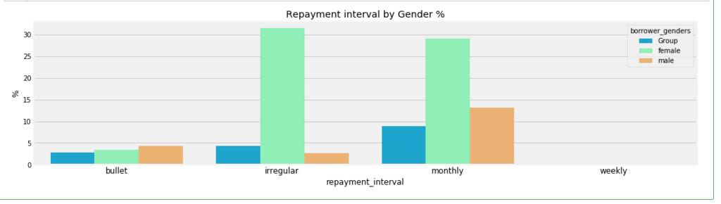
poo = (loan.groupby(['borrower_genders','repayment_interval']).agg(['count'])['id'].reset_index())

poo.loc[:,'borrower_genders'][~((poo['borrower_genders'] == 'female') |(poo['borrower_genders'] == 'male'))] = 'Group'

plt.figure(figsize=(16,4))

cnt = poo.groupby(['borrower_genders','repayment_interval'])['count'].sum().reset_index()

cnt['count'] = cnt['count']*100/cnt['count'].sum()

sns.barplot(y= cnt['count'],x = cnt['repayment_interval'],hue=cnt['borrower_genders'],palette='rainbow')

plt.title('Repayment interval by Gender %')

plt.ylabel('%');
loan['date'] = pd.to_datetime(loan['date'])

loan['disbursed_time'] = pd.to_datetime(loan['disbursed_time'])

loan['funded_time'] = pd.to_datetime(loan['funded_time'])

loan['posted_time'] = pd.to_datetime(loan['posted_time'])

loan_ts = loan.set_index('date')
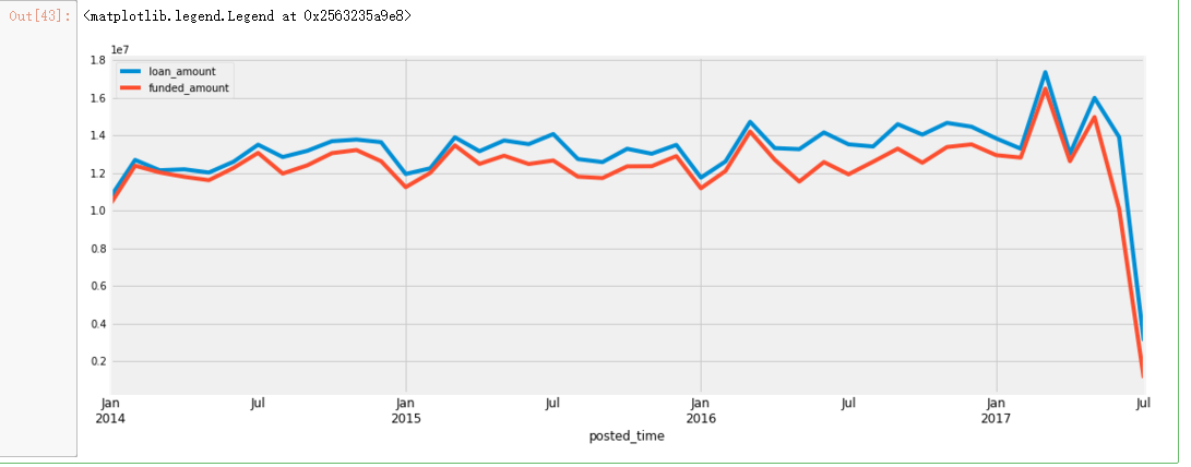
plt.figure(figsize=(16,6))

date_feature = ['posted_time','funded_time']

loan.set_index('posted_time')['loan_amount'].resample('M').sum().plot()

loan.set_index('posted_time')['funded_amount'].resample('M').sum().plot()

plt.legend()
plt.figure(figsize=(16,10))

gridspec.GridSpec(2,2)

# Agriclure

plt.subplot2grid((2,2),(0,0))

poo = loan[loan['sector'] =='Agriculture']['activity'].value_counts()[:10]

sns.barplot(poo.values,poo.index,palette='Wistia')

plt.ylabel('Activity')

plt.xlabel('Count')

plt.title('"Agriculture" Sector')

for i, v in enumerate(poo.values):

    plt.text(.6,i, round(v,2),fontsize=10,color='k')

plt.subplot2grid((2,2),(0,1))

poo = loan[loan['sector'] =='Food']['activity'].value_counts()[:10]

sns.barplot(poo.values,poo.index,palette='cool')

plt.ylabel('Activity')

plt.xlabel('Count')

plt.title('"Food" Sector')

for i, v in enumerate(poo.values):

    plt.text(.6,i, round(v,2),fontsize=10,color='k')

plt.subplot2grid((2,2),(1,0))

poo = loan[loan['sector'] =='Retail']['activity'].value_counts()[:10]

sns.barplot(poo.values,poo.index,palette='cool')

plt.ylabel('Activity')

plt.xlabel('Count')

plt.title('"Retail" Sector')

for i, v in enumerate(poo.values):

    plt.text(.6,i, round(v,2),fontsize=10,color='k')

plt.subplot2grid((2,2),(1,1))

poo = loan[loan['sector'] =='Entertainment']['activity'].value_counts()[:10]

sns.barplot(poo.values,poo.index,palette='magma')

plt.ylabel('Activity')

plt.xlabel('Count')

plt.title('"Entertainment" Sector')

for i, v in enumerate(poo.values):

    plt.text(.6,i, round(v,2),fontsize=10,color='k')

plt.subplots_adjust(hspace=0.4,wspace=0.5);

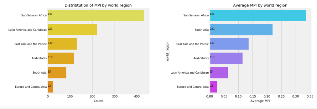
f,ax = plt.subplots(1,2,figsize=(16,6))

poo = mpi['world_region'].value_counts()

sns.barplot(poo.values, poo.index,palette=sns.color_palette('Wistia'),ax=ax[0])

ax[0].set_title('Distribtution of MPI by world region')

ax[0].set_xlabel('Count')

for i, v in enumerate(poo.values):

    ax[0].text(.6,i, round(v,2),fontsize=10,color='k')

agg = mpi.groupby(['world_region']).mean()['MPI'].sort_values().dropna().sort_values( ascending=False)

sns.barplot(agg.values, agg.index,palette=sns.color_palette('cool'),ax=ax[1])

ax[1].set_xlabel('Average MPI')

ax[1].set_title('Average MPI by world region')

for i, v in enumerate(poo.values):

    ax[1].text(0,i, round(v,2),fontsize=10,color='k')

plt.subplots_adjust(wspace=0.6);
f,ax = plt.subplots(2,3,figsize=(16,12))

axs = ax.ravel()

for i,c in enumerate(mpi['world_region'].unique()):

    k = mpi[mpi['world_region'] == c]

    agg = k.groupby(['country']).mean()['MPI'].sort_values(ascending=False).dropna()[:10]

    if i<6:

        sns.barplot(x = agg.values,y = agg.index, ax= axs[i],palette=sns.color_palette('cool',n_colors=i+1))

        axs[i].set_title('Region: \n {}'.format(c))

        axs[i].set_xlabel('Average MPI')

        axs[i].set_ylabel('')

        for j, v in enumerate(agg.values):

            axs[i].text(0,j,round(v,2),fontsize=10,color='k')

plt.subplots_adjust(wspace=0.5,hspace=0.3);

f,ax = plt.subplots(1,2,figsize=(16,6))

agg = mpi.groupby(['country']).mean()['MPI'].sort_values().dropna().sort_values( ascending=False)[:10]

sns.barplot(agg.values, agg.index,palette='Wistia',ax=ax[0])

ax[0].set_title('Distribtution of MPI by country')

ax[0].set_xlabel('Average MPI')

for i, v in enumerate(agg.values):

    ax[0].text(0,i, round(v,2),fontsize=10,color='k')

agg = mpi.groupby(['LocationName']).mean()['MPI'].sort_values().dropna().sort_values( ascending=False)[:10]

sns.barplot(agg.values, agg.index,palette='cool',ax=ax[1])

for i, v in enumerate(agg.values):

    ax[1].text(0,i, round(v,2),fontsize=10,color='k')

ax[1].set_title('Average MPI by Location Name')

ax[0].set_xlabel('Average MPI')

plt.subplots_adjust(wspace=0.6);

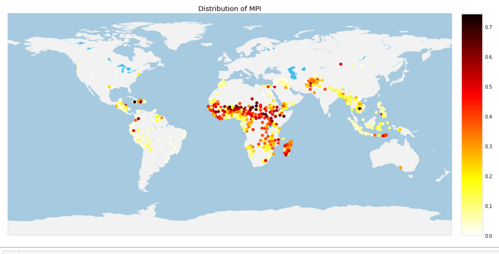
# MPI

plt.figure(figsize=(16,10))

m = Basemap(projection='cyl',resolution='c',)

m.drawcoastlines(linewidth=0.1, color="white")

m.fillcontinents(color='#f2f2f2',lake_color='#46bcec')

m.drawmapboundary(fill_color='#A6CAE0', linewidth=0.1)

#m.bluemarble(alpha=0.4)

m.shadedrelief()

values = mpi['MPI']

mloc = m(mpi['lon'],mpi['lat'])

m.scatter(mloc[0],mloc[1],c = values,zorder=20,cmap='hot_r')

m.colorbar()

plt.title('Distribution of MPI')

plt.show()

m

gc.collect();
# http://nbviewer.jupyter.org/github/python-visualization/folium/blob/master/examples/MarkerCluster.ipynb

loc = mpi[['lon','lat','region','MPI']].dropna()

m1 = folium.Map(location=[0,0],zoom_start=2)

locations = list(zip(loc['lat'],loc['lon']))

popups = ['lat: {} lon: {} <br> MPI: {}'.format(round(lat,2),round(lon,2),m) for (lat,lon,m) in zip(mpi['lat'],mpi['lon'],mpi['MPI'])]

marker = plugins.MarkerCluster(locations, popups=popups)

marker.add_to(m1)

m1

gc.collect()
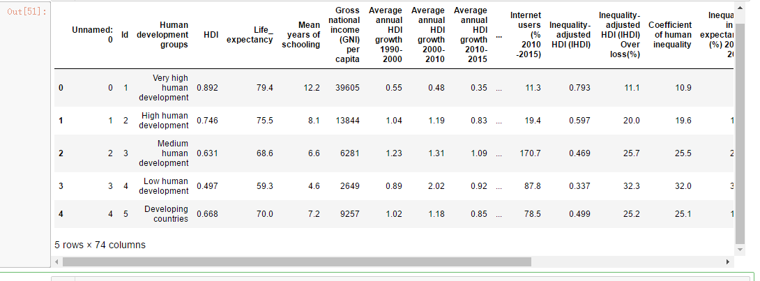
hdi.head()

continent_hdi.head()
kiva_country = loan['country'].unique()

len(kiva_country)

kiva_hdi = hdi[hdi['Country'].apply(lambda c: c in kiva_country)]

kiva_hdi['Country'].apply(lambda c: c in kiva_country)


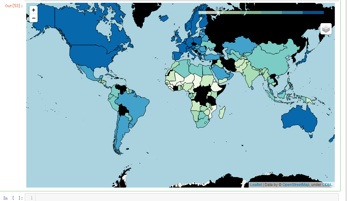
m = folium.Map(location=[0,0],zoom_start=2)

m.choropleth(geo_data= geo_world_data,data = hdi, columns=['Country','HDI'],key_on='feature.properties.name',name='HDI',fill_opacity=1,fill_color='GnBu',highlight=True, legend_name='HDI')

folium.LayerControl().add_to(m)

m
f,ax = plt.subplots(1,2,figsize=(16,6))

value = (hdi[['HDI','Country']].sort_values(by='HDI')[:10])

sns.barplot(value['HDI'],value['Country'],palette='cool',ax=ax[0])

ax[0].set_title('Bottom 10 country by HDI')

for i, v in enumerate(value['HDI']):

    ax[0].text(0,i, round(v,2),fontsize=10,color='k')

value = (hdi[['HDI','Country']].sort_values(by='HDI',ascending=False)[:10])

sns.barplot(value['HDI'],value['Country'],palette='Wistia',ax=ax[1])

ax[1].set_title('Top 10 country by HDI');

for i, v in enumerate(value['HDI']):

    ax[1].text(0,i, round(v,2),fontsize=10,color='k')

### col = hdi.columns[hdi.columns.str.contains('HDI')]
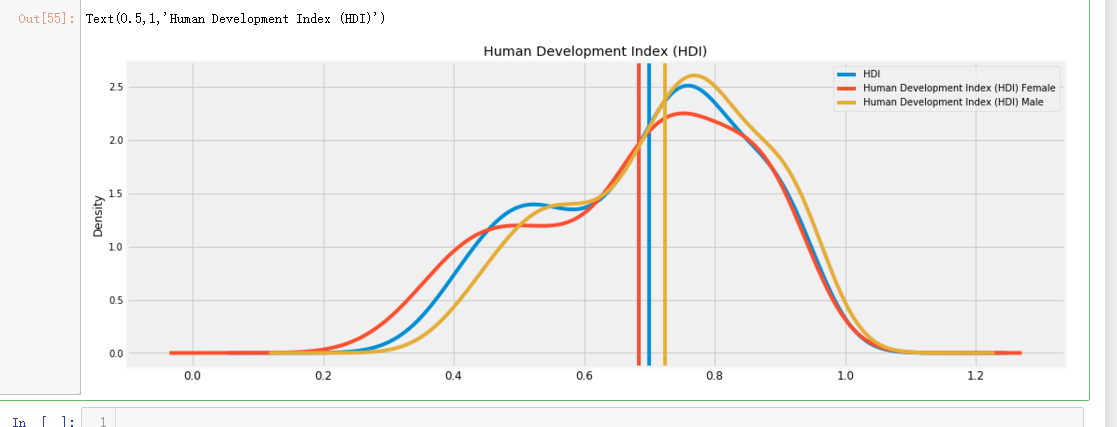
col = ['HDI','Human Development Index (HDI) Female','Human Development Index (HDI) Male']
f,ax = plt.subplots(figsize=(16,6))
for i,C in enumerate(col):
hdi[C].plot(kind='kde',ax=ax,color='C{}'.format(i))
mean = hdi[C].mean()
ax.axvline(mean,c='C{}'.format(i))
print('Mean value of {}: {}'.format(C,mean,))
#ax.text(round(mean,0),0.1,round(mean,2))
ax.legend()
plt.title('Human Development Index (HDI)')
#plt.savefig('hdi.png');
f,ax=plt.subplots(figsize=(16,6))

continent_hdi[['Human development groups','Average annual HDI growth 1990-2000','Average annual HDI growth 2000-2010',

       'Average annual HDI growth 2010-2015','Average annual HDI growth 1990-2015','HDI']].plot(ax=ax)

plt.xticks(np.arange(14),continent_hdi['Human development groups'],rotation=90);

col = hdi.columns[hdi.columns.str.startswith('Life expectancy')]

f,ax = plt.subplots(figsize=(16,6))

for i,C in enumerate(col):

    hdi[C].plot(kind='kde',ax=ax,c='C{}'.format(i))

    mean = hdi[C].mean()

    ax.axvline(mean,c='C{}'.format(i))

    print('Mean value of {}: {}'.format(C,mean,))

    #ax.text(round(mean,0),0.1,round(mean,2))

    ax.legend()

plt.title('Life expectancy');

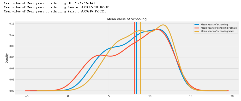
col = hdi.columns[hdi.columns.str.startswith('Mean years')]

f,ax = plt.subplots(figsize=(16,6))

for i,C in enumerate(col):

    hdi[C].plot(kind='kde',ax=ax,c='C{}'.format(i))

    mean = hdi[C].mean()

    ax.axvline(mean,c='C{}'.format(i))

    print('Mean value of {}: {}'.format(C,mean,))

    #ax.text(round(mean,0),0.1,round(mean,2))

    ax.legend()

plt.title('Mean value of Schooling');
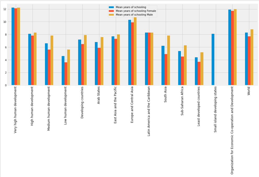
f,ax=plt.subplots(figsize=(16,6))

col = continent_hdi.columns[continent_hdi.columns.str.startswith('Mean years')]

continent_hdi[col].plot(ax=ax,kind='bar')

plt.xticks(np.arange(15),continent_hdi['Human development groups'],rotation=90);
f,ax=plt.subplots(figsize=(16,6))

continent_hdi['Share of seats in parliament (% held by women)'].plot(kind='bar',ax=ax)

plt.xticks(np.arange(15),continent_hdi['Human development groups'],rotation=90)

for i,v in enumerate(continent_hdi['Share of seats in parliament (% held by women)']):

    plt.text(i,2,round(v,2),fontsize=12,rotation=90);

f,ax=plt.subplots(3,1,figsize=(16,6),sharex=True)

axs = ax.ravel()

col = ['Population Ages 15–64 (millions) 2015','Population Under age 5 (millions) 2015',

       'Population Ages 65 and older (millions) 2015','Human development groups']

continent_hdi[col].plot(ax=axs[0],kind='line')

axs[0].set_title('Population by Age')

col = ['Total Population (millions) 2015', 'Total Population (millions) 2030',]

continent_hdi[col].plot(ax=axs[1],kind='line')

axs[1].set_title('Total Population')

col = ['Population Average annual growth 2000/2005 (%) ','Population Average annual growth 2010/2015 (%) ']

continent_hdi[col].plot(ax=axs[2],kind='line')

axs[2].set_title('Population Growth %')

plt.xticks(np.arange(15),continent_hdi['Human development groups'],rotation=90);

#axs[2].set_xticklabels([x for x in continent_hdi['Human development groups']], rotation=90);

f,ax = plt.subplots(1,2,figsize=(16,6))

value = (hdi[['Employment in agriculture (% of total employment) 2010-2014','Country']].sort_values(by='Employment in agriculture (% of total employment) 2010-2014')[:10])

sns.barplot(value['Employment in agriculture (% of total employment) 2010-2014'],value['Country'],palette='cool',ax=ax[0])

ax[0].set_title('Bottom 10 country Employed in agriculture')

for i, v in enumerate(value['Employment in agriculture (% of total employment) 2010-2014']):

    ax[0].text(0,i, round(v,2),fontsize=10,color='k')

value = (hdi[['Employment in agriculture (% of total employment) 2010-2014','Country']].sort_values(by='Employment in agriculture (% of total employment) 2010-2014',ascending=False)[:10])

sns.barplot(value['Employment in agriculture (% of total employment) 2010-2014'],value['Country'],palette='Wistia',ax=ax[1])

ax[1].set_title('Top 10 country Employed in agriculture');

for i, v in enumerate(value['Employment in agriculture (% of total employment) 2010-2014']):

    ax[1].text(0,i, round(v,2),fontsize=10,color='k')

f,ax = plt.subplots(1,2,figsize=(16,6))

value = (hdi[['Total Unemployment (% of labour force) 2015','Country']].sort_values(by='Total Unemployment (% of labour force) 2015')[:10])

sns.barplot(value['Total Unemployment (% of labour force) 2015'],value['Country'],palette='cool',ax=ax[0])

ax[0].set_title('Bottom 10 country by Unemployment')

for i, v in enumerate(value['Total Unemployment (% of labour force) 2015']):

    ax[0].text(0,i, round(v,2),fontsize=10,color='k')

value = (hdi[['Total Unemployment (% of labour force) 2015','Country']].sort_values(by='Total Unemployment (% of labour force) 2015',ascending=False)[:10])

sns.barplot(value['Total Unemployment (% of labour force) 2015'],value['Country'],palette='Wistia',ax=ax[1])

ax[1].set_title('Top 10 country by Unemployed');

for i, v in enumerate(value['Total Unemployment (% of labour force) 2015']):

    ax[1].text(0,i, round(v,2),fontsize=10,color='k')

m = folium.Map(location=[0,0],zoom_start=2)

m.choropleth(geo_data= geo_world_data,data = hdi, columns=['Country','Inequality in income (%)'],key_on='feature.properties.name',name='Inequality in income (%)',fill_opacity=1,fill_color='GnBu',highlight=True, legend_name='Inequality in income (%)')

folium.LayerControl().add_to(m)

m

吴裕雄--天生自然 PYTHON数据分析:人类发展报告——HDI, GDI,健康,全球人口数据数据分析的更多相关文章
- 吴裕雄--天生自然PYTHON爬虫:安装配置MongoDBy和爬取天气数据并清洗保存到MongoDB中
1.下载MongoDB 官网下载:https://www.mongodb.com/download-center#community 上面这张图选择第二个按钮 上面这张图直接Next 把bin路径添加 ...
- 吴裕雄--天生自然python Google深度学习框架:Tensorflow实现迁移学习
import glob import os.path import numpy as np import tensorflow as tf from tensorflow.python.platfor ...
- 吴裕雄--天生自然 PYTHON数据分析:糖尿病视网膜病变数据分析(完整版)
# This Python 3 environment comes with many helpful analytics libraries installed # It is defined by ...
- 吴裕雄--天生自然 PYTHON数据分析:所有美国股票和etf的历史日价格和成交量分析
# This Python 3 environment comes with many helpful analytics libraries installed # It is defined by ...
- 吴裕雄--天生自然 PYTHON数据分析:钦奈水资源管理分析
df = pd.read_csv("F:\\kaggleDataSet\\chennai-water\\chennai_reservoir_levels.csv") df[&quo ...
- 吴裕雄--天生自然 python数据分析:健康指标聚集分析(健康分析)
# This Python 3 environment comes with many helpful analytics libraries installed # It is defined by ...
- 吴裕雄--天生自然 python数据分析:葡萄酒分析
# import pandas import pandas as pd # creating a DataFrame pd.DataFrame({'Yes': [50, 31], 'No': [101 ...
- 吴裕雄--天生自然 python数据分析:医疗费数据分析
import numpy as np import pandas as pd import os import matplotlib.pyplot as pl import seaborn as sn ...
- 吴裕雄--天生自然 PYTHON语言数据分析:ESA的火星快车操作数据集分析
import os import numpy as np import pandas as pd from datetime import datetime import matplotlib imp ...
随机推荐
- Nginx(二) 常用配置
全局配置段 # 允许运行nginx服务器的用户和用户组 user www-data; # 并发连接数处理(进程数量),跟cpu核数保存一致: worker_processes auto; # 存放 n ...
- linux之samba使用
工作中,很多时候,我导出文件,或者上传文件的时候经常失败,报samba fail,但我并不知道samba是干什么用的,也老是听同事说什么samba没有挂载,但我基本上不知道什么是samba,更不要说什 ...
- kubernetes secret 和 serviceaccount删除
背景 今天通过配置创建了一个serviceaccounts和secret,后面由于某种原因想再次创建发现已存在一个serviceaccounts和rolebindings.rbac.authoriza ...
- 吐血推荐珍藏的IDEA插件
之前给大家推荐了一些我自己常用的VS Code插件,很多同学表示很受用,并私信我说要再推荐一些IDEA插件.作为一名职业Java程序员/业余js开发者,我平时还是用IDEA比较多,所以也确实珍藏了一些 ...
- Struts(四)
1.Struts 2提供了非常强大的类型转换功能,提供了多种内置类型转换器,也支持开发自定义类型转换器2.Struts 2框架使用OGNL作为默认的表达式语言 ==================== ...
- 12、PPP和HDLC
PPP主要包括三个部分1. 在串行链路上封装上层数据报文的方法2. LCP(link control protocals): 链路控制协议来配置和测试数据通信链路,协商PPP协议的配置参数 ...
- 在sublime text 3中搭建Java开发环境
在jdk bin目录下新建一个bat文件: 如D:\JAVA\jdk1.8.0_65\bin\runJava.bat @ECHO OFF cd %~dp1 ECHO Compiling %~nx1.. ...
- [Jinja2]本地加载html模板
import os from jinja2 import Environment, FileSystemLoader env = Environment(loader=FileSystemLoader ...
- DG参数 LOG_ARCHIVE_DEST_n
DG参数 LOG_ARCHIVE_DEST_n This chapter provides reference information for the attributes of the LOG_AR ...
- Optional类包含的方法介绍及其示例
Optional类的介绍 javadoc中的介绍 这是一个可以为null的容器对象.如果值存在则isPresent()方法会返回true,调用get()方法会返回> 该对象. 使用场景 用于避免 ...